Caterpillar Logo
Caterpillar is one of the top producers of specialized machinery for mining, agriculture, transportation, and other sectors. The Cat brand also produces a wide range of other products. Although its roots go back to the USA, the corporation includes about 500 divisions in 50 different countries on all continents, with the exception of Antarctica.
Meaning and History
The 1920s marked the start of Caterpillar’s history, which started as a merger of two other firms. One was known as the Stockton Wheel Company, established by the Holt brothers in 1883. The business produced agricultural equipment. In 1904, it launched its first successful tractor sold as Caterpillar, which later became the brand name. The second company was Daniel Best’s agriculture machinery manufacturing company. Its goods were actively exported to nearby countries at the beginning of the last century and soon to Europe and Russia.
What is Caterpillar?
Caterpillar Inc. is an American machinery manufacturer that sells its products in numerous countries. Its products are used in various industries, including agriculture, mining, and building. It also makes engines and other industrial and automobile equipment, as well as work clothes and boots.
1925 – 1931
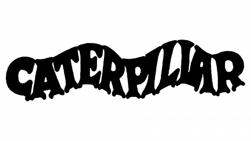
The original logo was its name which formed a shape of a caterpillar. It was simply black on a white background and featured thick serif letters. The bottom serifs looked like the caterpillar’s feet. It was unique but hard to read.
1931 – 1932
The new logo did not feature any additional elements. Instead, the designers went for a modest wordmark that used a font with straight serifs. It had rather thick lines, which gave it a bold look. The use of a red color further strengthen an association with a business that was going strong even despite the recent world war.
1932 – 1939
Since 1932, the company used a black version of the previous logo.
1939 – 1941
The new wordmark featured more angular lines and serifs, which made the logo look even bolder.
1941 – 1957

The company continued to modify the logo it introduced back in 1931. This time, the letters were stretched out vertically and still had squarish serifs. The letter “t” had a vertical line cut diagonally at the top. Bigger spacing between letters definitely made a statement.
1957 – 1967
Although the company kept the idea of the black name as its logo, it used a different font. This was the first time since the original version that the brand used all uppercase letters. There were no more serifs. The bold, uppercase letters that were closely spaced and had straight cuts and lines were more than appropriate for a company that made powerful machinery.
1967 – 1989
The designers added another element in the form of a square with a white letter “C” that looked like a circle with vertical and horizontal lines going through it, to the wordmark. The latter still featured bold, all uppercase letters. However, the font was changed.
1989 – Today
The new update gave the wordmark a fresh look. The typeface had a similar style with thick lines and straight-cut ends. A unique feature of this logo was a yellow triangle that was placed right under the “A”, covering it almost to the horizontal bar. It represented the growth and energy of the company.
Font and Color
After a trial with making the letters form a caterpillar shape, the company used a more classic serif typeface that was based on fonts such as NoraPen Medium or Gianotten Pro. The 1957 version featured a modified version of Filmotype Ford or a similar typeface. The 1967 typeface resembled Eurostile Unicase Pro Regular. The last version features a modified CG Triumvirate Inserat or Nimbus Sans L Cond Black typeface. The majority of the logos were simply black on white. This is a classic color that gives a professional feel and stands out on any background.


