Michelin Logo
Michelin is a large manufacturer of tires for cars, machinery, and aircraft. For more than 100 years, it has been conquering new heights in the field of technology and rubber production for a wide variety of vehicles. Today, it is one of the most recognizable brands in the world. The familiar Michelin marking itself acts as a sign of quality. The growth of the company’s wealth has led to the fact that Michelin now owns other well-known brands, including Kormoran, Taurus, B.F. Goodrich, and Uniroyal.
Meaning and History
![]()
It all started in 1830 with a small business in France. It appeared thanks to two brothers – André and Édouard Michelin. Initially, they manufactured everything they could possibly make from rubber. André Michelin was an engineer and had an excellent education and a brilliant mind. He found original and effective approaches to the development of their family business. By 1895, the company started making tires for cars. This direction has become the main one. Throughout the history of Michelin, its owners and developers have sought to introduce new solutions and produce unique products in the tire industry. The company received the familiar to us name Michelin much later, in 1889.
What is Michelin?
Michelin is a tire manufacturing company that owns many unique developments and innovations in the tire industry, such as radial and airless tires. It always strived to develop new tire models with improved performance. The company’s factories are located in many countries around the world.
1889 – 1925
![]()
Early on, the emblem was more like a flyer with all the possible information about the Michelin company on it. Besides the Mane printed in the center using a serif typeface, it included information on what the company was manufacturing, where it was founded, and so on. All the inscriptions featured different, elegant fonts and were done in French. The emblem was decorated by rubber plants.
1936 – 1968
![]()
Mister Michelin, or Bibendum, became the new symbol of the enterprise. A funny story contributed to its appearance. When the Michelin brothers came to a car show, they saw how the owner of one of the stands stacked tires of different diameters in piles. Eduard then jokingly told his brother that the tire tower very much resembles a little man, one only has to add hands. The owners of Michelin & Co turned to Marius Rossellini a cartoonist under the pseudonym O’Galop. Originally, Mr. Michelin was drawn with a cigar and a beer mug filled with nails. Later, though, he turned into a happy man running after a tire with one hand pointing at the brand name above and the other at the tire on its right. The name was placed on a slight diagonal. It featured cursive writing with the last letter turning and creating a horizon line while also underlining the name.
1968 – 1997
![]()
A strong and powerful logo was created in 1968. It was achieved thanks to thick strokes, a geometric font, and all uppercase wide letters that were closely spaced together. The logo was done in black and had no other elements.
1997 – now
![]()
An updated version uses a very similar font, only with some of the corners rounded. The whole inscription was italicized, creating another distinguishing feature.
1997 – 2017
![]()
The company used another logo alongside the plain name one. The designers added the rubber man on the left of the name. It was waving hello and made the company look very welcoming. The inscription was done in white and placed on a blue rectangular background with a bright yellow line going from the left almost all the way to the right end of the background.
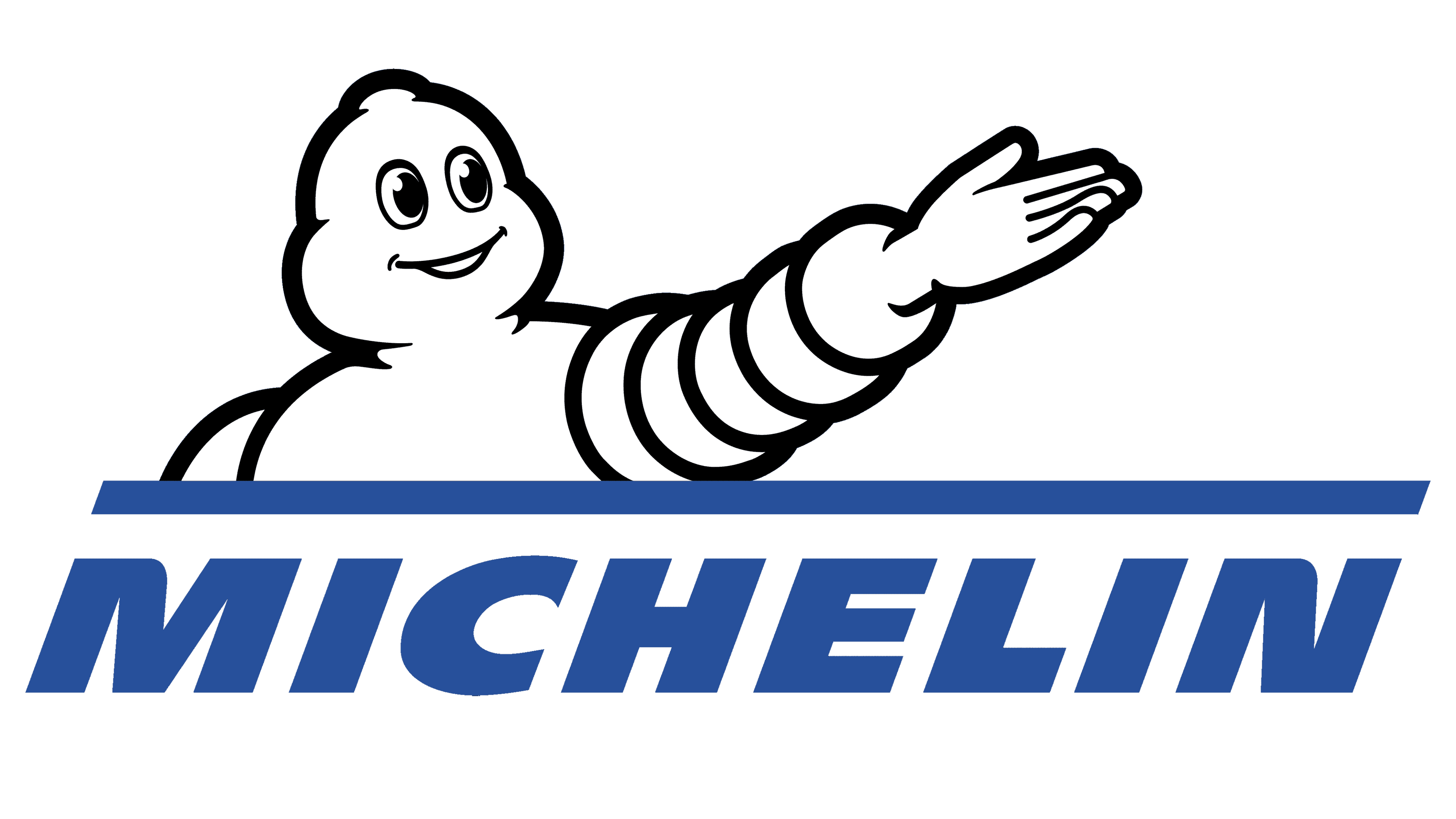
2017 – Today
![]()
The new logo is a modified version of the previous logo. The name was now done in blue, which was seen in the background earlier, using the same font. A yellow line was placed above it, right under a smiling and waving rubber man. Only the upper body of the Michelin Man is visible.
Font and Color
The original logo presented several sans-serif and serif typefaces to separate different inscriptions. From 1936 until 1968, Michelin’s logo featured a beautiful, cursive typeface with no serifs. Since 1997, the brand uses Michelin Black typography. It is an italicized, bold, sans-serif typeface. For many years, the company stuck to a black-and-white color palette. However, in 1997, it introduced more colors. These were blue and yellow. A bit of bright yellow adds a happy note, while the blue creates an image of a trustworthy and stable company.


