BASF Logo
BASF is a global chemical conglomerate renowned for its diverse portfolio, spanning from agricultural solutions to performance products. Headquartered in Ludwigshafen, Germany, the company plays a pivotal role in various sectors like automotive, construction, and consumer goods. As of 2022, BASF has cemented its presence in all major markets, with Europe and Asia-Pacific being key contributors to its revenue. The enterprise is publicly traded, with shareholders from around the globe holding stakes. In essence, BASF’s commitment to innovation and sustainability propels it as a leading chemical industry stalwart.
Meaning and history
Founded in 1865, BASF traces its origins to Mannheim, Germany, where it began as Badische Anilin- & Soda-Fabrik, focusing initially on the production of dyes. Over the years, BASF’s expansive growth, coupled with its penchant for innovation, allowed it to diversify into a plethora of sectors.
During World War I, the company’s production broadened to include synthetic rubber and ammonia. By the end of the war, BASF amalgamated with six other German chemical companies to form IG Farben, an entity that dominated the European chemical industry.
However, post World War II, IG Farben faced significant scrutiny due to its wartime activities, culminating in its eventual dissolution. By 1952, BASF re-emerged as a separate entity in Ludwigshafen and soon kick-started its journey of post-war recovery and expansion.
The 1960s and 70s were periods of significant growth. BASF introduced innovative products like Styropor, the first expandable polystyrene. Around this time, the company also marked its footprint in the North American market, establishing BASF Corporation in the US.
A new era began in the 1980s when BASF shifted from being predominantly a chemical producer to an integrated producer, delving into the fields of health and nutrition. It fortified its global presence, expanding in Asia, South America, and Eastern Europe.
The turn of the millennium witnessed BASF’s relentless pursuit of sustainability. With a commitment to environmental protection, the company has consistently launched eco-friendly products and systems.
Over its lifespan, while BASF remained a publicly-traded entity, it saw diverse shareholders, from private German investors in its early years to a global network of stakeholders today. Changes in ownership or control were predominantly due to mergers or geopolitical events, such as the aforementioned merger into IG Farben and subsequent re-establishment.
In summary, BASF’s journey from a modest dye producer to a global chemical industry titan is a testament to its adaptability, commitment to innovation, and its ability to pivot in the face of challenges. The company’s rich history is a mosaic of growth, diversification, and an unwavering dedication to sustainability.
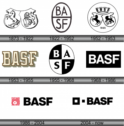
1873 – 1922
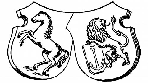
A symbol originating from bygone eras harkens back to a time when two iconic representations graced it – an equine figure and a majestic lion. These depicted quintessential elements often found on heraldic shields. Positioned to the left, a horse reared up on its back limbs. To the right stood a lion, proudly clutching a detailed anchor motif. The creatures were rendered more as intricate outlined sketches rather than filled forms. A single unifying streak bridged the two protective insignias, creating a harmonious blend. This iconography, steeped in history, speaks volumes of traditions and artistic interpretations of past ages.
1922 – 1952
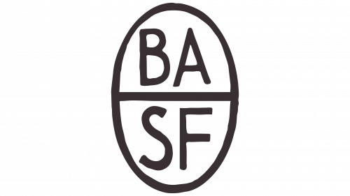
Subsequently, the emblem underwent a dramatic transformation. Gone were the twin heraldic shields, replaced by an upright elliptical shape. This ellipse was bathed in a soft beige hue, bordered with a pronounced black contour. Within it, another similar band bisected the form, creating an upper and a lower section. Residing in the upper half was the lettering “BA”, while “SF” was inscribed below. These characters were crafted in a sleek typeface, mirroring the robustness of the surrounding border. Every single one of these letters stood tall in uppercase, bearing a deep black tone, and devoid of any decorative flourishes or serif extensions. The new design mirrored a blend of simplicity and contemporary elegance, emphasizing clarity and distinction.
1952 – 1953
The creative team revisited the initial logo design, giving it a contemporary makeover. The equine and lion illustrations were darkened, allowing them to prominently contrast against a pristine white backdrop. Alongside, the artists introduced a linear motif echoing the semblance of a royal diadem. Its spikes stood upright, uniformly angled, creating spaces that accommodated the acronym of the esteemed chemical institution, Baden Aniline and Soda Factory, represented as “BASF.” Crafted in uppercase, these characters were bold, magnified, and exhibited a vertical stretch. Dominating the upper section, this assemblage was complemented below by a nod to the company’s foundational year – 1865. An understated black circumference gracefully enveloped the entire ensemble, adding finesse and unity.
1953 – 1955
The updated badge bore little resemblance to its predecessor. Its design was primarily textual, showcasing the condensed moniker of the enterprise. Each character was graced with a delicate mocha-hued border, evoking the imagery of a sketched enclosure. The inner recesses of these letters took on a soft beige palette. Subtle gray undertones adorned the exterior, casting shadows predominantly to the lower right. This fresh representation breathed modernity, infusing a harmonious blend of color and design elements, suggesting a forward-thinking yet grounded approach by the company.
1955 – 1968
In 1955, there was a nostalgic revival of the 1922-1952 emblem, albeit with a fresh twist in the arrangement of the letters. Each character was accorded its distinct compartment. Instead of bisecting the oval into two, designers ingeniously segmented it into four sections, mirroring the count of the letters. The characters “B” and “F” nestled within dark triangular spaces, while “A” and “S” resided in their lighter counterparts. This clever utilization of contrasting hues ensured that the letters boldly asserted themselves against their respective backdrops. This reimagined design underscored the importance of harmony in diversity, encapsulating both the legacy and innovation of the brand.
1968 – 1986
The subsequent emblem adopted a rectangular shape, oriented in a horizontal manner. This obsidian backdrop became the canvas for alabaster-hued characters. Representing the enterprise’s moniker, the letters stood tall in uppercase form – sleek, pronounced, and devoid of any ornate flourishes. The interplay of these opposing shades not only heightened the aesthetic appeal but also bolstered the legibility of the inscription. This design choice mirrored the company’s ethos of clarity and simplicity, exuding an air of modernity while maintaining a stark elegance that captured attention without being overly elaborate.
1986 – 2004
Unveiled in the mid-1980s, the emblem showcased a harmonious blend of typography and imagery. The brand’s name, rendered in deep ebony tones, was set against a pristine canvas. These characters, characterized by their broad stances, nearly bridged the gaps between each other, creating an imposing visual presence. Adjacent to this textual element, a diminutive red-and-white square insignia took its place. At its core, a central dot from which vertical spirals radiated outward, evoking dynamic movement. Tucked in the upper left corner of this emblematic square was a succinct rendition of the company’s moniker, reaffirming the brand’s identity in a more condensed form. This emblem resonated with the essence of the era, blending classic design elements with a touch of contemporary flair.
2004 – Today
Transitioning into the 21st century, BASF has unveiled a symbolic brand insignia. This logo is characterized by two dominant elements: the textual representation and a duo of squares. The textual component pays homage to the company’s longstanding legacy, symbolizing its resilience and the rich heritage rooted in the chemical industry. Meanwhile, the squares emphasize the firm’s commitment to fostering strong collaborations and offering tailor-made solutions. The smaller square seamlessly integrates into the larger one, resembling pieces of a cohesive jigsaw.
Interestingly, the square on the left is more expansive, bordered by a pronounced perimeter. Its counterpart on the right is diminutive, boasting a solid fill. This compact square serves a dual purpose: it’s not just a fragment of its larger counterpart but also acts as a delineating spacer between the “BASF” text and its encompassing boundary. The letters in this rendition are notably robust, exhibiting a breadth that surpasses their predecessors by nearly one and a half times. Some versions of this logo also incorporate the company’s tagline, “The Chemical Company.” As per the brand’s directives, this slogan remains exclusively in English, resisting translation into alternative languages, underscoring its universal appeal and significance.
