Toys ‘R’ Us Logo
Toys ‘R’ Us is a toy-making company from America. Besides toys, the company manufactures many other products intended for use by toddlers. The first shop of the company was established in 1948. However, it wasn’t until 1957 that the business took on its current name.
Meaning and History
Toys ‘R’ Us was founded in 1948 by Charles Lazarus in Washington, D.C., initially as a baby furniture retailer. As the demand for toys increased post-World War II, Lazarus expanded his business into a toy store chain, pioneering the concept of a dedicated toy store that was part of a larger chain. Over the years, Toys ‘R’ Us became synonymous with toys and childhood, branding itself with the iconic Geoffrey the Giraffe mascot.
Throughout its history, Toys ‘R’ Us achieved numerous milestones, including the introduction of its first comprehensive toy catalog, which became a staple in American households during the holiday seasons. The company also expanded internationally, entering markets such as Canada, Europe, and Asia, thus cementing its presence as a global leader in the toy retail industry. In the late 20th century, Toys ‘R’ Us was the go-to destination for toys, games, and educational products for children, influencing generations of consumers.
However, with the rise of e-commerce and changes in consumer shopping habits, Toys ‘R’ Us faced significant challenges, leading to its bankruptcy in 2017. Despite these setbacks, the brand has been revitalized under new ownership by WHP Global, which acquired a controlling interest in 2021. Today, Toys ‘R’ Us continues to operate with a focus on reinventing its physical and online presence to reconnect with today’s consumers, maintaining its status as a beloved brand among families around the world.
What is Toys ‘R’ Us?
It is a global retailer dedicated to toys and children’s products, recognized for its wide array of toys suited for kids of all ages. From classic board games to the latest tech-driven toys, Toys ‘R’ Us offers a diverse selection of products designed to foster fun and learning.
1948 – 1957
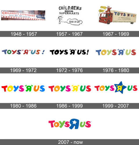
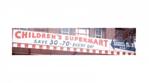
Initially, this chain of stores was called just ‘Children’s Supermart’. The logo they used was a simple wordmark featuring their name written in red. It was all capital letters, although their size diminished the closer to the middle you got because the bottom was curved upwards, while the top stayed on the same level.
1957 – 1967
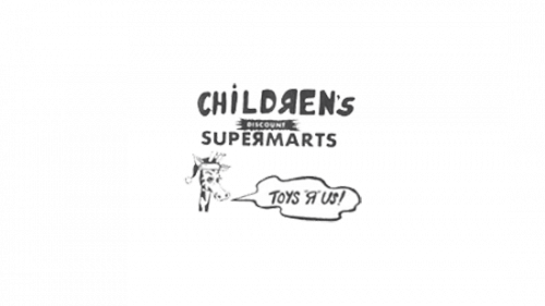
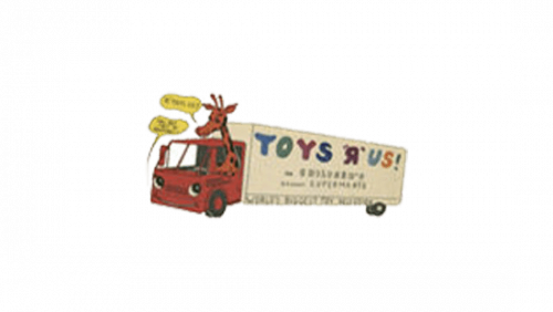
The name ‘Toys ‘R’ Us’ was adopted in 1957, although they kept calling themselves the ‘Children’s Supermarts’ for some time after that. This logo depicted both names – the latter written in comical letters (some mirrored or disproportionate). The former was put below it into a speech bubble that came off from a cartoonish giraffe that was nearby.
1967 – 1969
In 1967, they introduced the first version of their iconic wordmark logo. They basically wrote their name (as ‘TOYS ‘R’ US!’), where the ‘R’ letter is mirrored into ‘Я’. The style is cartoonish, and these letters generally look like balloons. Each letter had a unique color, ranging from blue to red to orange.
They used it standalone, but sometimes they’d place the wordmark onto an image of a truck, driven by a giraffe from before.
1969 – 1972
It’s a similar wordmark, except the letters took on different colors and were tilted into different sides. They’d also sometimes put the ‘children’s bargain time’ note beneath the name’s right half.
1972 – 1976
That’s the same wordmark without anything else, except the letters have been streamlined and made softer. The color is unspecified for this one, which means it could be anything, not just what you see on the screen.
1976 – 1980
In 1976, they got rid of the ‘!’ in the end. Also, the color scheme was now specified: only three colors were used for these letters, including pale shades of green, blue & yellow.
1980 – 1986
The color choice was then updated to this. Each letter now had its own color, and there were all much brighter and more saturated.
1986 – 1999
Following the 1986 update, there were further modifications to the color scheme. The shade of green was deepened slightly, and all the letters, with the exception of “T” and “S,” underwent a color change, though still within the same color palette. This version continued to be used by several outlets up until 2018.
1999 – 2007
This time, the colors (or anything, for this matter) didn’t really change. They did add a softly drawn blue star behind the ‘R’ letter, however.
2007 – today
The font was updated for once – they were generally similar shapes, but some characters grew in size. The ‘R’ part was updated more: the letter got rid of the commas on each side, was increased in size and given a star-shaped hole. The star from before was removed. Moreover, the coloring for all letters changed to orange, pink or green.
