Boston Celtics Logo
Founded in 1946, the team of professional basketball players has their home games at the TD Garden. Celtics are proud NBA champions as they had won seventeen times, which is an absolute record among all teams. Some of its players were also honored to be called the NBA Most Valuable Player. The team uses traditional Irish colors as the team colors. In 1950, Chuck Cooper was the first African-American to join the franchise.
Meaning and History
In mid 40s, Walter Brown brought together the players as a Basketball Association of America team. When the BBA and NBL merged, the Celtics joined the NBL. Initially, the players showed very poor quality games. However, basketball results began to gain momentum with Red Auerbach leading and coaching the players. The Celtics won their first title in 1957. Many other successful games have followed and made the team well-known across the states.
What is Boston Celtics?
The Boston Celtics is a North American basketball club that has been playing in the National Basketball Association (NBA) since 1949. During this time, the team became the NBA champion seventeen times. One of the main Celtics opponents is the LA Lakers club. Between themselves, they met in the finals 12 record times and Boston Celtics won nine of these games.
1946 – 1950
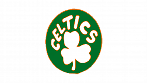
The first emblem of the team was an oval green amulet. It had “Celtics” arching in the upper half. The letters were white and thick and the wordmark looked hand drawn. Under the name, a simple drawing of a clover leaf was done in white. All the elements had a thin orange outline.
1950 – 1960
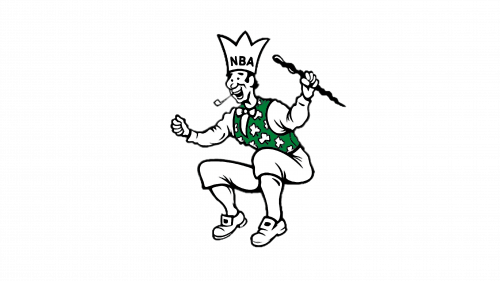
The next logo was much more interesting as it depicted a jester. The character was jumping and had a happy grin. A smoking pipe, wand, and a crown with NBA written across complete the look. The jester is a black and white contour drawing. An exception is a green vest that has white clover leaves scattered across it.
1960 – 1968
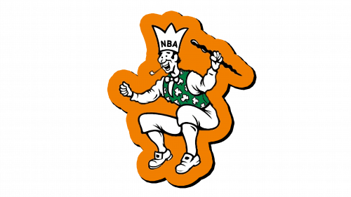
Ten years after its creation, the logo was updated. There was no much change as the same joker was simply set on a bright orange background that repeated the shape of the character. It looked like a sticker as there was a black shade that gave the emblem a 3D effect.
1968 – 1974
The logo depicts a leprechaun with a grin spinning a basketball. Initially, this diminutive supernatural being, which further emphasized the roots of the team, was drawn only in 3 colors: black, white and green. The red basketball that casts a shade on one side is used as a background for the drawing, with the team’s name spelled out in capital letter using white color on either side of the leprechaun. Overall, the logo was done in a more professional manner and the character had some mystery about him and at the same time looked very confident.
1974 – 1996
One of the most noticeable changes introduced in 1974 was a color palette. There was no more red and the emblem was primarily green and white with black being used for contouring. The leprechaun was drawn in more detail and had a more define shape. Otherwise, the character closely resembled the original drawing done in 1968. Instead of the ball, the emblem now has a round green frame with the team’s name done in white capital letters.
1996 – Today
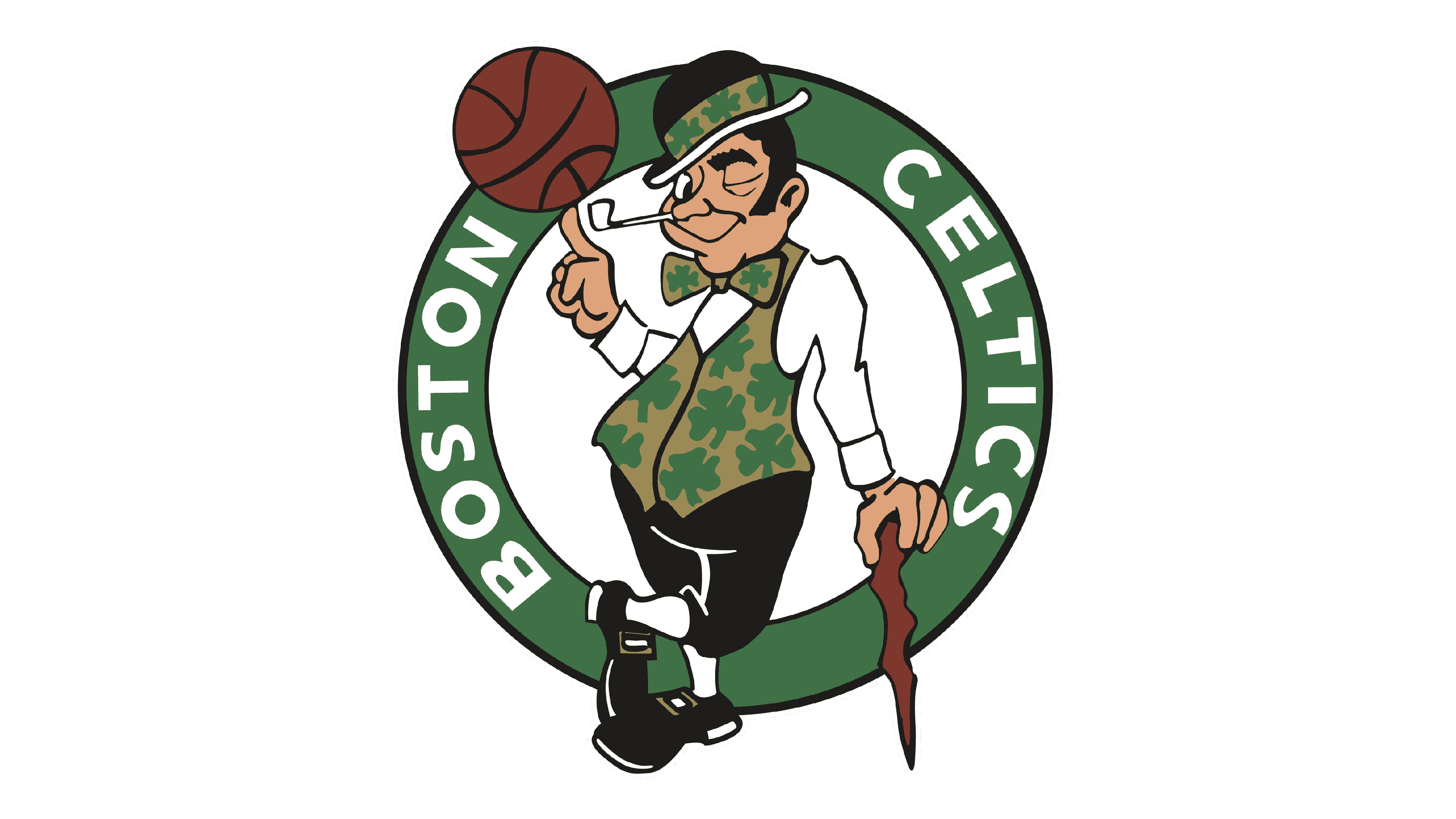
Fifty years after the foundation, the leprechaun has acquired some color. It was exactly the same emblem. However, the ball and cane were colored with a red, while the face and hands acquired skin color. The hair, eyebrows, hat, pants and shoes were done in black. Clover leaves are no longer drawn on a white background. The green used for leaves and round emblem also acquired a darker shade, with the round being outline on the inside and outside by a thin black border. Some elements, though, stayed white. Overall, the emblem acquired a more realistic look.
