Brighton & Hove Albion Logo
The team represents the city of the same name, Brighton. Brighton is an ancient city located on the shores of the English Channel, in the very south of England. This is the most popular and fashionable seaside resort in England, which locals have dubbed “London by the sea”. At one time, the team’s coach was Brian Clough, famous in England. There are many interesting facts in the history of the team, including players missing games or being seriously injured. However, these downtimes did not stop it from acquiring a strong fan base.
Meaning and History
Brighton & Hove Albion FC was founded in 1901 and 19 years later, it was included in the Football League’s new Third Division. The local team was not fetching stars from the sky. It has only one trophy, the English Super Cup, won in 1910. Until 1979, the team wandered around various divisions until a new coach came to the team – former England national team player Alan Murray, who led the Seagulls to the elite division. In 1983, Brighton qualified for the FA Cup final. Despite it being a significant event for the club, three key players were unable to play for a variety of reasons. The team’s nickname is “Seagulls”. They say it appeared due to the coastal location of the city. The team was called “Dolphins” and “Shrimps” in the early years. According to another version, the “bird” nickname is associated with the team’s long-time rivals – the Crystal Palace club, which bears the nickname “Eagles”.
What is Brighton & Hove Albion FC?
This is a football Club from the UK. Being one of the oldest football teams in the country, it has a rich history and tradition. A modest budget did not stop the team from having great aspirations and achieving a great deal.
1948 – 1970
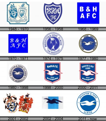
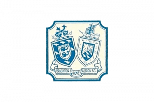
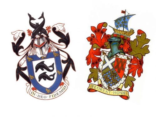
The logo has two main elements – the Edwardian Brighton Sussex Coat of Arms and the crest of Hove. Both have a lot of symbolism: the Brighton crest focuses on its closeness to the water, while the Hove crest has a cross of St Andrew and shackles to represent two churches while its lower section stands for the de Warrene family, the Rape of Lewes and six martlets the emblems of Sussex. The latter also has a ship, which is hinting that it is also a seaside part of the country. Both are placed on a square base with corners curving inward. The designers also added the team name on a banner across the bottom.
1956 – 1958
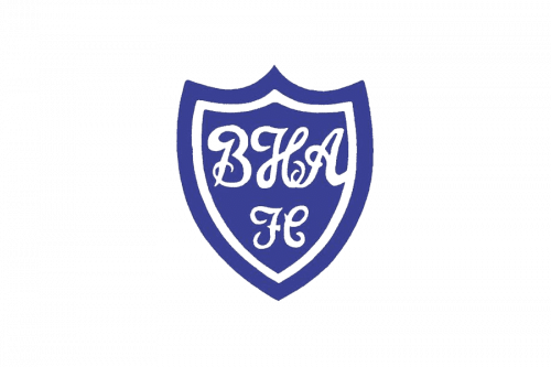
The team also created a simplified version of its logo that would be easy to remember. It was a dark blue crest with a double white and blue border. The name initials were also done in white and featured a handwritten cursive typeface. At the bottom, the crest featured a monogram that stood for “AFC”. It was written in the same style as the initials above.
1968 – 1969
This logo looks overly simplified and minimalistic. The square base has a perfect shape with no curves. It also had a neon blue color. The inscriptions were still done in white, but the font looked completely different. It was a typical, sans-serif font with straight, clean strokes and cuts. The top line had “B&H”, while the bottom had “AFC”. The logo made the team look strong and confident.
1970 – 1971
The logo was slightly modified in 1970. The inscriptions were now written using a cursive font with serifs. This gave the logo a more sophisticated and grand appearance.
1974 – 1975
A round emblem done in a blue and white color palette was presented in 1974. It featured a drawing of a jumping dolphin. The club’s nickname at the time was Dolphins. This was also written around the bottom of the emblem. The full name, Brighton & Hove Albion, was added across the top. The designers used a basic, sans-serif font that matched the simple design of the emblem.
1977 – 1980
During the 1975-76 game season, the fans began calling the team “Seagulls” in response to the opponent’s fans chanting “Eagles”. Mike Bamber liked the idea and changed the nickname to the Seagulls. Accordingly, the logo was changed to have a seagull in the center. It also no longer had “Dolphins” printed at the bottom. Another change introduced in 1977 was the addition of a golden border. The blue color got darker and the inscription was bolder and now had a thin blue outline. The logo looked stronger and more confident.
1980 – 1998
The logo was slightly redone in 1980. First of all, the dark blue background now had a pattern, and the seagull was redrawn. The darker blue gave the emblem a richer and more serious appearance. In addition, the golden border was removed, while the border now had “The Seagulls” at the bottom. The logo now featured a finer and larger font.
1998 – 2000
A more drastic update was done in 1998 as the logo not only got red accents but also had a different shape. A crest shape has already been used by the team, but this time it has a straight top. The double border was done in white followed by red. The seagull, which now had its wings go beyond the base as if it was flying out of a window. The team name was abbreviated and printed across the top, while the bottom had “The Seagulls” printed under the bird.
2000 – 2011
The only change done a few years after the logo was created was the replacement of the name abbreviation with a full name. No other changes were made.
2001 – 2002
The original logo was brought back with a few adjustments. The key change was the presentation of the logo in a colored version. The background and banner underneath were also gone. It was a bright and busy logo, but at the same time, it was a tribute to the team’s origins.
2002 – 2004
A minimalistic design was brought back. This time, the logo had a rectangular shape with a blue strip running down its center. It referred not only to the sky above us but also to the seaside location of the team. The seagull silhouette was also brought back, but it was done in contrasting black.
2011 – Today
The rectangular emblem stayed with the team and the round emblem was brought back. The key modification this time was the direction of the bird’s flight. The name was printed across the top, while the location “Albion” was added at the bottom. This logo looked modern and at the same time was instantly recognizable.
Font and Color
Although, initially, the team went back and forth between a basic sans-serif font and a more elegant cursive font, it went for a simpler font choice for most of its logos. Such font choice made the logo easily readable and resized as desired.
Different shades of blue were used by the team as the main color in all of its logos, except for one. It was typically complimented by a neutral white with splashes of golden or red once in a while. The exception was a multicolored logo used for the 2001/02 season. The blue color makes people feel confident and secure.
