Barcelona Logo
Barcelona Football Club is one of the most popular in the world. Generations of footballers are replacing each other, but this team always strives to achieve the highest goals. Few can match Barcelona in terms of the number of titles won.
Meaning and history
FC Barcelona was founded on November 29, 1899, by Swiss entrepreneur Joan Gamper, who had a deep passion for football and aimed to create a club that would become a symbol of sporting excellence in Barcelona. The club quickly became a pillar of sports and culture in Catalonia and Spain. Throughout its history, FC Barcelona has accumulated numerous trophies, including numerous La Liga titles and several UEFA Champions League titles. The club’s main achievements include establishing one of the world’s most successful football academies, La Masia, and maintaining a strong tradition of promoting youth players to its first team. The club’s philosophy of attractive, attacking football and its motto “Més que un club” (More than a club) reflect its commitment to cultural and regional identity. Today, FC Barcelona holds a prestigious position in global football, continually competing at the highest level and boasting a massive global following.
What is FC Barcelona?
It is a renowned football club based in Barcelona, Spain, known for its rich history, strong emphasis on youth development, and iconic blue and red striped uniforms. The club competes in La Liga, one of the top football leagues in the world.
1899 – 1910
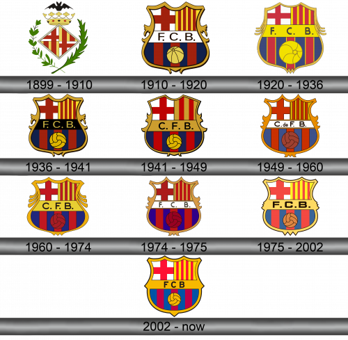
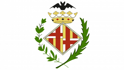
In 1899, together with the formation of the club, the first logo appeared. There is a rhombus in the center, divided into 4 parts. On one diagonal, a red and white flag (in the form of a cross) is inscribed in it, on the other – an orange-red flag (in the form of stripes). On the sides of the rhombus are branches of plants, on top of the crown, above the crown is a bat.
1910 – 1920
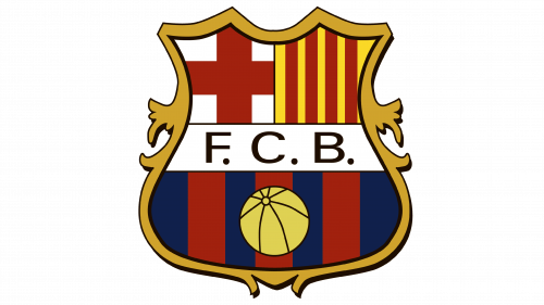
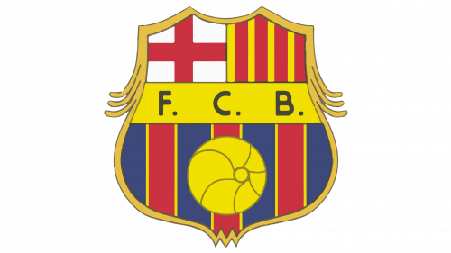
In 1910, the club acquired the emblem, which is still in use today. Only minor edits were made to it. The base is a shield with characteristic features at the top. Centered abbreviation FCB in black letters on a white background. Top left is a red cross in honor of Saint George (patron saint of Barcelona), top right – red and yellow stripes representing the flag of Catalonia. Under the abbreviation there are blue-garnet stripes with a yellow ball on them.
1920 – 1936
The shape of the shield has been slightly changed, the lower part has become larger, the ball has increased in size. The background for the letters has turned yellow.
1936 – 1941
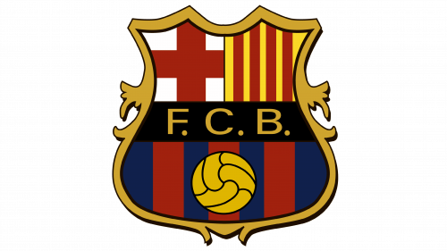
Adjusted the shape of the shield again. The inscription is now in yellow letters on a black background.
1941 – 1949
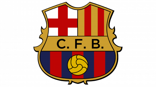
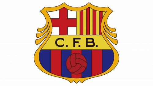
The shield retained its shape, but the colors and tones were changed. The order of the letters has changed, now it is CFB, they are applied in black on a golden background.
1949 – 1960
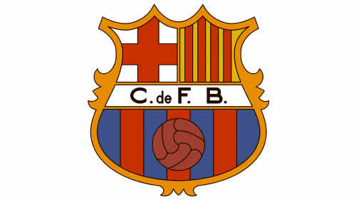
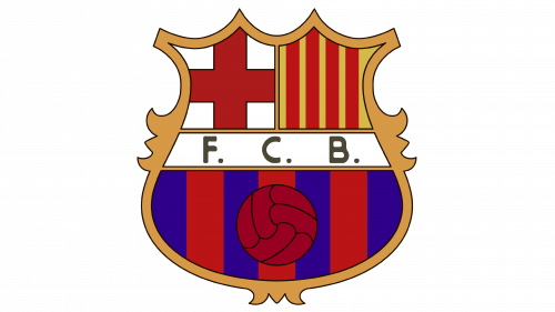
More adjustments have been made to the shield image. The abbreviation is C. de F. B. The inscription is now in black letters on a white background. The colors at the bottom of the shield have become closer to the grenade, the color of the ball has changed.
1960 – 1974
The colors of the label have been changed again, now the letters are black and the background is yellow. The colors at the bottom are brighter. The shield changed shape.
1974 – 1975
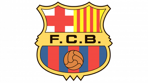
The shape of the shield is reminiscent of the style chosen in 1949. The previous order of letters FCB returned, they became black, and the background was white. Rich colors became a distinctive feature of the emblem.
1975 – 2002
The background for the inscription has become golden, now it merges with the inner edging of the shield. The ball at the bottom was returned to yellow.
2002 – Today
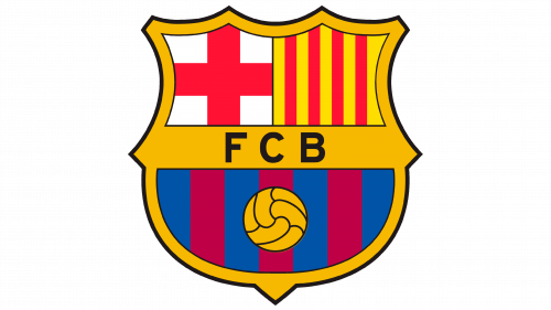
Changes have been made to the shades of colors. In 2018, an additional version of the emblem appeared, where there are no black borders between individual elements, there is no abbreviation.
Color and font
The team’s primary colors are blue and garnet and are used at the bottom of the shield. There is also a red cross in honor of St. George and the flag of Barcelona, these important symbols have always been present in the emblem. Different fonts were used for each version of the logo.
