Galatasaray Logo
Galatasaray stands as a beacon of sports and education in Istanbul, Turkey. Ali Sami Yen and his comrades birthed this institution with a vision. They chose the heart of the city for its home. Initially, their aim was to foster youth through sports and camaraderie. It’s more than a sports club; it’s a symbol of pride and history. Its name, inspired by a nearby historic area, echoes through the corridors of Turkish and European sports.
Meaning and history
Galatasaray, a titan of Turkish sports, was founded by Ali Sami Yen in 1905. Initially a football team, it quickly blossomed, becoming a multi-sport club. The club’s colors, yellow and red, were chosen to signify fiery passion and fierce competitiveness. Over the years, Galatasaray has become synonymous with football excellence, achieving domestic dominance and European glory. Its 2000 UEFA Cup win is legendary, etching its name in international football lore. The club also prides itself on basketball prowess, volleyball success, and other sports achievements. Galatasaray High School, the club’s birthplace, continues to foster young talent. The club’s legacy is a tapestry of sports culture, education, and relentless pursuit of greatness.
What is Galatasaray?
Galatasaray is a vibrant tapestry of sports, education, and culture. At its core, it’s a Turkish sports club, renowned for its football team. Beyond the field, it symbolizes unity, excellence, and a rich heritage. Its influence stretches across education through its affiliated school, molding future generations.
1905 – 1923
The emblem before you showcases a bold interlocking “G” and “S,” symbolizing the Galatasaray Sports Club. A rich red dominates the upper half, signifying passion and vigor, while a warm yellow fills the bottom, reflecting joy and creativity. The design exudes modernity and simplicity, its clean lines creating a lasting visual impact. The “G” stands tall, with a regal crown-like dot, whereas the “S” wraps around with dynamic curvature, embodying the club’s embrace of both tradition and ambition.
1923 – 1961
This iteration of the Galatasaray emblem evolves with an oval outline, adding elegance. The interlocked “G” and “S” remain central, this time with the significant year “1905” nestled within. The red and yellow hues continue to command attention, a testament to the club’s enduring spirit. The number’s inclusion is a clear nod to tradition, anchoring the design in history. The oval contour provides a sense of completeness, framing the legacy within.
1961 – 1987
The design has been streamlined: the oval now thinner, the “G” and “S” larger and more pronounced. The year “1905” sits boldly in the foreground, underscoring the club’s inception. The red and yellow colors remain vivid, yet their interaction is more dynamic, emphasizing movement and energy. This version of the emblem simplifies the shapes, lending a more contemporary feel while maintaining its historical reverence.
1987 – 1993
In this version, the emblem retains its iconic oval and color scheme but refines its elements for clarity. The “1905” shifts to a centered position, clearly announcing the club’s foundation year. The “S” and “G” appear more streamlined and balanced, enhancing visual harmony. Red and yellow are as vivid as ever, yet their placement now creates a seamless flow, symbolizing the club’s continuous momentum. This emblem is a polished echo of its predecessors, capturing tradition in a modern light.
1993 – 2000

The emblem maintains its recognizable oval shape, but the “1905” now sits flush with the “G”, asserting its foundational pride. The intertwining “S” and “G” flow more seamlessly, a symbol of the club’s intertwined history and ambition. Colors remain a striking red and vibrant yellow, but the contrasts appear more defined, sharpening the emblem’s overall look. This design iteration subtly refines its predecessors, presenting a cleaner, more contemporary badge.
2000 – 2001
The emblem now boasts two stars above the “GS” monogram, each representing a significant achievement in the club’s storied history. The “1905” still prominently anchors the design, set firmly within the “G”. The colors remain unchanged, but their vibrancy is highlighted even more against the backdrop of success symbolized by the stars. This design iteration reflects triumph and tradition, enhancing the club’s storied image with a touch of glory.
2002 – 2018
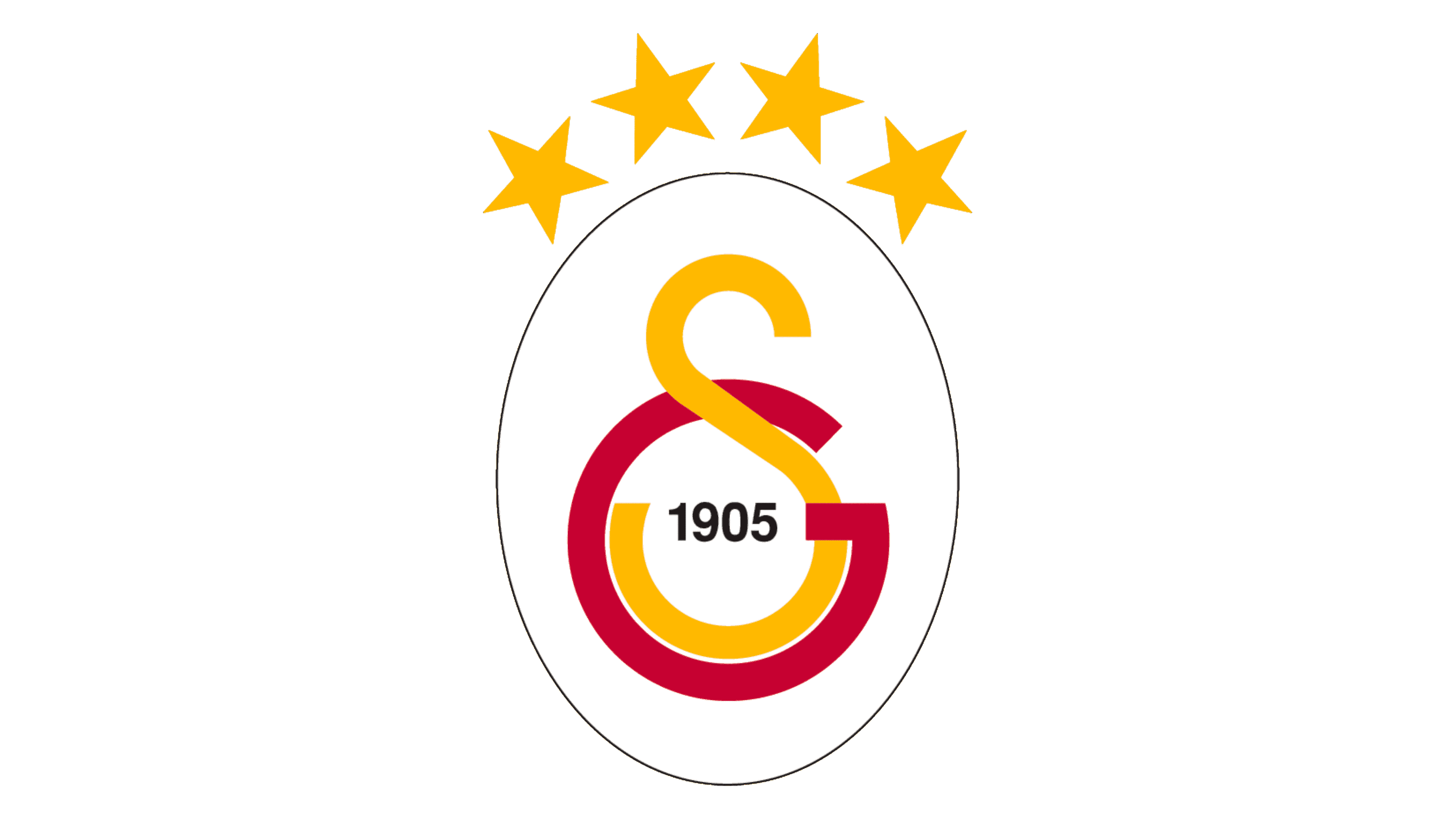
The emblem now proudly bears four stars above the “GS” monogram, each star shining for five championships, a tribute to the club’s success. The return of the oval shape encapsulates the design, adding a classic touch to the modern achievements. The “1905” is encircled more prominently by the “G”, signifying the club’s unbroken circle of ambition and honor. This design evolution symbolically layers history with contemporary triumphs, a sign of Galatasaray’s ongoing legacy.
2019 – Today
The newest rendition of the emblem features an additional star, bringing the total to four, each star symbolizing the club’s 20 championship victories. The stars are now aligned in an arc, crowning the top of the oval. This arc of stars signifies a celestial nod to the club’s ascending legacy. The “1905” within the “G” continues to stand as a proud reminder of the foundation year. The emblem’s oval border, “S” and “G” remain, their colors as striking as ever, embodying the club’s enduring passion and energy.


