Borussia Dortmund Logo
Borussia Dortmund, colloquially known as BVB, stands as a pillar of German football prowess. With its inception in 1909, the club has woven a rich tapestry of history marked by triumphs, embodying the spirit of its vibrant yellow and black colors. Internationally renowned, BVB has captivated hearts worldwide, solidifying its stature with a fervent fan base, the iconic “Yellow Wall.” The team’s ethos marries tradition with a commitment to nurturing young talents, fostering a dynamic, high-energy playing style. This ethos, coupled with the club’s storied stadium, Signal Iduna Park, cements Borussia Dortmund’s status as a formidable force in world football.
Meaning and history
Founded in 1909, Borussia Dortmund, or BVB, has sculpted a rich narrative steeped in tradition and triumph. Initially, the club navigated the tumultuous landscape of regional competitions, steadily rising to prominence.
A significant chapter unfolded during the 1950s and 1960s when Dortmund secured multiple German Championships. The Yellow and Black’s prowess was further solidified in 1966 as they became the first German team to capture a European title, the Cup Winners’ Cup.
However, the 1970s and 1980s witnessed financial turmoil and sporting setbacks, culminating in a relegation to the second tier in 1972. This adversity forged a resilient spirit that would define BVB’s future success.
The 1990s marked a renaissance, with back-to-back Bundesliga titles in 1995 and 1996 and a monumental UEFA Champions League victory in 1997. This golden era was propelled by iconic figures like Matthias Sammer and Karl-Heinz Riedle.
In the new millennium, Dortmund faced financial instability again, but strategic management and a focus on youth development paved the way for a resurgence. Under Jürgen Klopp, Dortmund clinched consecutive Bundesliga titles in 2011 and 2012, coupled with an appearance in the 2013 Champions League final.
Today, Borussia Dortmund stands as a testament to resilience, talent development, and electrifying football, with the iconic Yellow Wall of fans in Signal Iduna Park as its beating heart. The club’s narrative is interwoven with the city’s fabric, creating a unique symbiosis that fuels its pursuit of glory on the footballing world stage.
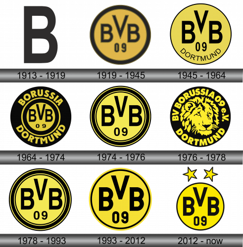
1913 – 1919
The initial symbol was simplistic in its design, featuring a straightforward black “B” in a sans-serif font, all set against a pristine white backdrop. This emblem was devoid of intricate components or embellishments, embodying a clean and classic aesthetic that highlighted the letter itself. The monochromatic color palette of black and white lent the design a timeless quality, ensuring its relevance and appeal across various contexts and time periods. It was a testament to the principle that sometimes, simplicity is the ultimate sophistication, allowing the essence of the character “B” to shine through without any unnecessary distractions or complications. Overall, the earliest emblem of the brand was a prime example of minimalistic design done right, demonstrating that even the most basic of graphics can leave a lasting impression when executed with precision and thoughtfulness.
1919 – 1945
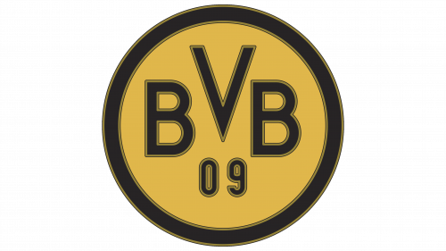
In the year 1919, a revolutionary transformation took place in the visual identity of the brand, giving birth to a fresh logo that set the precedent for a series of circular emblems. The emblem was graced by the inscription “BVB 09,” where “BVB” stands as a shorthand for the initial portion of the club’s title, BV (Ballspielverein) Borussia Dortmund, while “09” is symbolic of the club’s inaugural year, 1909. The core of the emblem was adorned in a vivid shade of orange, encapsulated within a bold black border that was delicately traced by subtle khaki lines. This iteration marked a significant evolution in the club’s branding, introducing elements that would become emblematic of its visual identity in the years to follow. The addition of the club’s initials and founding year served as a nod to its rich heritage, while the round shape and color scheme added a contemporary flair, reflecting the club’s forward-moving ethos.
1945 – 1964
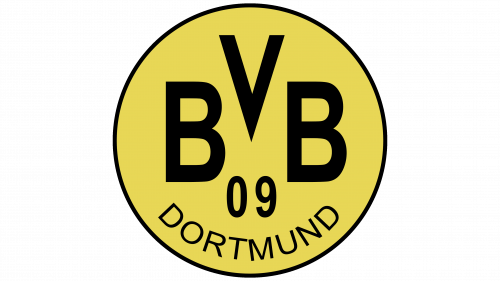
Post its temporary dissolution, the club made a prompt comeback, rebranded as SG (Sportgemeinschaft) Borussia 1898 Dortmund. Remarkably, the familiar acronym “BVB” managed to retain its presence. This, coupled with the numerical “09,” continued to adorn the circular logo, which had undergone a color transformation to yellow.
In an interesting turn of design evolution, the previously broad black border surrounding the emblem was substituted with a more refined, slimmer version. This alteration created additional whitespace, paving the way for the inclusion of the word “DORTMUND” at the emblem’s base. This new textual addition harmoniously aligns with the “BVB 09” inscription, both sharing the same typographic style, thereby maintaining a cohesive and balanced aesthetic appeal across the emblem’s entirety. These subtle yet impactful changes in the logo reflect a blend of tradition and modernity, encapsulating the club’s rich history while propelling it into the contemporary football landscape.
1964 – 1974
In 1973, following their triumphant championship win, Borussia Dortmund marked the occasion by adopting a bold, black-hued logo – a color often associated with power, leadership, and unyielding strength. This marked a significant departure from previous designs, introducing a multifaceted aesthetic.
At the heart of the emblem sat a diminutive yellow circle, proudly bearing the letters “BVB” and the numerals “09.” This central motif was cradled within a larger black circle, with a yellow band serving as a delineator between the inner circle and the surrounding inscription of “BORUSSIA DORTMUND.”
The reception and success of this new design remain a topic of speculation. Although the symbolism behind the black color was powerful and relevant, the football team found themselves clinching just a single title in the decade that followed the logo’s introduction. The intricacies and nuances of the emblem’s design reflect the club’s aspirations and identity, weaving together a rich tapestry of symbolism, history, and ambition that is emblematic of Borussia Dortmund’s journey through the annals of football history.
1974 – 1976
By 1974, the emblem underwent another metamorphosis, reverting back to a yellow backdrop, while the text took on a stark black hue. A noticeable change was the spacing of the characters; they were given ample room to breathe as the word “DORTMUND” was omitted. The circle wasn’t left bare; instead, it was enveloped in multiple concentric rings, alternating between black and yellow, adding a dynamic edge to the overall design.
This design evolution could be seen as a reflection of the club’s continuous quest for simplicity and clarity, focusing on the core elements that define its identity. The removal of “DORTMUND” was perhaps a strategic move to offer a more streamlined and focused visual message, while the addition of the rings provided a touch of sophistication and modernity. In essence, this emblem captured the essence of Borussia Dortmund, encapsulating its spirit and legacy in a single, cohesive visual symbol.
1976 – 1978
During the latter part of the 1970s, Borussia Dortmund took a bold step in its branding journey, replacing its traditional logo with the emblem of Samson, a move necessitated by the stipulations of a sponsorship contract. Consequently, the emblem underwent a significant transformation. The central area of the black circle, previously reserved for the club’s insignia, now featured the iconic lion symbol of the tobacco manufacturer, its shaggy mane meticulously captured by the artists. The perimeter of the circle was adorned with the text “BV BORUSSIA 09 e.V. DORTMUND,” neatly encircling the regal lion head. This marked a pivotal moment in the club’s history, showcasing its willingness to adapt and evolve in alignment with the changing dynamics of football sponsorship and commercial partnerships.
1978 – 1993
Much to the fans’ elation, the lion emblem was a transient chapter in the club’s history, having graced the team’s paraphernalia for a mere two years. The culmination of the partnership with Samson paved the way for a nostalgic return. The club resurrected the emblem that had been prominent during the years 1974 to 1976, marking a return to its roots. This emblem, characterized by its vibrant yellow background, was a visual representation of the club’s rich heritage and tradition. It served as a reminder of the club’s storied past, while also symbolizing a fresh start and a recommitment to the values and aesthetics that have long been synonymous with Borussia Dortmund.
1993 – 2012
In 1993, a shift towards simplicity saw designers opting to streamline the emblem’s border, doing away with several of the concentric rings that had previously encircled the logo. This refined the emblem’s overall appearance, making it more modern and clean. However, amidst these aesthetic changes, the club retained its foundational elements, preserving the initials “BVB” and the significant “09,” denoting the year of the team’s inception. These components stand as testament to the club’s storied history and rich heritage, embodying the essence of Borussia Dortmund while also adapting to the evolving landscape of modern design sensibilities. This careful balance between past and present, tradition and innovation, is what has allowed the emblem to continue resonating with fans and upholding the club’s legacy.
2012 – Today
In the contemporary iteration of the emblem, the design has been pared down to its essence, opting for a singular black line as its frame, a stark contrast to its predecessor. This minimalist approach enhances the logo’s modernity and sleekness. However, to celebrate the club’s triumphant conquests, two golden five-pointed stars have been gracefully perched above the circle. These stars are symbolic of the titles clinched by the team, serving as a proud reminder of its accomplishments. This amalgamation of simplicity and symbolism encapsulates the essence of the club, blending its rich history and successful present into a cohesive and iconic visual identity that resonates with fans and stands as a testament to the team’s legacy.
