Charlotte Hornets Logo
The Charlotte Hornets represent an American basketball sensation. George Shinn took the initiative to create this vibrant team. Its birthplace lies in the bustling city of Charlotte, North Carolina. The purpose was clear: to enrich the NBA with a team that mirrors the dynamism and spirit of its home city. This team stands as a testament to the city’s love for basketball, blending sportsmanship with community pride.
Meaning and history
The Charlotte Hornets came into existence in 1988, marking Charlotte’s leap into the NBA scene. This era began under George Shinn’s vision, who sought to bring professional basketball to the heart of North Carolina. The team’s journey saw a relocation in 2002, adopting the name New Orleans Hornets. However, the original spirit returned to Charlotte in 2014, reclaiming its beloved Hornets’ name. Throughout the years, the Hornets have symbolized Charlotte’s resilience and passion for basketball, evolving with the times while holding onto their cherished heritage.
What is Charlotte Hornets?
The Charlotte Hornets is a professional basketball team based in Charlotte, North Carolina. Part of the NBA, they embody the sport’s excitement and the community’s unwavering support. The team’s history reflects a journey of change and revival, mirroring the city’s own growth and spirit.
1988 – 2002
The logo showcases a cheerful, anthropomorphic hornet, donning the team’s blue jersey. It dribbles a basketball with skill, wings outstretched in a welcoming gesture. The team’s name arches above in bold, capital letters, colored in a sharp teal. The font’s retro flair hints at the logo’s vintage, while the hornet’s playful posture embodies the team’s energetic spirit. This design merges sport with entertainment, encapsulating the essence of the Charlotte Hornets.
2005 – 2007
This emblem shifts from the playful hornet to the fierce bobcat. Its gaze is intense, focused, and the colors are bold. A dynamic red streak flows behind the bobcat’s head, suggesting swift movement. The typography is modern, angular, and direct, with “CHARLOTTE BOBCATS” etched above. It conveys a new era, one that’s more aggressive and assertive than its predecessor. This logo embodies a competitive spirit, aiming to strike respect into the hearts of its rivals.
2008 – 2012
The logo features a powerful bobcat’s profile, its fur a bold, fiery orange, conveying energy and aggression. The piercing eyes of the bobcat suggest focus and determination, and the creature is enshrined within a stylized navy pennant, pointing forward to signify momentum and progress. Above, “CHARLOTTE BOBCATS” is written in a modern, block-letter font in a light blue hue, adding a cool contrast to the warm orange. This design reflects a spirit of fierce competition and swift action on the basketball court.
2013 – 2014
In this logo, the Charlotte team presents a sleeker bobcat, simplified and stylized. Gone are the red streaks, replaced by a streamlined design. The bobcat’s features are now more abstract, less detailed, but still radiating a formidable presence. “CHARLOTTE BOBCATS” is prominently displayed in a modern font, with a color palette of navy, light blue, and orange accents. This evolution signifies a move towards a more contemporary and polished brand image, emphasizing speed and precision.
2014 – Today
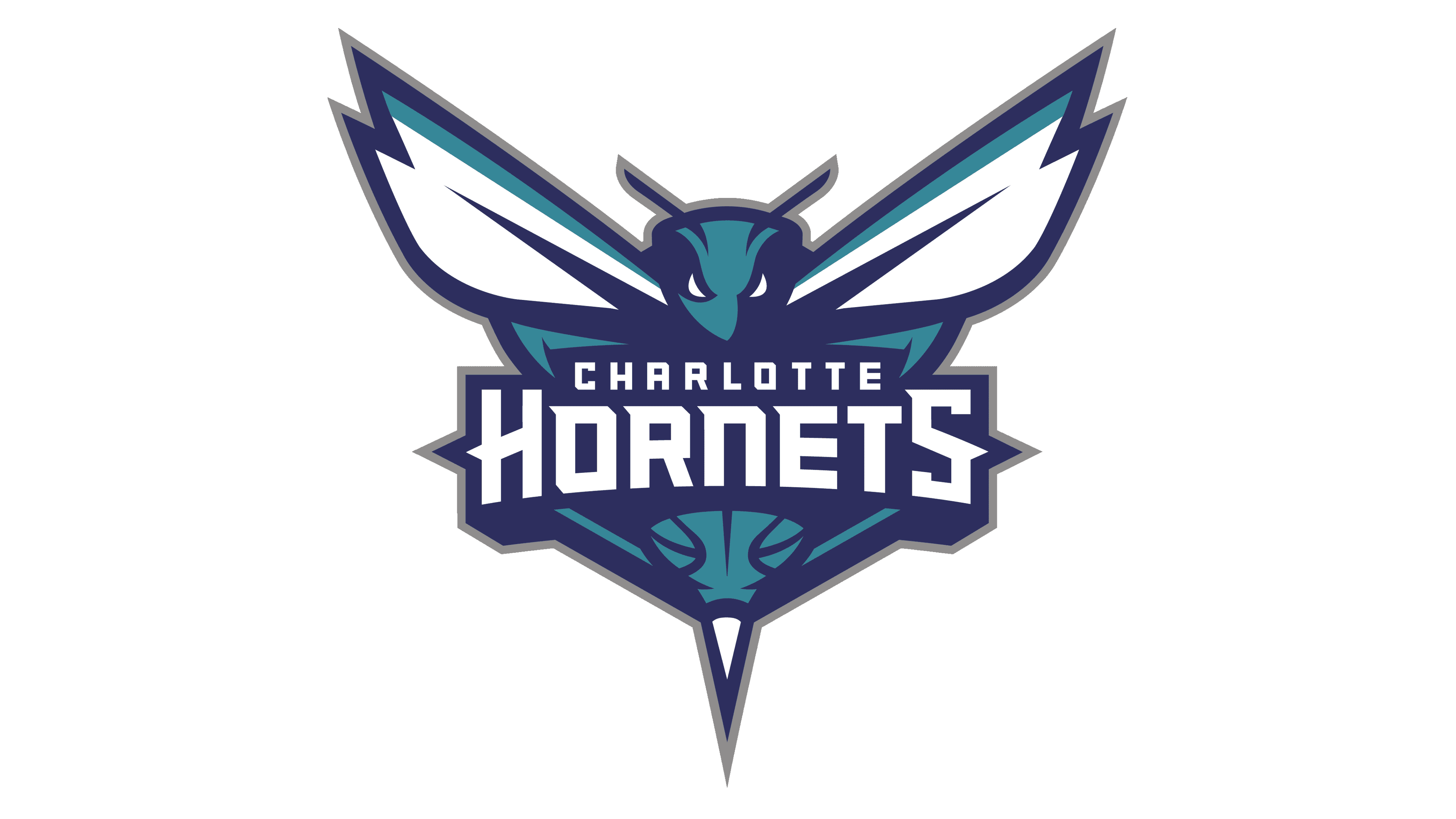
Reverting to its roots, the Charlotte Hornets logo revives the original cheerful hornet. It abandons the bobcat’s aggression for a fun, cartoonish mascot. Dressed in the team’s colors, the hornet is playful, balancing a basketball. The typeface for “CHARLOTTE HORNETS” is bold and encircles the hornet, fostering a classic, yet familiar energy. This nostalgic shift embraces the team’s history and original charm.


