Cincinnati Bearcats Logo
The Cincinnati Bearcats represent the University of Cincinnati in collegiate athletics. Competing in the American Athletic Conference (AAC), this powerhouse boasts a rich history, especially in basketball and football. The basketball team, famed for its tenacious defense, has multiple NCAA Tournament appearances and titles. Meanwhile, the football squad has consistently ranked among the nation’s elite, making significant bowl game impacts. The Bearcat mascot energizes fans across events, creating a vibrant atmosphere. With passionate support, the Bearcats continue to uphold Cincinnati’s sporting pride in the NCAA landscape.
Meaning and history
The Cincinnati Bearcats, representing the University of Cincinnati, have a storied history, especially within NCAA sports. While collegiate teams don’t have “owners” like professional franchises, they’ve witnessed several pivotal leadership changes over the years, especially in terms of athletic directors and head coaches.
In the early 20th century, the Bearcats rose to prominence mainly in basketball. Through decades, various basketball coaches have shaped its legacy, from George Smith in the 1920s to Ed Jucker in the 1960s, who led the team to consecutive NCAA Championships in 1961 and 1962.
The football program has also experienced significant transformations. Sid Gillman, in the late 1940s, brought innovative offensive strategies. More recent leaders, like Brian Kelly, led the team to back-to-back BCS bowls in the late 2000s, and Luke Fickell, in the late 2010s and 2020s, reinvigorated the program, achieving national rankings and major bowl game appearances.
The evolution of the Bearcats isn’t just about coaches. Athletic directors, responsible for hiring these coaches and shaping the department, have been instrumental. From the likes of Mike Thomas, who witnessed the program’s growth in the early 2010s, to John Cunningham, who’s navigating the current era, each has left an indelible mark.
While individual faces have changed, one thing remains constant: the Bearcats’ enduring spirit and quest for excellence across collegiate athletics.
1914
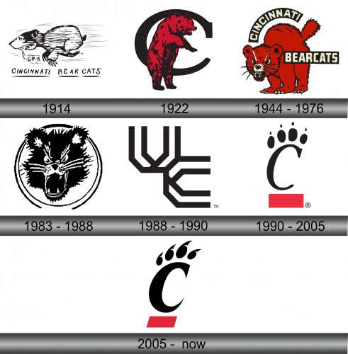
In 1914, illustrator Paddy Reece crafted a bearcat illustration for the university’s newspaper, not necessarily envisioning it as a potential mascot. His primary intent was a witty wordplay on “Teddy Baehr” for UC’s football showdown against the University of Kentucky’s Wildcats. Fast forward to the present, and this very artwork is recognized as the foundational depiction of the bearcat, marking the beginning of a legacy. With Reece’s imaginative brushstrokes, what began as a simple jest turned into a symbolic representation that resonates even today. His seemingly casual sketch played a pivotal role in shaping the iconography of the institution.
1922
Back in 1922, the emblem for UC’s Bearcat prominently featured an actual bear, poised assertively on its back limbs, displaying a fierce expression. Accompanied by a prominent ‘C’ situated behind the creature, this design from 1922 stands as one of the earliest instances where the university adopted a bearcat motif for its official insignia. It symbolized both strength and determination, capturing the essence of the institution’s spirit and forging a lasting connection with its legacy. Over the years, this iconic representation has come to be an integral part of the university’s rich history and identity.
1944 – 1976
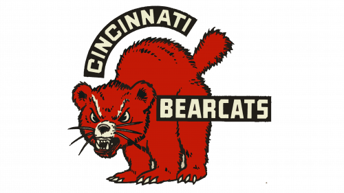
In 1944, the Bearcats unveiled a logo that depicted a comically stern animal, showcasing an aggressive grin. While its intent was to exude a sense of threat, the design carried a touch of innocence, diluting the intended fierceness. Nevertheless, the emblem radiated confidence and vividness, making it both distinctive and unforgettable. The brand’s name was gracefully inscribed on two distinct black banners, using bold, sans-serif white letters. The word “Cincinnati” was nestled on a curved banner hovering above the creature’s head, whereas “Bearcats” stretched across a straight strip, partially intersecting with the mascot on its right side. This blend of humor and intensity created a balanced and impactful visual representation.
1983 – 1988
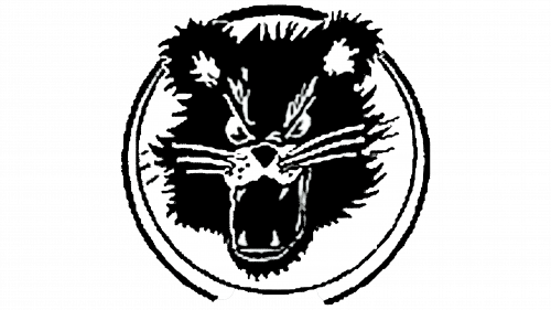
In 1983, a new emblem was introduced, exuding a more minimalist design compared to its predecessor. This version highlighted the mascot’s head, sketched in black against a stark white backdrop, ensconced within a twin black ring. Strikingly, it abstained from any textual elements, vibrant color touches, or athletic motifs. However, the clarity of the emblem’s contours was a point of contention, with the portrayal appearing somewhat unrefined and making the bearcat identification somewhat challenging. Notwithstanding these drawbacks, this distinct design remained the face of the team for a commendable duration of six years. This duration hints at its unique charm and ability to resonate despite its simplicity.
1988 – 1990
The UC emblem, often alluded to as the “Dueling Horseshoes,” made its debut in 1977. Colored in a deep black hue, it brought forth a distinct identity for the institution. For a short span during the late 1980s, this specific design took center stage, becoming the primary symbol for the institution. Its unique representation, intertwined horseshoes, captured both tradition and competitive spirit, setting it apart from conventional university logos. Over time, this design has become an integral chapter in the institution’s visual history, echoing a time of transformation and growth.
1990 – 2002
In 1990, the Cincinnati Bearcats emblem underwent a streamlined transformation. Four distinct claws elegantly arch over a prominent, “C”, styled with a refined font that sports pointed terminations and a subtle rightward tilt. Beneath this letter, a vibrant red rectangle is set horizontally, echoing the design of its predecessor. The inventive inclusion of the black claws, which are reminiscent of inverted commas varying in size, imbues the insignia with a distinctive flair that sets it apart from others, making it both memorable and iconic. This new design choice underscores the team’s evolution while paying homage to past emblems.
2005 – Today
In 2005, the brand unveiled a fresh logo, characterized by a slanted letter “C” devoid of any decorative flourishes. Above this central figure, one can discern marks resembling the unique patterns of fingerprints intermingled with bear-like claw imprints. Below the “C”, there’s a bold, crimson stripe fashioned in the precise shape of a parallelogram, lending a modern touch to the overall design. This innovative emblem, with its elements combined, subtly conveys the essence of the brand while embracing a contemporary aesthetic that resonates with its audience. The fusion of traditional and modern design elements beautifully encapsulates the brand’s evolution and forward-thinking approach.


