Corsair Logo
Corsair is a leading company in the gaming and streaming gear market. Andy Paul, Don Lieberman, and John Beekley founded it. They established Corsair in California. Their mission was to enhance the performance of computers. The company started by focusing on high-speed DRAM modules. Corsair then expanded into other areas. These include gaming peripherals, components, and streaming equipment. Their products enhance the gaming experience. Corsair is known for quality, performance, and innovation.
Meaning and History
Corsair was founded in 1994. Initially, it produced high-performance memory modules. The company quickly gained a reputation for quality and reliability. By the early 2000s, Corsair had expanded its product line. They included power supplies and cooling solutions by then. In 2010, Corsair ventured into gaming peripherals. This move diversified their offerings further. Their product range now encompasses a wide variety of equipment. This includes keyboards, mice, headsets, and PC components. Corsair has remained at the forefront of gaming technology. They consistently innovate to meet the evolving needs of gamers and content creators.
What is Corsair?
Corsair is a renowned brand in the gaming industry. They specialize in high-performance gear and technology. Their products cater to gamers, streamers, and PC enthusiasts. Corsair stands out for its innovation, quality, and comprehensive product range.
1994 – 2015
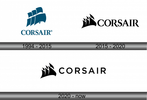
The logo presents a stylized ship sail, evoking a sense of movement and adventure. Its color is a deep, navy blue, symbolizing depth and stability. The design is minimalist yet dynamic. Bold lines create three forward-leaning sails, portraying speed and innovation. Below the emblem, the word “CORSAIR” appears in uppercase. The entire logo is underscored by a sense of precision and high-tech sophistication.
2015 – 2020
The updated logo transforms its aesthetics to a monochrome palette. The sails are now angular and sharp, with fragmented tips suggesting a digital era. This edgier look reflects modernity and cutting-edge technology. The font is bold and sleek, with a uniform thickness that conveys strength and reliability. The design evokes speed and precision, aiming to resonate with a high-tech savvy audience. The overall simplicity ensures versatility and strong brand recognition. The logo’s evolution marks Corsair’s growth and contemporary relevance.
2020 – Today
In this logo, the sails remain unchanged, maintaining their stylized, abstract form. The alteration lies in the font. The new typography is more contemporary, with a cleaner, more uniform appearance. Each letter stands separate, clear, and easily readable. This shift in typeface reflects a modern, perhaps more digital-friendly approach, while the iconic sails uphold the brand’s legacy of adventure and exploration. The overall effect is a fresh yet familiar visual identity for Corsair.


