Daikin Logo
Daikin is a world leader in the production of home and industrial air conditioners along with heating and ventilation systems. Thanks to the introduction of the most advanced technologies in production and focus on high-quality products, Daikin has a good status on the market. It owns more than 1500 patents for unique equipment, it is not for nothing that the company is called an innovator in the development of high-tech equipment.
Meaning and History
The history of the Japanese business dates back to 1924. It was originally called OKKL (Osaka Kinzoku Kougyou) and the main product was metal pipes for radiators used by civilians and military aviation. By 1930, the company’s products became so famous that it had an opportunity to expand its line of products and capture the market for cooling and ventilation equipment. Since 1964, Daikin has taken a leading position in the Japanese market for the production of refrigeration and climate equipment for mass use. Ten years later, the company was already in Europe. Since the early 90s, it focused on making environmental-friendly products. It was not until the early 2000s that the North American market saw Daikin products. Today, it has one of the most modern production as well as scientific and technical capabilities.
What is Daikin?
Daikin Industries Ltd. is the world’s largest manufacturer of air conditioning, ventilation, and refrigeration systems from Japan. Production of Daikin products is deployed in Europe, Southeast Asia, Australia, and the USA.
1934 – 2004
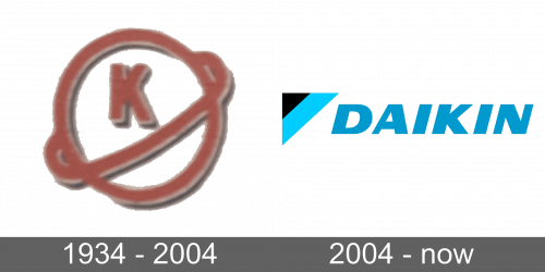
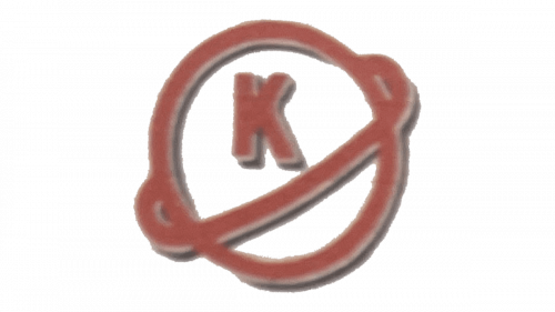
The original logo of Daikin, or as it was called when established — Osaka Kinsoli Kougyuo, brand, was graphical, unlike today’s text. The color palette was composed of smooth red and gray, with the element placed over a transparent background. It was an outlined circle with an orbit, weaving diagonally around it, and the capital letter “K”, placed in its top segment. All of the elements were drawn in red lines of the same thickness and outlines in silverfish gray.
2004 – Today
There were minor design updates to the emblem. First of all, there was a lighter shade of blue for the name without any changes to the font. The other change was an extension of the light blue in the triangle element over the white strip, which was now gone altogether. This update made the logo look more light and airy while preserving a recognizable brand image.
Font and Color
The blue color is used by many recognized companies. It is associated with professionalism, responsibility, trust, and loyalty. This color also gives a feeling of calmness and peace, which is very appropriate for a company that focuses on creating comfortable living conditions for everyone. There is also a touch of black, which is also a classic color choice. Although the font has been modified and made unique for the company, it closely resembles Nuber Next Black Extended Italic and Univers 93 Extra Black Extended Oblique typefaces.
