Delaware Blue Hens Logo
The Delaware Blue Hens are a sports team from the University of Delaware. The name “Blue Hens” comes from the fighting Blue Hen, a bird known for its fighting spirit. The team’s origin traces back to the university’s military company in Delaware.
Meaning and history
The Delaware Blue Hens name originated in 1911, symbolizing the fierce fighting spirit of a breed of chicken raised during the Revolutionary War. The Blue Hen has been associated with Delaware since it was used by the state’s troops in the 18th century as their mascot. Throughout the years, this mascot has come to represent not only the university’s athletic teams but also Delaware’s state bird, officially adopted in 1939. The university’s teams have carried the Blue Hen name since their formal establishment, and it has become a symbol of pride and tradition within Delaware sports.
What is Delaware Blue Hens?
The Delaware Blue Hens refers to the athletic teams of the University of Delaware. They are named after the Blue Hen, Delaware’s state bird, known for its fighting prowess. The teams participate in a variety of sports, representing the university in collegiate competitions.
1939 – 1955
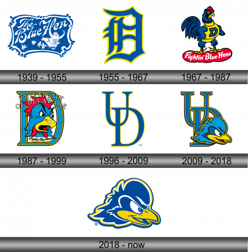
The logo features elegant, curvy lettering spelling “The Blue Hen” in a vibrant blue. Below the text, a hen with spread wings stands over her three chicks, conveying protection and unity. The entire image is enclosed in an ornate, decorative border, reminiscent of vintage filigree, adding a timeless quality to the design. The use of a single color accentuates the classic feel, while the imagery captures the essence of nurturing and strength.
1955 – 1967
This contemporary logo swaps ornate elements for bold simplicity. A large, stylized “H” dominates, incorporating a blue hen profile within its structure. The blue and yellow colors remain, but their application is reversed, providing a fresh visual twist. Sharp lines replace curves, imparting a modern, athletic feel. This design speaks to a streamlined identity, focusing on dynamic form and clear symbolism of the hen, the essence of the team’s spirit.
1967 – 1987
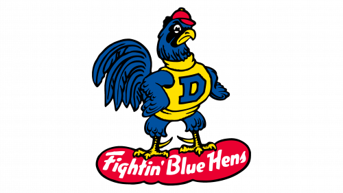
The latest logo bursts with character, showcasing a hen adorned with a cap and sweater, symbolizing school spirit. The hen stands assertively on a red banner reading “Fightin’ Blue Hens”. Vivid colors – blue, yellow, red – introduce a playful energy. The transition to a more animated, cartoon-like style marks a stark departure from the previous logo’s minimalism. This hen’s spirited stance and attire add a personified charm, evoking the lively essence of collegiate sports.
1987 – 1999
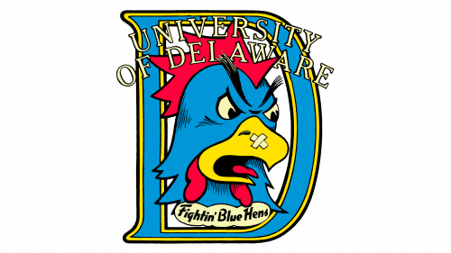
The evolution continues with a fierce hen’s head taking center stage, exuding aggression and readiness for battle. The colors are more segmented, with distinct blocks of blue, yellow, and red. “UNIVERSITY OF DELAWARE” encircles the hen, framing it within a yellow outline, against a navy backdrop. The red starburst behind the hen’s head emphasizes energy and dynamism. The banner with “Fightin’ Blue Hens” is now placed directly below, integrating text and image tightly. This iteration boldly emphasizes competitiveness and school pride.
1996 – 2009
Stripping down to minimalism, this logo features interlocking “U” and “D” letters in blue, outlined in yellow. The emblem removes all figural representations, opting for a clean and academic letterform. This design choice signifies a shift towards a more formal and universal collegiate identity. It’s a stark contrast from the previous character-driven imagery, placing emphasis on the institution rather than the mascot. The “TM” symbol suggests official trademarking, highlighting the brand’s maturity.
2009 – 2018
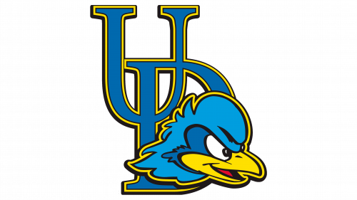
In a nod to tradition, the hen re-emerges, combining with the interlocking “UD” from the previous logo. The hen’s head is rendered in a stylized, cartoon-like form, peeking boldly from behind the letters. The use of blue and yellow is consistent, yet the hen adds a vibrant touch of red, bringing life to the design. The hen’s determined gaze injects personality and reasserts the athletic and combative spirit of the team. This blend of letterform and mascot strikes a balance between academic identity and sporting prowess.
2018 – Today
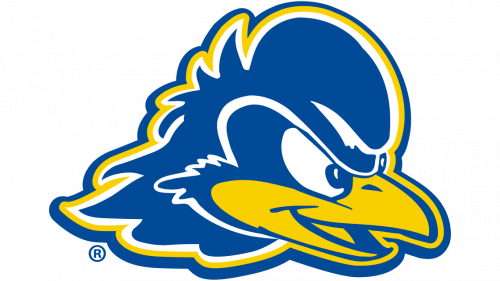
The logo has been refined to feature only the hen’s head, outlined in bold yellow. The illustrative style is sleek, focusing on the hen’s determined gaze, suggesting intensity and focus. The removal of text and other elements indicates a confidence in the hen’s image alone to represent the brand’s strength and spirit. The “R” symbol denotes a registered trademark, implying a strong, established brand presence. The design’s simplicity allows for versatile use across various media, showcasing the hen’s profile as the unmistakable icon of the Delaware Blue Hens.
