Duke Blue Devils Logo
The Duke Blue Devils represent Duke University in NCAA Division I athletics. Located in Durham, North Carolina, they are a powerhouse in college sports, especially basketball, under the helm of legendary coach Mike Krzyzewski. The Blue Devils have clinched multiple national championships, with their basketball feats capturing attention every March during the NCAA tournament. Aside from basketball, they also have competitive teams in sports like lacrosse, soccer, and football. Their fierce rivalry with the nearby University of North Carolina Tar Heels is renowned, creating electric atmospheres during their matchups. A symbol of excellence, the Blue Devils continue to be a dominant force in collegiate athletics.
Meaning and history
The Duke Blue Devils, representing Duke University in Durham, North Carolina, have carved a distinctive legacy in the annals of NCAA Division I sports.
Established in the early 20th century, the athletic programs took a while to find their footing. It wasn’t until the late 1930s that the men’s basketball team began gaining traction with their first appearance in the NCAA Championship.
However, the basketball program’s zenith came under the direction of Coach Mike Krzyzewski, affectionately known as “Coach K,” who took the reins in 1980. Under his leadership, Duke transformed into a perennial powerhouse. Coach K’s tenure has been dotted with national titles, Final Four appearances, and the fostering of numerous NBA talents. His coaching prowess and commitment to excellence solidified Duke’s reputation as one of the premier programs in the nation.
But Duke’s lore isn’t limited to the hardwood. Their football program, though having experienced ups and downs, has seen moments of brilliance, especially under Wallace Wade in the 1930s and 1940s. The lacrosse team, after facing challenges, has emerged as a dominant force in the 21st century, clinching multiple national championships.
Duke’s athletics have not been without challenges. They’ve faced scandals, fierce competition, and changing collegiate landscapes. Yet, resilience remains a cornerstone of the Blue Devils’ ethos.
One cannot discuss Duke without mentioning its storied rivalry with the University of North Carolina (UNC) Tar Heels. Separated by just a few miles, the intensity of this rivalry, especially in basketball, is palpable, drawing global attention. Their matchups are not mere games; they’re cultural events, with both schools’ legacies often hanging in the balance.
Today, the Duke Blue Devils stand not just as a symbol of athletic excellence, but as a testament to the spirit of competition, perseverance, and the enduring power of collegiate sports. Over the years, they’ve evolved from a modest program to a beacon of excellence in the NCAA, proudly donning their royal blue and white, and inspiring generations of fans and athletes alike.
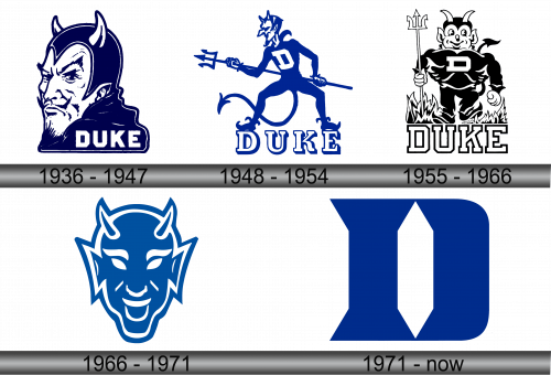
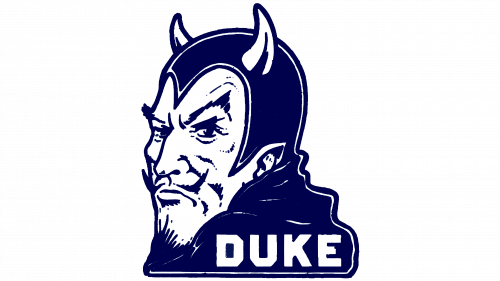
1936 – 1947
In 1936, the central element of the team’s emblem was an illustration of the Devil. This figure was positioned at a three-quarters angle, showcasing a mischievous grin, subtle whiskers, and unmistakably, the iconic horns. The word “Duke” was boldly presented in crisp white uppercase letters, using a robust, simple font. This inscription was strategically placed against a deep blue backdrop, occupying the lower right corner of the symbol. This design embodied both the team’s identity and spirit, making it instantly recognizable to fans and opponents alike. It became a defining image for the team, cementing its place in sports iconography.
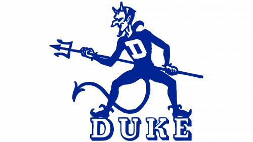
1948 – 1954
In 1948, the depiction of the Devil underwent a transformation. This time, he was portrayed atop striking white characters that had a blue contour. The entity grasped a trident, symbolizing power and control, and his attire was adorned with a prominent white “D”, signifying his affiliation. This version of the logo adopted a more whimsical, animated style. While it exuded a more approachable and lighthearted vibe compared to its predecessor, it also had a somewhat less professional appearance. Nevertheless, this rendition brought a fresh perspective, infusing a touch of humor and charm to the team’s visual identity.
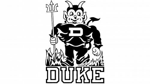
1955 – 1966
In 1955, the team underwent a transformative visual overhaul. The vibrancy of earlier designs gave way to a more austere monochromatic scheme. The Devil, once portrayed with a dynamic posture, now stood erect, exuding an air of authority. The accompanying text, rendered in a robust typeface with distinct outlines, was subtly magnified. The characters were positioned in close proximity, imbuing the design with a sense of unity and strength. This revamped imagery spoke volumes about the team’s evolving identity, blending both the timeless and the contemporary into a visual statement of unwavering determination and cohesion.
1966 – 1971
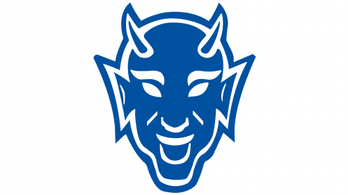
In 1966, the team unveiled a radically redesigned logo. This iteration showcased a contemporary depiction of the Devil, crafted with sophisticated and fluid lines. Blue dominated the emblem’s hue, with subtle white nuances accentuating its features. This choice of colors lent the badge a striking visual appeal. The creature’s menacing grin, combined with its tapered horns, conveyed power and intimidation. Yet, the gentle curves framing its face added a touch of softness and elegance. Together, these elements harmoniously represented the team’s blend of fierceness and finesse, making it not just a symbol, but a reflection of their spirit and ethos on the field.
1971 – Today
By the close of the 1970s, the team opted for a radical shift in its visual branding. They decided to step away from the Devil’s depiction, choosing instead to spotlight a uniquely designed blue letter “D”. Within this letter lay a slender white hexagonal shape, tapering at both its apex and base, reminiscent of a precious jewel. This element imbued the design with a touch of sophistication and luxury. While the emblem’s color scheme varies depending on the sport it represents, its iconic design ensures consistent recognition and flair across all variations. This refreshed identity marks a blend of tradition and modernity, upholding the team’s heritage while embracing the future.

