Fall Out Boy Logo
Fall Out Boy is a rock band formed in Wilmette, Illinois. Pete Wentz and Joe Trohman founded the group. They aimed to create a distinct blend of music. Their music serves as an emotional outlet and a form of entertainment.
Meaning and history
Fall Out Boy was established in 2001. They quickly made a name for themselves in the pop punk scene. By 2005, they had become mainstream stars, thanks to their album “From Under the Cork Tree”. Key moments include their 2009 hiatus and 2013 return with the album “Save Rock and Roll”, which marked a significant comeback. The band’s name, inspired by a character from “The Simpsons”, underscores their quirky and fun approach to music, aligning with their energetic performance style.
What is Fall Out Boy?
Fall Out Boy is a pop punk band from Illinois. Formed by four musicians, they are celebrated for their dynamic music and lively concerts. Their work has made a significant mark on the music scene.
2002 – 2003
The logo presents the name “FALLOUTBOY” in bold, capital letters. The font is sans-serif, suggesting modernity and simplicity. All characters connect, giving a unified appearance. The black letters stand out starkly against a white backdrop, ensuring high contrast and visibility. The design is minimalist, with no additional graphics or emblems, which underscores a focus on the name itself. This typography-driven approach aligns with contemporary design trends, highlighting the brand’s name without distraction.
2003 – 2005
This version of the logo shifts in color to a soft blue hue, contrasting with the previous stark black. The color evokes calmness and a more relaxed vibe. Lettering remains bold and capitalized, maintaining brand recognition. Yet, the color change introduces a fresh, airy feel, possibly reflecting a new creative phase or style adaptation. Blue often symbolizes trust and dependability, which may hint at the band’s established presence in their genre. The logo retains its simplicity, focusing purely on typography without any graphic elements.
2005 – 2007
Transitioning back to a classic black color, this iteration of the logo exudes a timeless quality. The font style appears serifed, adding a touch of sophistication. Each letter stands separate, promoting clarity and easy reading. The switch from blue to black might symbolize a return to the band’s roots or a shift in creative direction. This logo version uses space and font to make a subtle yet impactful statement, highlighting the band’s name with a nod to tradition.
2007 – 2008
This logo takes an artistic turn with a handwritten, cursive style. The black ink conveys a personal, informal touch, a departure from the previous formal serif font. The letters flow with an irregular rhythm, mimicking the signature of an autograph. This design might reflect a more intimate or individualistic phase for the band. The fluidity of the strokes imparts a sense of movement and dynamism, resonating with the energy of Fall Out Boy’s music. It stands as a stark contrast to the structured and upright previous logo, offering a glimpse into the band’s evolving brand identity.
2008 – 2013
This logo opts for a mix of uppercase and lowercase letters, creating a visual rhythm. “FALL” and “BOY” anchor the design with strong capital letters, while “out” offers a lowercase interlude, adding a casual twist. The font is a clean, modern sans-serif, signaling a contemporary edge. This style choice may suggest a playful yet assertive identity, capturing the band’s versatile and dynamic nature. The uniform black color returns, reinforcing the logo’s readability and impact. The alternating letter case introduces a distinctive character to the band’s visual brand.
2013 – 2016
This logo sports a distressed effect, adding an edgy and rugged feel to the text. The once smooth edges of the letters now show wear, suggesting a more raw and authentic vibe. This textured look may symbolize the band’s journey and experiences in the industry. The font retains its boldness but gains character through the simulated weathering. The black and white color scheme continues, ensuring the logo’s assertive presence.
2016 – 2018
Reverting to a clean, unblemished look, the logo now features crisp, solid black letters. The distressed texture is gone, replaced by a smooth finish on each character. The serifs return, bringing a classic touch to the contemporary scene. This design strips away the rough edges seen in the previous version, perhaps signaling a new chapter or refined focus for the band. The logo’s simplicity and sharpness make a bold statement of elegance and strength. The band’s name stands out with a balance of tradition and modernity, reflecting their ongoing legacy in the music world.
2018 – 2019
The logo iteration adopts a hand-drawn aesthetic. The text appears less formal, more personal, as if quickly sketched with a marker. The uneven lines and varying thickness of the strokes impart a relaxed and approachable vibe. This design choice could signal the band’s connection to the raw energy and authenticity of their roots. The black hue remains, yet the informality of the handwriting introduces a sense of intimacy and spontaneity. This logo may reflect a focus on individual expression, aligning with the band’s ethos of staying true to oneself.
2019 – Today
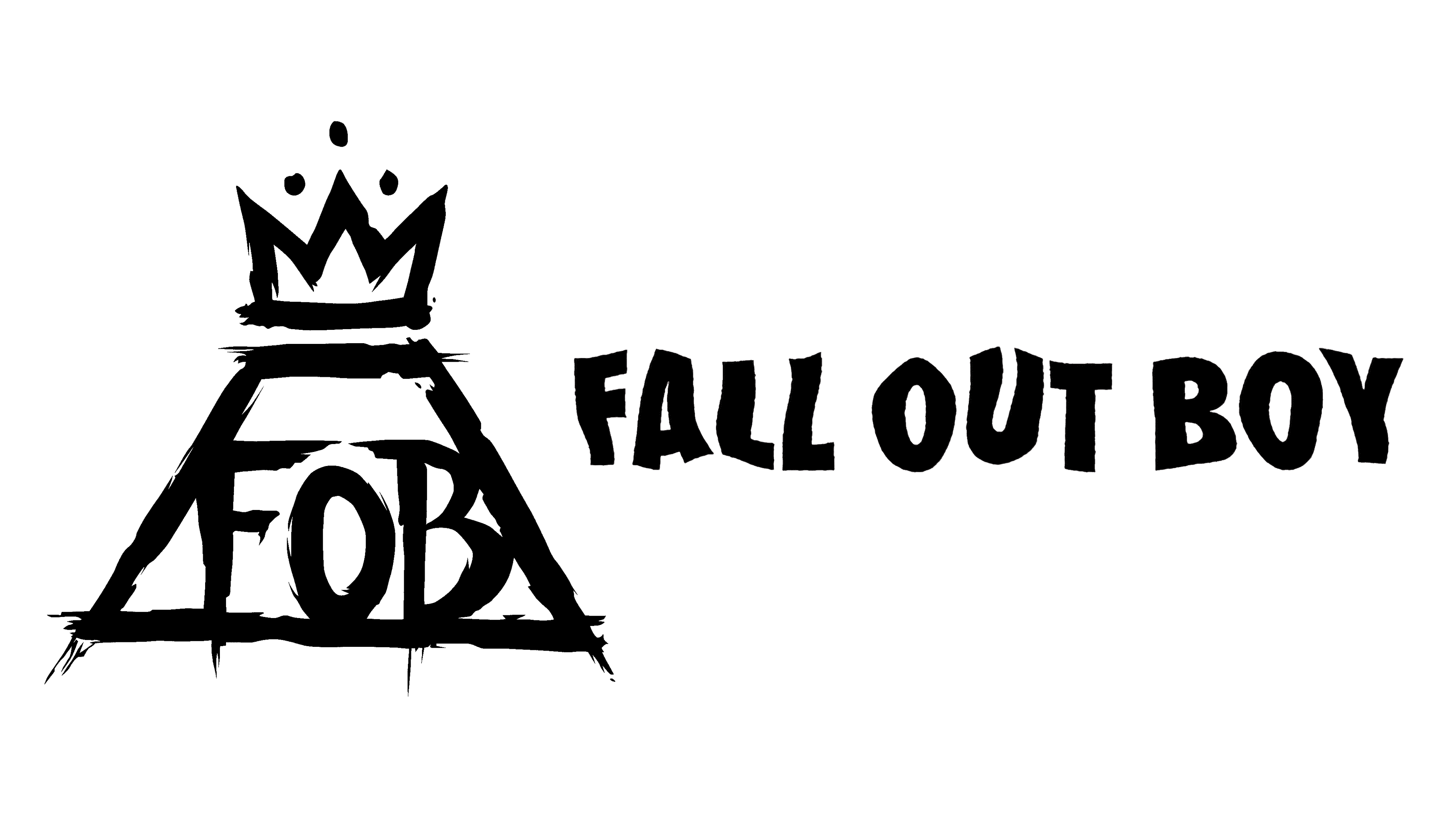
This logo iteration introduces an iconic graphic element: a crowned triangular symbol with the initials “FOB” inside. This addition creates a regal and emblematic quality, hinting at a sense of accomplishment or royalty in the music realm. The hand-drawn “FALL OUT BOY” text now sits next to the symbol, striking a balance between the band’s identity and the emblem’s commanding presence. The rough, brush-like texture on both the text and the symbol contributes to an artistic and rebellious flair.


