Tool Logo
Tool is an American rock band formed in 1990 in Los Angeles. Tool is considered to be one of the main alternative bands of the nineties and the 2000s. Playing complex progressive rock and metal, they managed to break into the mainstream, displacing popular grunge bands, conducting a world tour, and winning several Grammy awards.
Meaning and history
![]()
The band Tool was formed in 1990 in Los Angeles, where its future members had met the year before. By coincidence, none of the guys were natives of Los Angeles, they all came there on their own, hoping to find their calling in life.
There were four founding members: vocalist Maynard J. Keenan, guitarist Adam Jones, bassist Paul D’Amour, and drummer Danny Curry. The vocalist explained the name of the band Tool by the fact that the word has many meanings in the English language, among which are a big wrench and a large male sexual organ.
In 1992 the EP “Opiate” was released, combining dense metal riffs and politicized lyrics. The release made the band get serious attention thanks to such tracks as “Hush” and “Opiate”. A video clip was made for the first one, where the musicians appeared naked and with their mouths taped shut (in this way they protested against the censorship).
The band decided to take a time out in the 2010s, leaving the stage for a while. The concerts resumed in 2016, and soon afterward the work on a breakout album began. The disc “Fear Inoculum” showed Tool’s craving for epic forms and consisted mostly of six long tracks, diluted with electronic-experimental interludes. Anyway, people were really longing for the band’s work, and that is why the band became the leader of the main Billboard list for the third time in a row.
What is Tool?
Tool is the name of one of the world’s most popular alternative rock bands, which debuted in Los Angeles at the beginning of the 1990s, and reached the peak of their popularity in the 2000s. Today Tool is considered one of the most significant events in the history of rock music.
In terms of visual identity, Tool has always been different. Starting with the iconic graphical logo in the 1990s, the band has changed it to a simple wordmark, which turned into something extremely sophisticated and even chic in the 2010s.
1991 – 1992
![]()
The original Tool logo was created in 1991 by Cam de Leon, a famous artist. The badge covered both meanings of the band’s name, explained by the vocalist. It was a graphical image with a vertically-oriented wrench, stylized as the male sexual organ. The drawing was executed in thin white lines against a solid black background, with no lettering on it.
1992 – 2001
![]()
The redesign of 1992 introduced a badge, which could be found on the cover of the Opiate EP. It was heavy serif lettering in the uppercase, with the stable extra-bold characters drawn three-dimensionally and shadowed. The composition was executed in a blue and black color palette with some metallic gradients on the blue outlines of the letters. This version of the badge was in use for almost ten years.
2001 – 2006
![]()
With the redesign of 2001, the Tool logo turned into something mysterious, with an Arabic touch. The new logo was composed of a blurred white contour of the lowercase inscription, set against a plain black background. The shapes of the letters, glued together, made up an abstract image, looking like Arabic lettering.
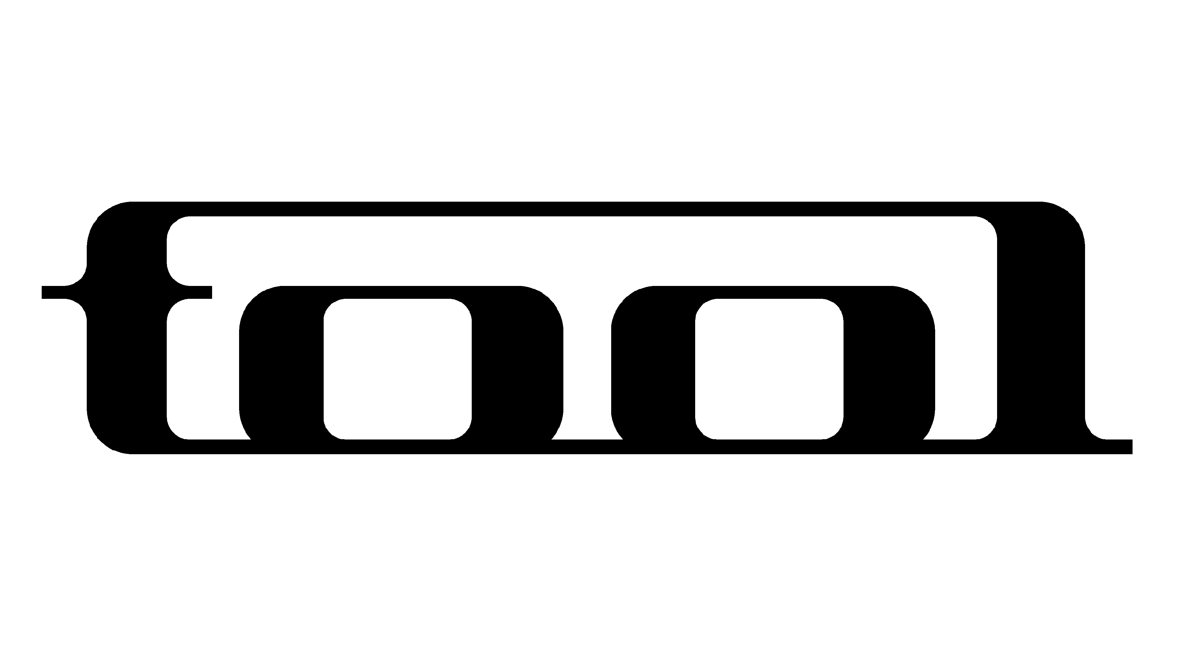
2006 – 2019
![]()
In 2006 the Tool released a new album, 10,000 Days, and a new logo was designed for its cover. It was a stylized lowercase lettering, set in white characters against a black background. All letters were connected to each other and enclosed into a rectangular frame with rounded corners. This is, probably, the most famous logo in the band’s history, which is still used by the Tool in their tours and concerts.
2019 – Today
![]()
The Fear Inoculum album was released in 2019, with an updated logo on its cover. The new concept is based on a sleek golden inscription in a thin sophisticated typeface with a distinctive Art-Deco look. The inscription is set in the uppercase, with the capital characters featuring elongated and curved lines, and accompanied by two horizontal bars, coming out of the wordmark to the sides. The logo can be used both on a white and black background.
Font and color
The custom uppercase lettering from the primary Tool logo is set in an elegant sans-serif typeface with thin three-dimensional bars of the characters, elongated and slightly curved. The inscription is set in a designer font, which has no commercial analogs and looks very unique and memorable.
As for the color palette of the Tool visual identity, it is based on a combination of gold and black, a very chic and sleek duo, which evokes a sense of excellence and a professional approach.


