Florida Gators Logo
The gators are professional football players. This team has many achievements, among which are three national championships (1996, 2006, 2008) and eight Southeastern Conference championships, and three Heisman Trophy winners. Their biggest rival is Alabama. Tim Tebow, who is considered to be an amazing football player in the history of this sport, played college football in Florida.
Meaning and History
This famous team started its games back in 1906 when the University of Florida was forming its first sports teams. They got their nickname “Gators” soon after their foundation. Given their location, it is no wonder that they got such a nickname. For about the first 5 years, the team was just developing and did not really have serious opponents. Later, though, it began playing more games against well-established football clubs. This team first rose to the national level in the 1920s. In 1930, the team got a new place to play – the Florida Field.
What is Florida Gators?
This is a team that plays football not just for fun. As it is easy to guess from the name, it represents the University of Florida.
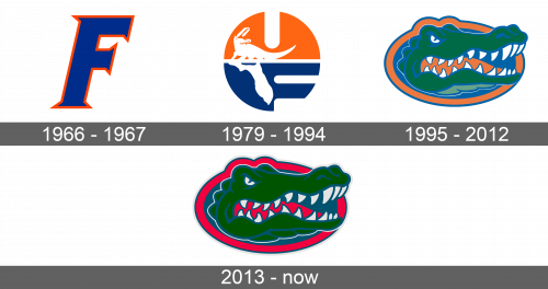
1966 – 1967
The team did not initially go all out when the logo was being designed. It was just one letter. The “F” was drawn in a color that was very close to an azure shade of blue. A bright orange border around it made sure the relatively simple logo catches the attention. The letter was italicized and had pointed ends that added an interesting detail.
1979 – 1994
The new logo was a circle that was split in half horizontally. The upper half was bright orange and had a slit at the top, which made it look as if it is a letter “U”. On top of the horizontal dividing line, there was a solid alligator icon. Its tail was curving under the “U” and the head was turned towards the center with a wide-open mouth. The bottom half, which took the blue from the original logo, also had two cutouts coming from the right that made it look like an “F”. A solid image of the Florida state map, which kind of looked like it was an alligator’s shadow, popped against a blue background on the left. The logo had a lot of symbolism and looked very balanced and memorable.
1995 – 2012
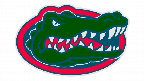
There was only a slight resemblance to the previous version thanks to the orange and blue colors in it. Otherwise, the logo was completely altered. It featured a very dangerous and angry animal – the alligator. The head of the alligator popped against blue and it seemed as if the animal is peaking from the water. Around the blue oval shape, there was a thick orange border that contoured the eyes but otherwise did not change its shape. The orange border was followed by a thinner blue border. The alligator itself had a wide-open mouth with its white teeth and orange tongue clearly visible. It was green while blue was used for all the outlines and details. A thin white line around the head made it pop.
2013 – Today
The updates touched mainly the color palette. A bright pink replaced the orange, while the green acquired a grassier and saturated shade. The logo was also stretched out vertically just a little, which made the reptile look even more dangerous. The color changes have also contributed to a bolder and more dramatic feel.
