Friskies Logo
Even those who have never owned a cat know about the existence of Friskies food. The popularity is easily explained by the combination of affordable prices and good quality products. Nestlé Purina PetCare, a division of Nestlé International, currently has the rights to this wet and dry cat food and treats brand. It is an expert in the field of pet nutrition and creates balanced diets that are flawless in terms of physiology.
Meaning and History
As a line of dog food, Friskies was first developed by Carnation in the 1930s. The first dry pet food developed exclusively for cats was developed by Friskies and launched in the 1950s. The Friskies brand has successfully dominated the cat food industry as the demand for the new product surpassed the demand for dog food. It was 1985 when Nestlé purchased the company for $3 billion. Friskies PetCare Company became the new division. At the end of the 20th century, the brand was actively expanding the range of Friskies cat products as the competition was growing.
What is Friskies?
Nestle produces dry and wet food for cats under the Friskies brand. One can buy food made for kittens and for adult cats that lead an inactive lifestyle. There is also an option for sterilized pets.
1921 – 1999
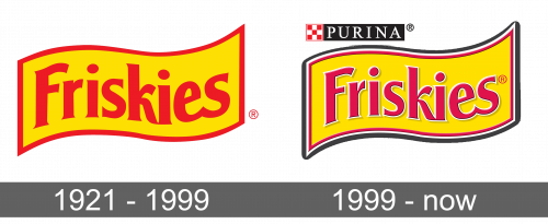
A yellow flag with a red border and smooth, wavy lines served as the base for the logo. The name was placed across the whole base. It followed the shape of the base and featured a sans-serif font. The red that was used for the border was also used for the name.
1999 – Today
The logo was updated and given more details. The red border around the base looked thinner and was accompanied by a white one. The whole emblem was casting a shadow that gave it a 3D appearance. The ends of the banners were stretched out and looked sharper, which gave the logo some dynamics. The name was also given volume with a thin black and white outline. In addition, it had “Purina” written on a black rectangle with an emblem to the left to reflect changes in the company. This element was placed in the upper left corner.
Font and Color
The company went for a bright color palette from the very start. It used yellow and red, which arouse warm, positive feelings and are full of energy. Later, it added a bit of white and black for accent and volume. The font has also stayed the same, except for minor changes, throughout all these years. It looked like Clear Gothic TS Semi Bold or a Serial Bold.
