Whiskas Logo
Whiskas are balanced diets for cats of all breeds and ages. All pet food is produced using modern technologies, based on natural ingredients (meat, seafood) with the addition of vitamins and minerals. The Whiskas brand line includes diets for animals of all ages, from kittens to cats over 7 years old. There are preventive products designed t acto address certain health problems. Its research and development are carried out at the main scientific center in the UK.
Meaning and History
This brand’s cat food first hit the shelves in the UK in 1958. It was produced at Melton Mowbray by a branch of Pedigree Petfoods Ltd., the same location other well-known brands produced animal food. Since 1935, Pedigree Petfoods has been a subsidiary of the Mars Corporation. Mars Inc. buys Kal Kan Foods, another cat food manufacturer established in the UK, in 1968. The business introduced the Crave cat food line in 1980, which later became part of the Whiskas brand. As the first cat food company to provide consumers with a variety of tastes, Whiskas effortlessly established itself as the market leader and rose to the top of the sector in both Europe and Australia. The brand also grew in other markets.
What is Whiskas?
The popular brand is owned by the well-known Mars company. The brand makes wet and dry food for pets, which includes crispy pads with filling, pates, jellies, stews, meat pieces in the sauce, and much more. Cats fed with Whiskas food do not need an additional intake of vitamin and mineral complexes.
1936 – 1988
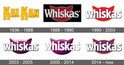
Originally, the company was called Kal Kan. The logo stated just that without any additional details. Bright yellow color with a thin dark outline made the emblem eye-catching and full of good emotions. The bold letters featured rounded serifs. The capital “K”s that were going above and below the other letters made this logo unique.
1988 – 1990
The name of the company was done using a serif typeface. The white letters were barely touching and had a shadow as well as highlights that added a feeling of volume. Behind the name, a silhouette of a cat’s hat in red color with a silver 3D border adorned the logo and confirmed the main consumer of the brand. Black background in the form of a rectangle added some contrast and boldness. This logo set the base for the look of future variations.
1990 – 2003
The new emblem got rid of the black background in favor of a more fun logo. The name was now done in all lowercase, sans-serif letters. They were still white with a black shadow for a 3D appearance, although the font has been changed for a more modern one. The cat’s head looked very similar to the original one, but had a different shade of red and featured a yellow outline for a more vibrant look.
2003 – 2005
The outline around the name was removed, leaving only a shadow so the white letters would not blend with the white background. Otherwise, it was still a bold, sans-serif font. The cat’s image is what has brought the most difference. It was done in purple with shadows and highlights to give it volume. Whiskas parent company even applied to register the color ‘Whiskas purple’ as a trademark. The yellow outline was kept, but now it looked more like a golden accent around the head.
2005 – 2014
The outline around the name was removed, leaving only a shadow so the white letters would not blend with the white background. Although the company kept the purple cat head, it had gradient highlights and shadow instead of more angular and prominent ones featured in the previous logo. The golden outline was also lighter. Overall, the logo lost that bold appearance.
2014 – Today
The designers decided to bring back a rectangular background. Now, it was purple, which looked more welcoming than the black counterpart. The pet’s face remained purple, only a slightly darker shade than the background and bigger in comparison to the other versions. It did not have a 3D effect, although its outline got thicker and actually looked like it has some volume. Under the head, there was a highlight, which added a happy note to the logo. The font changed, but it was small details that were redrawn. Otherwise, the consumer saw familiar thick, white letters with a little shadow for added volume.
Font and Color
The company always used white for its name, which is a color of perfection and freshness. For the first fifteen years, red was the base color for the cat’s face. It was a bright element that caught attention, while a yellow outline used throughout the years added some warmth, positivity, and energy. Later, red was replaced by purple. In the West, this color is tied to monarchy and is considered to be a color of quality and luxury, which shows that Whiskas believes that cats are not simply animals, but beloved members of the family that have a special place in it. The font used in the logo is very similar to ITC Quorum Black but without such obvious serifs. The latest logo is more customized with the letters “k” and “a” meeting at the top.
