G7 Logo
G7 is an unofficial forum of the leading developed countries with the largest economies in the world in terms of GDP and human development index. It is not an international organization. Its decisions signify the intentions of the parties to adhere to an agreed line on a particular international issue and have no legal force. Representatives of the European Union also take part in the forums of this community. In most cases, the meetings discuss the economy, although other important issues are also raised there.
Meaning and History
![]()
Initially, a Group of Four (France, Germany, the USA, and Great Britain) appeared in 1973. It reached a group of seven (G7) by 1976 when Canada, Italy, and Japan joined the group. Russia first took part in the G7 summit in 1991, which is how the G8 appeared in 1997. In 2014, though, Russia hosted the G8 summit, but due to the referendum in Crimea and the events in Ukraine, the leaders of the seven countries refused to participate. They could not exclude Russia, so they announced the suspension of their own participation in the “Group of Eight”. In January 2017, Russia announced its permanent withdrawal from the G8, which was renamed back to G7. In 2022, the president of the USA suggested inviting Russia back if the situation in Ukraine changes, but it has not happened.
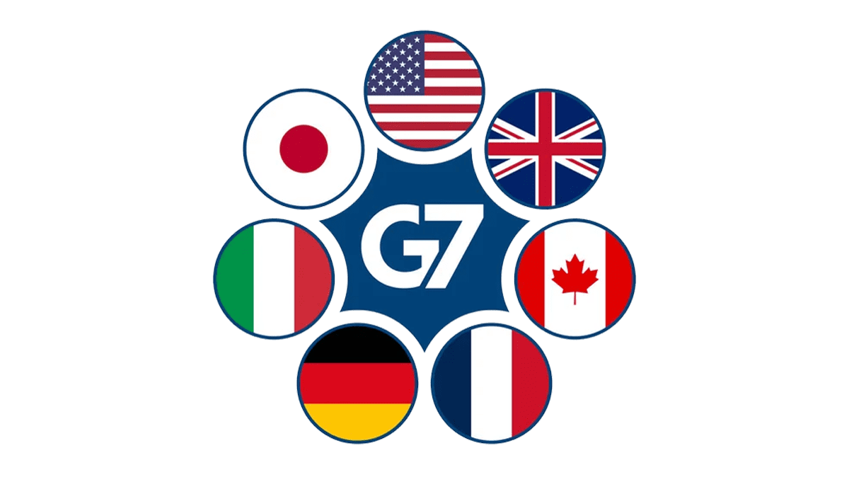
What is G7?
The member countries the Group Seven are the leading countries with developed economies, united in one group, which is referenced as G7. The heads of these countries mainly gather to resolve issues related to international economic policy taking place at the moment.
1994
![]()
The logo for G7 Summit was simple and elegant. A light blue gradient filled a square background. “G7” was painted over it, featuring brush strokes. Above it, there was a wavy line that could be interpreted as a mountain outline or a wave, making it quite universal. Under the square, it stated “Napoli Summit 94” using all uppercase, sans-serif font of the same blue color.
1995
![]()
Abstract red and yellow shapes, which reminded of the Canadian national symbol – maple, were accompanied by blue wavy lines. The inscription was curving right underneath and said “Sommet Halifax Summit” followed by the year on the second line.
1996
![]()
This is one of the most minimalistic logos in the history of the group. It simply has the name printed in blue, serif letters. What made it look unique is the vertical line between the letter and the number. In addition, number 7 was placed slightly lower for some dynamics.
1997
![]()
This was the first time Russia participated in this summit. Denver Summit of the Eight, as it said on the logo, had a very colorful look as it was decorated with the flags of all the participating countries. They were stacked diagonally with a blue base to form a shape of a mountain. The date of the summit was placed at the very bottom, while the year was barely noticeable in the right corner of the mountain.
1998
![]()
A dark blue rectangle had “1998” printed across the full length of it. The first two numbers were done in red, while the second half was printed in white and the “9” looked like a lowercase “G”. It was an interesting play. “The Birmingham Summit” was printed in small white letters at the bottom of the rectangular base. The date of the event was placed outside the blue background.
1999
![]()
A four-line inscription was accompanied by an abstract image on the left. The latter was a square formed by eight smaller squares, six of which were black and the other two were red and yellow. The ninth square was replaced by two blue triangles because there were only eight members in the group.
2000
![]()
There was a very creative approach to the logo for the Summit 2000. The location, event, and date were printed in a blue, sans-serif font. Above, there was a simple drawing of a red flower with a deep blue center. Similarly to the previous logo, the flower had eight petals that stood for each country. The red color has always been associated with power and strength, while blue stands for stability and communication.
2001
![]()
A black rectangle featured an abstract drawing of white sails. It was an appropriate image considering that the G8 Summit in 2001 was held in Italy. As you might know, this country is surrounded by water on almost all sides. In the bottom left corner, it stated “G8 2001” with the first half being bold.
2002
![]()
Canada’s national geographic feature, the mountains, decorated the emblem this year. They had sleek strokes form “G8” in front of the mountain image. Underneath, it stated “Sommet Kananaskis Summit”, where sommet is a French word for the summit, with “Canada 2002” following in a smaller font on a second line. The well-recognized red maple leaf was also included in this logo.
2003
![]()
Another minimalistic logo was presented in 2003 by France. It stated “Sommet D’evian” and specified the year right underneath. The inscription was decorated by a blue circle with a green outline above it and two green petals, which suggested it was a flower, underneath.
2004
![]()
The national tree of the United States decorates the logo. It is one of the grandest trees on earth. The tree is done in color, which adds liveliness to the emblem. There is a thin blue horizon line running at the bottom of the tree. Right under this line, it specifies the location and year the summit was held.
2005
![]()
An abstract drawing of a green and dark purple flower that resembles Scottish thistles is the main element of the official logo of the group this year. It is accompanied by three lines of writing, which state “G8” followed by location and year. The inscriptions are done in the same purple as the top of the flower, which created a balanced image.
2006
![]()
A Bronze Horseman statue decorates the logo of Group 8 and suggested that the summit was hosted by Russia. This statue is located in Saint Petersburg, which is the location of the event as also specified in the logo. A dark blue and red color palette creates a bold and strong image of the group.
2007
![]()
Similar to all the other official logos, this one had the summit’s name, year, and location printed in two lines. Both used an italicized, sans-serif font, but the upper line featured a darker blue than the second line. A decorative element was done in a form of wavy lines underneath. The majority of them were different shades of blue, although there was also a green and yellow line. These are very light, natural colors that give a very positive impression.
2008
![]()
The logo presented in 2008 is also very nature and environment-oriented. It has a green circle with “G8” printed in white and two green leaves sprouting from it. The circle has a blue border with the location and date printed around the perimeter. The emblem has a rectangular background with a light blue pattern on it.
2009
![]()
The blue turtle silhouettes with a white globe pattern over them not only draw a link to the seas surrounding the hosting country but also the environmental issues that require action. The inscription was printed around the turtles, creating a round border. It said in bold, black, sans-serif font “From La Maddalena to L’Aquila” and “Summit 2009” in light gray using the same font. At the bottom, the inscription specified the event – G8.
2010
![]()
The logo of the 2010 summit features a bright red “G8” with an abstract tree drawing on the left. Above, there is a location and year. It should be noted that the logo specifies Muskoka as the location, but the actual event took place in Huntsville. One of the most recognized symbols of Canada, a red maple leaf, along with the country’s name, is placed at the bottom.
2011
![]()
France was the hosting country this year not only for G8 but also G20. Thus, it used the same logo, changing only the name of the event. It says “G8 France 2011” in the upper right corner. The Eifel tower on the left was done in a gradient, going from blue at the bottom to red at the top. It has a sun peaking behind the tower on the right.
2012
![]()
Since the summit was held at Camp David, the logo for the event was based on the emblem of the retreat. The “Camp David” sign was accompanied by a larger one with “G8” printed on it. The year was added at the very bottom using a small font.
2013
![]()
An outline of the beautiful Lough Erne Resort decorates an emblem that has an abstract, rounded shape. The typical information(event name, location, and year) is placed underneath. The logo features two shades of blue with a lighter one being used for the background.
2014
![]()
Russia was supposed to be a host country for Summit 8 and also the Olympics, which might be the reason why the “G8” inscription reminds of the circles in the Olympics emblem. It is done in gray, red, and blue. The location and year are printed in the upper left corner. All the logo elements form a square shape and look cohesive. The event, though, took place in Belgium.
2014
![]()
G8 was renamed back to G7, which is reflected in the logo. The logo also has the Atomium monument as the symbol of Brussels, the summit location. A sky-blue rectangular background also features seven yellow stars, one for each country in the group.
2015
![]()
Seven zigzag-like lines of different countries meet at the top, forming a mountain shape. Such a simple, abstract drawing has a lot of meaning behind it. Underneath, there are two lines with text. The upper one says “G7 Germany” in bold, serif font, while the bottom one has the year and city printed in small font.
2016
![]()
This is another colorful logo. It is interesting that it was designed by students who have not even graduated high school. Just like many other logos, it has a great meaning. A blue circle with an opening and a white oval shape on the right symbolizes the ocean surrounding the island where the summit was held as well as world unity. In front of it, there is a flower with a red center, which also symbolized the sun, and seven pink petals that stand for seven countries. Text with typical information is placed in front of the image.
2017
![]()
Italy used one of the symbols of the city where the summit was held as part of the logo. It is an ancient Greek theatre in Taormina. The arena was partially enclosing the “G7 2017” text with “Italia” printed right underneath. The logo is done in a turquoise and blue color palette with a splash of red.
2018
![]()
The logo portrays the hills and forests of the Charlevoix, which is what it says at the very bottom of the emblem. “G7 2018” is printed in the middle. The inscription has two lines at the top and the bottom and just like in the previous emblem created by Canada, there was a maple leaf.
2019
![]()
France created a bold logo that featured a predominantly dark blue and red color palette. A double line was used to write “G7”, which had a 3D appearance and was the main element of the emblem. The inscription “France” was placed underneath and was the same width as the line above it. At the very bottom, it specified the city and year in light gray which did not instantly grab attention.
2021
![]()
Although the G7 summit was canceled in 2020 due to the Covid-19 pandemic, it was held again in 2021 in the UK. It featured a bold inscription on a white background with “G7” on one line and “UK 2021” on the second line. At the bottom, there were multiple wavy lines of different shades of blue.
2022
![]()
The logo had an interesting design where the number “7” was placed slightly lower than the letter “G”. As a result, it helped to create the letter, which otherwise would look more like a “C”. Underneath, it stated “G7 Germany” followed by the year the event was held at the very bottom. A deep blue background and white lettering made the logo look professional and instilled confidence in future stability, which was shaken earlier by the pandemic.
Font and Color
The color palettes used in G7 (G8) logos were often influenced by national symbolics. However, there were cases when the color scheme was more environment-oriented or simply used blue, red, and other powerful colors. The fonts also varied each time, but they were relatively simple with the addition of serifs at most. The inscriptions were always easy to read. Some parts were accented with color while others were made bold.