Garmin Logo
Garmin has very straightforward business practices and is wholly focused on the needs of its customers. Its principles include comfort and effectiveness as well as high standards of innovation, quality, and service. Garmin has a reputation as a professional brand – they produce equipment for tourism, sports, and aviation. Today, the brand’s products are present even on Mars. The controlled drone Ingenuity flies over the surface of the “red planet” using a Garmin optical sensor.
Meaning and History
The US government proactively worked to develop a GPS system in the middle of the 1970s. The two Garmin founders were developing GPS devices for use in aircraft in 1983. The engineer was Gary Burrell, and Ming Kao oversaw the development group. They kept working together after the project was over and had a desire to make GPS technology more accessible. Thus, in 1989, ProNav has been created. The US Army was the business’s first contract in 1991. The company changed its name about the same time to the familiar Garmin. The founders’ last names were combined to create the name for their company. The entrepreneurs succeeded as it took only a few years to gain worldwide recognition. Over time, it added more products to the list. In 2009, Garmin even cooperated with Taiwanese ASUS for about a year, making smartphones and communicators under the Garmin-Asus brand.
What is Garmin?
Garmin is a maker of navigators, smartwatches, and other electronics from the USA. The product assortment also includes navigators for drivers, hand-held devices for travelers, hunters, and just lovers of relaxation, as well as many other gadgets, including for athletes and fishermen. Owners of boats and yachts will be happy to know that internet and satellite TV can be enjoyed directly on board.
1989 – 2006
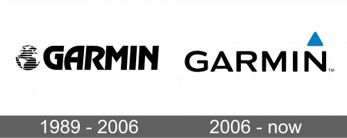
The original logo featured “Garmin” accompanied by an abstract image of the globe. It had white continents while oceans were done as uneven black and white stripes. It was meant to symbolize the ease of navigation around the globe (and even beyond it) that Garmin technology made accessible for everyone. When it comes to the name, it had a very bold and professional appearance with thick, clean lines of the letters. The word was italicized and had letters that were placed quite close together.
2006 – Today
The updated logo looked contemporary and stylish. Although there was nothing wrong with the globe, it did not add much uniqueness to the emblem. The designers chose to replace it with a small blue triangle. It was placed right above the last letter and had rounded corners. It gives some dynamics to the logo, while the blue color stands for reliability. The fact that the triangle resembles an arrow pointing upwards can also give an impression that Garmin is striving to achieve new goals and focuses on innovation and growth. It can also be associated with an arrow seen in navigation systems.
Font and Color
The custom font in the original emblem was inspired by typefaces such as Diablo Regular and Ragtime TS Bold Italic. The clean lines are bold with sharp edges. There are also smooth curves with an interesting shape. The next font resembles Praktika Rounded Bold Extended and FM Bolyar font family. It is not as striking as the previous one, but its unique feature is curved corners. The black color used in both logos creates a classic and sophisticated appearance. There was a bit of blue in the second design, symbolizing reliability, dedication, trust, and security.


