Golden State Warriors Logo
The basketball club was formed in 1946 in the city of Philadelphia. The first name of the team – Philadelphia Warriors lasted until 1962. After a while, San Francisco became their new home. These basketball players are true and brave Warriors, and they have a lot of titles to prove that. In 1951, the Philadelphia club became the best in the Eastern Division with 40 victories. The team won its 2nd title in the 1956 season. In the period from 1971 to 1977, they constantly went to the play-off round.
Meaning and History
In 1946, Pennsylvania saw a new team being born. Philadelphia Warriors was one of the founding teams of the BAA. Later, it was playing in California and was known as the San Francisco Warriors until 1971, when they became known as Golden State Warriors. As seen from their history, the name of the team was connected to their location, while the Warriors part was added as a memory of the previous basketball franchise.
What is Golden State Warriors?
This is a team of basketball players from the United States. The Warriors have been proudly playing since WW2 was over. According to Forbes, the Dubs, as fans call them, is the seventh most valuable sports franchise in the US and tenth in the world.
1946 – 1951
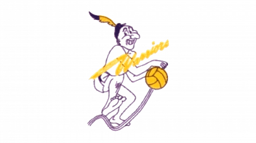
A cartoon drawing of a native American was taken as their symbol. The character was on the move, which is complemented by three wavy lines, with a yellow ball in his arms. A yellow element in the form of a feather was added to a hat. The player was drawn using purple ink with minimal details and white filling. A team’s name was written across the image at a diagonal using a custom typeface. The letter “W” had a long swish going to the left.
1951 – 1962
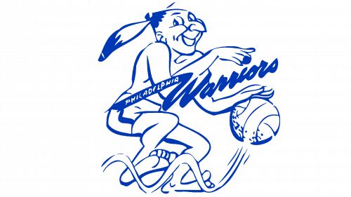
The emblem was redrawn. It had a more round rather than elongated shape as the player was done at a slightly different angle. The character had some mystery about him. The word “Philadelphia”, which was done in white capital letters, was added to the elongated tail of the “Warriors”. The name also acquired more defined lines. Besides the change in the image itself, the most significant change was the colors. Now, it was blue for all the outlines and white as a filling.
1962 – 1969
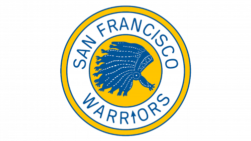
With a change in location, the emblem was also updated. This was a more radical change, but the team managed to carry the idea of Native Americans by placing a blue with white details Indian headpiece. It stood out against a yellow circle in the background with a blue outline. “San Francisco Warriors” was written in simple capital letters using a blue color around the yellow centerpiece. Although the letters were done using thin lines, the name contrasted well against a white background. A yellow and blue border completed the emblem. An interesting element was added to the name by changing the “I” into an arrow.
1969 – 1971
A completely new emblem represented the team for a short period of time. It still maintained the same color palette, but this time it was a city scene, a bridge to be more specific, against a yellow background. The whole image was done in the form of a circle with a thin blue border that complemented the bridge outline. Above the yellow circle, it stated “The City” with the second word being done in large capital letters. The words were also blue.
1971 – 1972
The bridge was changed to a rough outline of the CA state with a solid star, which marked the location of the San Francisco city. The circle stayed yellow, but it had a more golden shade to it. The outline was roughly done, as if hand-drawn. The words “Golden State Warriors” arched above and below the circle. They were done in deep blue color, just like the outlines. While the first two words were written using a fancier font, the “Warriors” had more clean lines and simpler font.
1972 – 1975
The changes done in 1972 were minimal. Besides making the yellow color brighter, the logo designers added the number “14” to the circle. Instead of “Golden State”, it said “Warriors” using the same font only the letters were slightly bolder and bigger. Below the circle, the emblem said “Basketball”. All the elements and letters did not have very defined lines and edges.
1975 – 1988
The new logo looked much more professional with clean, dark blue lines. A slightly different font was used to write the name of the team, although the style was very similar. The most noticeable change was done to the circle, which now looked like a basketball with a symmetrical pattern. The number on it was also removed.
1988 – 1997
The basketball acquired a new look with a more orange shade of yellow. The ball and outline of the state looked unchanged otherwise. The letters looked more rounded and the words almost created a full circle. A darker shade of blue was used for the lettering and outlines.
1997 – 2010
The new logo was much more complicated and futuristic. Although it still included a basketball, it was now in the background. The ball looked more realistic as it was no longer a solid color but had a gradient. An image of a strong, almost superhero-like, man done in dark blue with light blue highlights was featured in front of the ball. The character was on the move with a lightning bolt in his hands – a true Warrior. Right under the lightning bolt, it said “Warriors”. The word was done in orange with white highlights and deep blue shadows for a 3D effect. All the elements had a thin red outline.
2010 – 2019
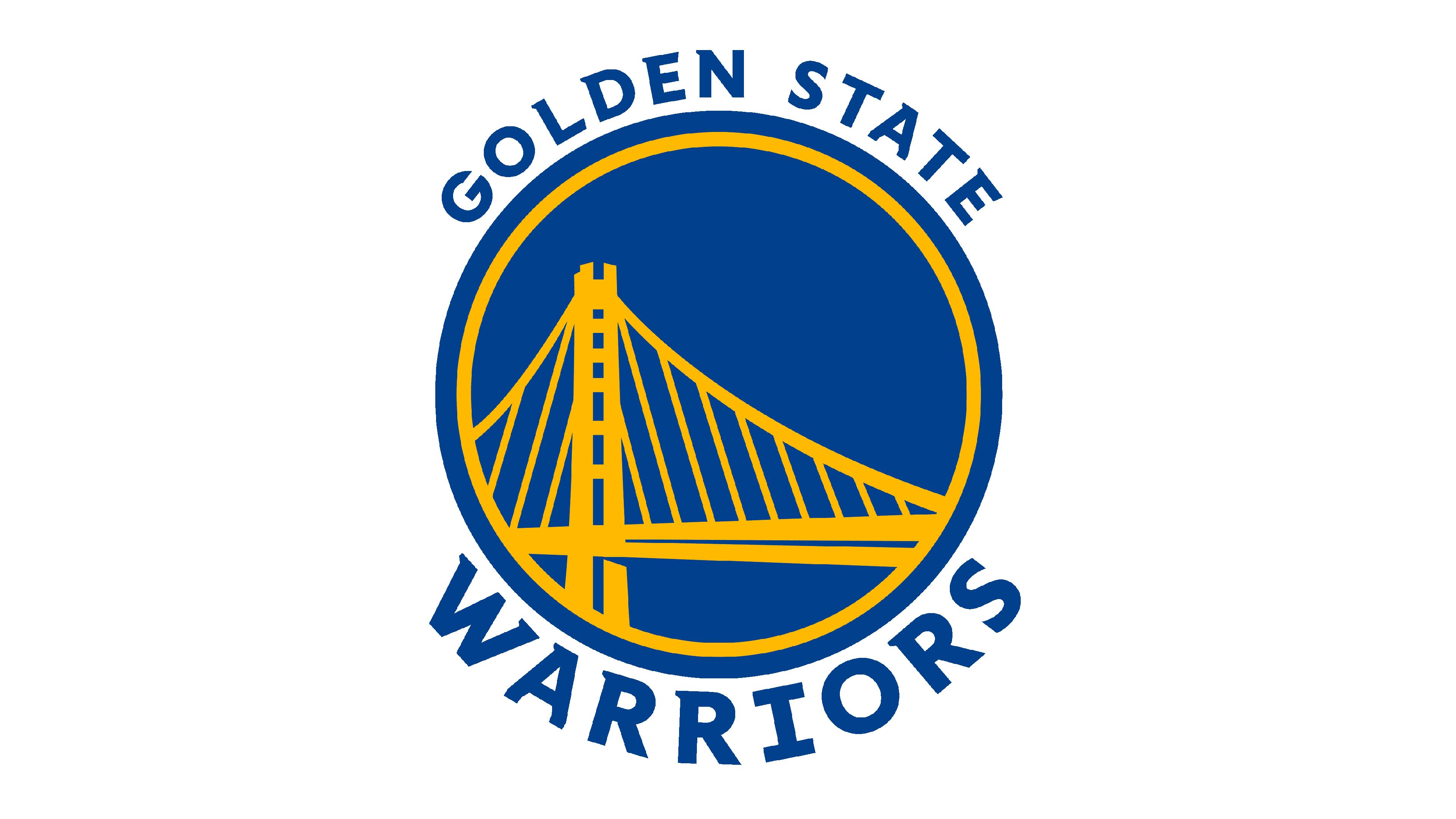
A more recognizable version of the logo was brought back in 2010. It was a blue medallion with a yellow outline of the bridge that was encircled with a yellow border, which was positioned slightly off-center. “Golden State” was written using a classic font above the medallion, while “Warrior” was placed below it and done in a larger font.
2019 – Today
A simple change in the shade of the colors being used made a significant impact. The emblem looked bolder and more modern thanks to a deeper shade of blue, which contrasted well against an intense blue color. There were no other changes or additions to the emblem.
