Green Day Logo
Green Day is an iconic American punk rock band formed by lead vocalist and guitarist Billie Joe Armstrong and bassist Mike Dirnt. Originating in East Bay, California, the band was created to bring energetic punk music to the mainstream. Known for their raw sound and socially conscious lyrics, Green Day gained fame with their 1994 album “Dookie”, revolutionizing punk rock and influencing a new generation of musicians. Their work addresses themes of adolescence, disillusionment, and societal issues.
Meaning and history
Formed in California, 1986, by Billie Joe Armstrong and Mike Dirnt, Green Day redefined punk. “Dookie” (1994) skyrocketed them to fame. Hits like “Basket Case” captivated millions. The 2004 album “American Idiot” critiqued politics, winning a Grammy. Known for energetic shows and political lyrics, they’ve influenced countless bands. From underground clubs to global stages, Green Day’s journey is a punk rock legend. Their sound evolved, but they remained true to punk roots. With over 30 years in music, they’ve left a lasting legacy.
What is Green Day?
Green Day, a trailblazing punk rock ensemble birthed in the mid-80s, reshaped the music landscape with their electrifying anthems and defiant lyrics. Spearheaded by Billie Joe Armstrong, their discography is a vibrant mosaic of social commentary and raw energy, leaving an indelible mark on the genre.
1989, 1992 – 1994
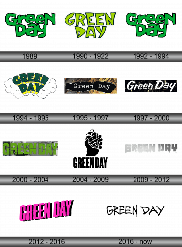
The logo presents a stark, green-hued typography with a deliberately jumbled, graffiti-like aesthetic, evoking raw punk energy. The letters, seemingly hand-drawn, are bold and irregular, with an untamed quality that mirrors the band’s rebellious spirit. Sharp angles and extended points give a sense of motion, as if the words are bursting forth with the same vigor found in the band’s music. It’s a visual shout, resonating with the ethos of Green Day’s sound and philosophy.
1990 – 1992
In this evolution, the logo’s green is more vibrant, contrasting sharply against a clean white backdrop. The letters “GREEN DAY” are bolder, with an almost tangible depth, as if they could leap off the surface. The edges are softer, rounder, imparting a more approachable vibe compared to the previous edginess. Each character is infused with a playful twist, encapsulating the band’s dynamic and evolving nature while retaining a connection to their punk rock roots.
1994 – 1995
This iteration bursts with a three-dimensional effect, letters in dark green with yellow accents seemingly crack through a cloud. The font’s emboldened, contoured by shadows, giving an illusion of leaping off a misty backdrop. The cloud softens the logo’s energy, juxtaposing the band’s punk essence with a whimsical touch. It’s a playful twist, suggesting a blend of grit and creativity, a nod to the band’s maturing sound yet retaining their rebellious soul.
1995 – 1997
This logo presents “Green Day” in whimsical, curvy white letters, reminiscent of the 1960s’ psychedelic rock era, set against a black, irregularly shaped backdrop that seems torn or organically formed. The edges of the black shape have a rough, uneven white border, giving it a handcrafted look. Surrounding this central form is a collage of earthy textures and colors, evoking a feeling of vintage album art or a patchwork of autumn leaves. The overall effect is both nostalgic and eclectic, suggesting a blend of classic rock influences with the band’s own unique identity.
1997 – 2000
The logo displayed is bold and edgy, with a grunge-inspired aesthetic. It features the words “Green Day” in a distressed, white stencil font that stands out starkly against a textured, black background, reminiscent of peeling paint on a weathered wall. The letters appear slightly eroded, conveying a sense of rebellion and raw energy. The typography is sans-serif, which gives it a modern and clean look despite the deliberate wear.
2000 – 2004
This iteration of the logo contrasts sharply with the previous one. The text “Green Day” is now presented in a bright, lime green hue, giving it a vibrant pop. The background is no longer dark but instead is transparent, allowing the logo to overlay any chosen imagery without losing its impact. The letters have a glossy, reflective quality, as if made of glass or coated in a high-shine varnish, which catches light and creates a feeling of depth. The font remains sans-serif but looks cleaner and more futuristic, lacking the previous version’s weathered texture. This design feels fresh and lively, embodying a slick, more polished rock vibe.
2004 – 2009
The logo takes a stark turn from its predecessor. It is a monochromatic design with a powerful central image of a hand clutching a heart-shaped grenade. The grenade is stylized, with a checkered pattern and a pulled pin, symbolizing both love and rebellion. Below the graphic, “GREEN DAY” is written in capital letters, using a bold, blocky font that communicates strength and presence. The design is clean, with a high contrast black and white palette, which reinforces the logo’s bold statement. There’s a simplicity and directness to the design, echoing the band’s punk ethos.
2009 – 2012
This logo departs from the previous high-contrast, black-and-white motif. It opts for a grayscale palette, with the band’s name “GREEN DAY” in block letters that seem to be carved from a concrete or stone-like texture. The letters have a three-dimensional appearance, with shadows giving them depth, and they’re dripping, as though the material is melting or disintegrating. This gives a sense of decay or transformation. There’s no accompanying image, focusing solely on the text, which is more abstract and artistic than the literal previous design. This version conveys a sense of erosion over time, perhaps reflecting a more mature phase of the band’s evolution.
2012 – 2016
The newest logo abandons the grayscale motif for a striking hot pink color, energizing the band’s name “GREEN DAY” with a neon-like vibrancy. The font is bold and slightly askew, giving it a dynamic, almost vibrating effect. The letters appear hand-painted or stenciled with rough, imperfect edges and streaks, suggesting an underground, street-art influence. This style injects a youthful, contemporary edge, signifying a possible return to the band’s punk roots.
2016 – Today
Transitioning from the neon vibrancy of the last logo, this design embraces a raw, brushstroke style in stark black. The words “GREEN DAY” are handwritten, resembling ink or paint applied with hurried, forceful strokes. This creates an organic feel, as if quickly tagged on a wall, channeling a DIY punk aesthetic. The letters are irregular, with dripping paint details, adding to the sense of urgency and authenticity. The background is plain, allowing the handcrafted nature of the letters to stand out, suggesting a back-to-basics approach for the band. This logo feels personal, unfiltered, and true to the roots of garage band culture.


