Hooters Logo
Hooters is an American pub and sports bar. It constantly broadcasts various sports competitions and events. The menu is represented by traditional American dishes: wings cooked according to various recipes, burgers, sandwiches, French fries, appetizers, salads. In the bar, visitors can get various non-alcoholic and alcoholic drinks, including wines, cocktails, bottled beer, and other strong drinks. In a restaurant, the team of waiters is called the Hooters Girls.
Meaning and History
Back in 1983, in the small American town of Clearwater, Florida, six friends saved $140,000 and opened the Hooters restaurant. For all of them, this was the first business before they worked a variety of different jobs. After having some beer, they came up with the idea of a “men’s restaurant” with chicken wings and sexy waitresses. They also chose the name with a reference to the word “hoots”, which has two meanings: “hoot of an owl” and “women’s breasts.”
What is Hooters?
This is an American restaurant bar with a textbook masculine atmosphere, featuring good food and drinks and, most importantly, attractive girls. A successful concept, in which gorgeous girls in not so modest clothes occupy a central place, was adopted by a number of entrepreneurs, and soon turned into a separate restaurant genre. Now, more than 450 restaurants operate under the Hooters brand in more than 20 countries around the world.
1983 – 2013
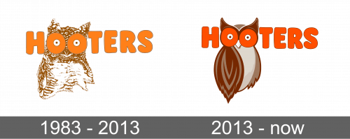
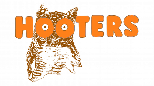
The logo was a detailed and realistic drawing in a brown and white color palette of an owl. Across the owl, the logo had the name of the restaurant written in such a way that the to “O”’s were the owl’s eyes. The latter were illustrated to look like a female’s breasts. The letters were orange, which is the main brand color, and had a darker outline. It was written using a bold sans-serif typeface and used all uppercase letters.
2013 – Today
The owl drawing was replaced by a cartoon-style bird. It had a darker brown palette, with more shades of this color. The two “O”’s were more integrated into the drawing and now looked more like they were actually the owl’s eyes. At the same time, one could still give those eyes a secondary interpretation. The name was also a brighter shade of orange and had a dark brown outline, but the original font has been preserved. Against the white backdrop, the logo looked even more daring.
