Shake Shack Logo
Shake Shack, a renowned fast-food chain, is celebrated for crafting gourmet burgers, crispy fries, and indulgent shakes. The eatery was first established in the bustling metropolis of New York in 2004 and has since expanded into a globally recognized brand with over 250 locations. Their extensive menu boasts a variety of inventive and traditional burger choices, including the iconic ShackBurger and SmokeShack.
Meaning and history
![]()
The name Shake Shack evokes a sense of whimsy and old-timey charm, reminiscent of a bygone era of American diners. It perfectly captures the label’s focus on crafting delectable burgers, fries, and shakes with a playful, stylish twist.
With the first-ever eatery furnishing the Madison Square Park of the bustling metropolis of New York City, Shake Shack has burgeoned into a global sensation, boasting over 250 locations worldwide. The company’s unwavering dedication to utilizing only the freshest, all-natural ingredients and implementing eco-friendly practices has earned it an enthusiastic following of burger enthusiasts from all corners of the world.
Shake Shack’s meteoric rise to prominence is a testament to the brand’s steadfast commitment to providing an unparalleled fast-food experience. From their quintessential ShackBurger to their imaginative culinary partnerships with high-profile chefs, Shake Shack consistently blurs the line between fast-food and gourmet, while remaining unswerving in their devotion to excellence and ecological responsibility.
What is Shake Shack?
Shake Shack, is a global conglomerate of fast-food eateries. Founded in 2004 by the visionary Danny Meyer, its inaugural restaurant still operates within the bounds of Madison Square Park, serving up scrumptious burgers and fries to this day. With locations spanning the globe, this gastronomic goliath calls New York City its home base.
2004 – 2008
![]()
Initially, Danny Meyer, one of Shake Shack’s creators, sought to build an eatery able to blend seamlessly into the urban terrain of the redesigned Madison Square Park. The group of park designers directed by James Wines conceived of a design inspired by a 1960s kiosk, complete with sharp angles and an ivy-covered facade.
Enter Pentagram, who developed the initial signage for Shake Shack, mindful of the multitude of art studios in the vicinity. Their letterforms paid homage to Art Deco, with a nod to the classic bar counter aesthetic, using slim sans-serif lettering in a solid black. The prominent stainless steel lettering on the construction made for an impressive sight.
Branding expert Paula Scher took charge of the project pro bono, as part of the Madison Square Park restoration. Scher assured the owners that the symbol design would blend harmoniously with the surroundings, selecting the contemporary and sleek Neutra script for the final variant of the emblem.
2008 – today
![]()
As the brand ventured outside the park area, the original poster no longer blended with the urban milieu. Meyer commissioned a logo adaptation that would retain its authentic aesthetics yet match the more traditional cityscape. Paula Scher was once again in charge of the redesign, albeit not for free this time, as she lamented the low fee.
Guided by Scher’s expertise, the design team crafted a mid-century burger concept that they modified to suit contemporary standards. The Galaxie Cassiopeia script was picked for the lettering, mimicking handwritten script. Scher likened the typeface to a neon signboard from the ’50s on the brink of glowing. The only letters not bonded were “S” and “h.”
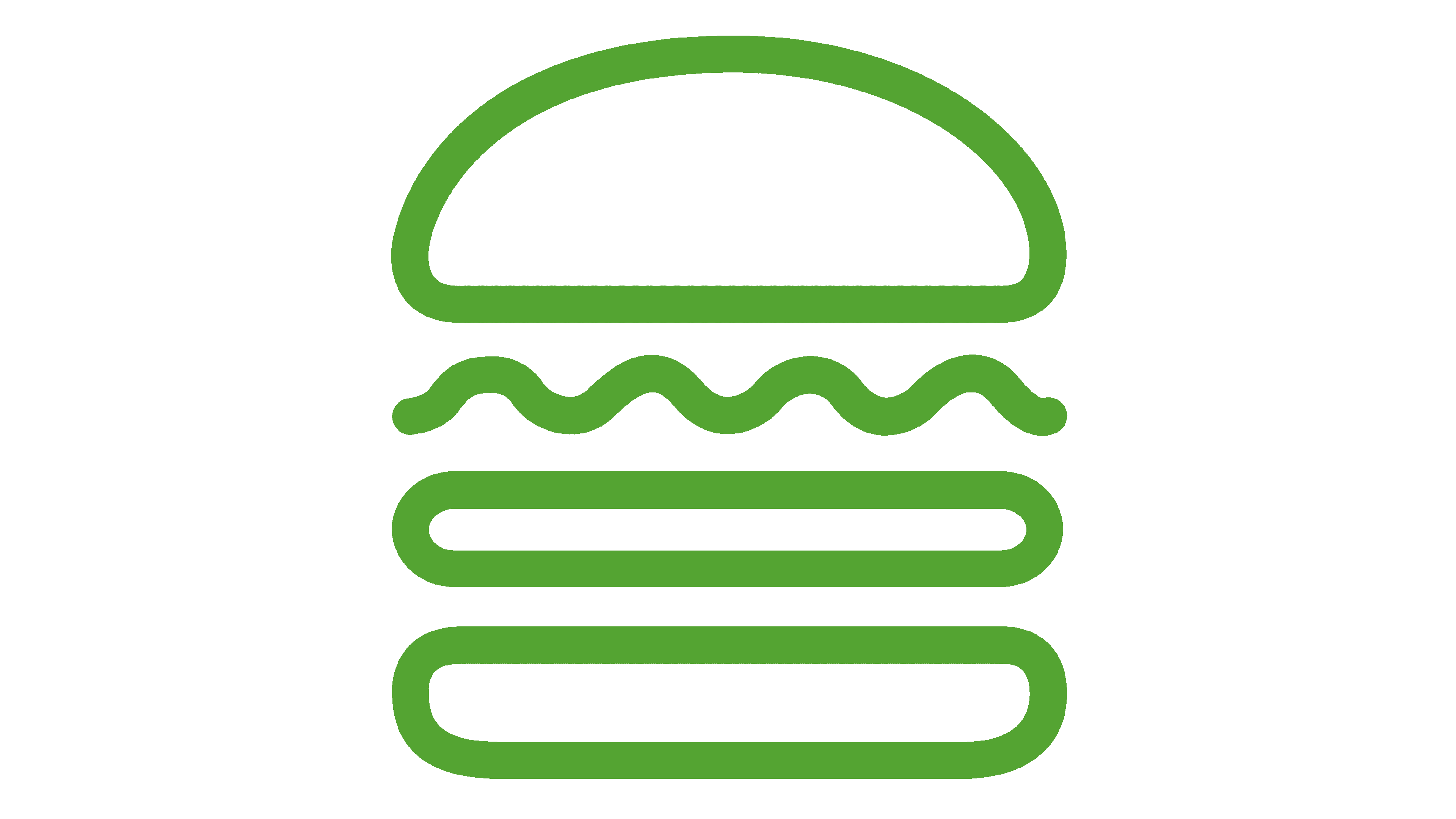
The cursive script was paired with a product image, positioned in the middle to divide “Shake” and “Shack.” The icon comprised four green-bordered white components. Above was a semicircle resembling a sliced bun’s crown. Beneath it was a wavy line masquerading as a lettuce leaf, followed by two rounded rectangles. One simulated a patty, the other a roll’s bottom.
2010 – today
![]()
In 2010, Shake Shack took its delectable burgers to other cities, and the growth necessitated a logo redesign. However, no fresh design elements made their way into the logo. The contemporary rendition blended an old-fashioned wordmark and a burger icon crafted in 2008. The design maestros from Pentagram merged them by setting the picture in the customary spot to split the two portions of the label moniker.
Font
The typeface utilized in Shake Shack’s original logo was a geometric grotesque called Neutra, designed by Christian Schwartz in 2002. It featured distinctive downward-shifted horizontal stripes and was inspired by the work of Richard Neutra, a famed Austro-American architect. For the 2008 rebrand, designers opted for Galaxie Cassiopeia, a script with wavy and circled lines that emulated the look of handwritten text.
Color
Pentagram’s design team gave Shake Shack’s wordmark a classic black hue, while the hamburger icon was outlined in a light green shade. The logo’s backdrop and internal elements were kept crisp and clean, with a pure white color that contrasted sharply with the black lettering.


