IKEA Logo
The IKEA product range includes all kinds of home goods: furniture, lighting, decor items, textiles, household supplies, and much more. It offers Swedish design, which is bright, light, and functional. The company positions itself as the largest retailer that sells products from the best manufacturers. It is also a manufacturing company and is actively involved in franchising. The buyers assemble most of the furniture at home, so goods are transported in flat boxes, thereby reducing logistics and service costs, which leads to lower costs of goods.
Meaning and History
Ingvar Kamprad founded IKEA in 1943 at the age of 17 using only his own savings. Initially, IKEA sold various small items, such as pens. In the forties, Ingvar noticed that Swiss furniture is quite expensive and inaccessible to ordinary people, so in 1948 he transformed his company into a furniture store that sold goods from local furniture workshops. The low prices ensured growth and created a danger for competitors, who initiated boycotts. So, the design and production of furniture were expanded to Poland, and later Germany, China, Russia, etc. Active expansion into the international market began in the 70s. The name IKEA is an abbreviation of the first letters of the name of the founder, the location of his childhood farm, and the name of the parish near his home village.
What is IKEA?
IKEA is a brand specializing in the production and retail sale of furniture and household goods. The company pays exceptional attention to design, collecting and implementing interesting ideas around the world. At the same time, IKEA products are cheaper than analogs of well-known brands.
1951 – 1952
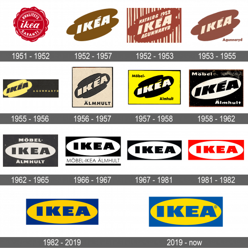
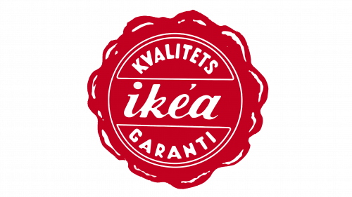
A red wax seal with “IKEA” written across the center and “Kvalitets Garanti”, which means quality guaranteed, curving at the top and bottom is how the first logo looked. The name was done in all lowercase cursive letters, while the other inscription featured sans-serif, all uppercase lettering. All the inscriptions were done in white.
1952 – 1957
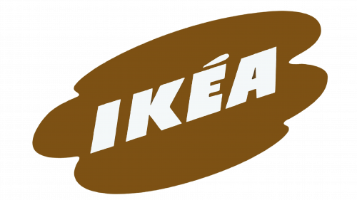
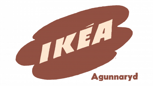
The new emblem was not as traditional and had the name printed in bold, all uppercase letters. It was done in white and placed on an abstract background of a brown color that resembled a cloud. The whole emblem was placed on a diagonal, which gave it some dynamics and interest.
1952 – 1953
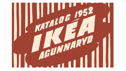
There was another version of the logo introduced in 1952, which was used for a short period of time. It was based on the other version, but also had “Katalog 1952” written above the name and “Agunnaryd”, the name of the parish in the founder’s home village, below it in a slightly smaller font. In addition, there was a striped, rectangular background. The color palette was beige and brown.
1953 – 1955
Since “Katalog 1952” was no longer relevant, it was removed. The “Agunnaryd” inscription was moved to the lower right corner of the rectangle and printed in brown using a different font. The other update this year was the removal of the striped background. It was now simply beige. The logo did not look as bold anymore, but at the same time, more accent was placed on the company’s name.
1955 – 1956
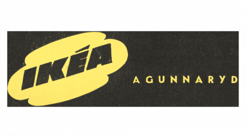
The beige color was replaced by black, while the brown turned yellow. The new color palette made the emblem appear more professional and confident. The letters appeared wider and closer spaced apart. Another notable change was an elongation of the rectangular background on the right. It created more space for the “Agunnaryd” inscription, which was now placed higher and printed using all uppercase letters.
1956 – 1957
The logo was modified again and had a square shape. Now, it specified the location where the first store was built – Almhult. The background and inscription were beige again, while the “cloud”, an inscription in the bottom corner, along with the border were black.
1957 – 1958
The yellow color was brought back and used for the rectangle that served as the base. The shape of the cloud was changed and it did not look as diagonal. “Mobel” was placed in the upper left corner, while “Almhult” was printed in the lower right corner. The updates did not really change the brand image.
1958 – 1962
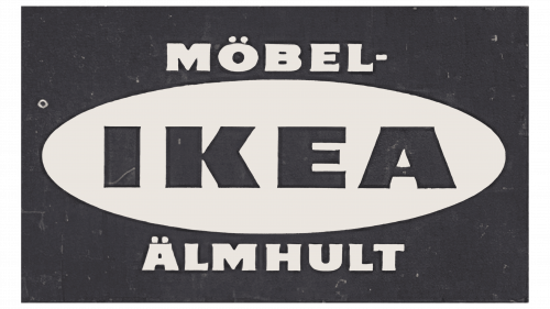
The cloud shape was replaced by an oval. The more defined lettering along with the black that was used for the background and the name made the emblem appear more sophisticated. The “Mobel” and “Almhult” inscriptions were made larger.
1962 – 1965
This was the first time the company printed the name straight without placing the oval shape on a diagonal. The “Mobel” and “Almhult” inscriptions were now placed above and below the oval shape. They were now printed using a different font, featuring all uppercase letters. The glyph above the “E” was removed.
1966 – 1967
It was not long before a new version was introduced. The oval shape was placed at the top of the black rectangle. It featured a brighter shade of blue and slightly redrawn lettering. Across the bottom, the company added a white banner that held a “Mobel-Ikea Almhult” inscription in a thin, sans-serif font. The overall look was bolder and more modern.
1967 – 1981
A version of this logo, only featuring different color palettes, was used for many years since its introduction in 1967. It was quite minimalistic and featured only the upper half of the previous logo. It was just a black rectangle that was just big enough to fit the white oval with the company’s name.
1981 – 1982
Not much changed in 1981. In fact, only the black color was replaced by red. It reflected the company’s leadership in the industry as its products were now sold in many countries.
1982 – 2019
The yellow color, only bolder this time, was brought back. It was used for the oval shape and reflected the warmth, positivity, and energy of the products of this Scandinavian brand gave. The other color was a calm blue, which was used to symbolize the reliability and stability of the company.
2019 – Today
The modification made in 2019 consisted only of the color palette update. It introduced a slightly different shade of blue, making the emblem even more pleasant to the eye.
Font and Color
The brand used several color palettes throughout its history. The red and beige/white one was used only during the years 1951 and 1981. For a short period in the beginning, it also chose to go for brown and beige colors. Most of the logos, though, featured a black-and-white color palette. There was also a bit of yellow in 1957, which was brought in 1982 in combination with blue and is still used by the company. When it comes to fonts, the way the company’s name was written since 1952 has not changed much. It was a bold, sans-serif font. Created by Robin Nicholas, it is known as IKEA Sans.
