In-N-Out Burger Logo
In-N-Out Burger, a renowned label of fast-food eateries formed in 1948 in Baldwin Park, California, boasts an uncomplicated yet palatable menu, centering on classic American burgers. The company’s unwavering dedication to quality and freshness, using only the finest ingredients and preparing all meals to order, has propelled its popularity and success to soaring heights. What sets In-N-Out Burger apart is its steadfast independence and refusal to turn public, keeping it a family-controlled and driven enterprise.
Meaning and history
In-N-Out Burger’s success story started with Harry and Esther Snyder, who wished to provide top-notch cuisine and outstanding client service. The firm’s moniker is a nod to its promise to serve newly made burgers and fries to consumers as fast as possible, either in their automobiles or inside the building. The earliest In-N-Out Burger eatery appeared in Baldwin Park, California, and quickly gained local popularity. The company has always been a Snyder-driven business, and it has stayed with its authentic values, neither franchising nor going public.
As time went by, In-N-Out Burger continued to expand its reach, establishing new places across California and other states. However, the brand has maintained its loyal fanbase by adhering to its simple menu. In-N-Out Burger’s commitment to delivering high-quality and fresh eats has won it an avid following, with customers traveling great distances to taste their famous dishes.
What is In-N-Out Burger?
This well-known restaurant, originating from California, specializes in quick and convenient cuisine. The establishment boasts a limited but enticing menu, comprised of several burger types, milkshakes, sodas, and golden-crisp French fries.
1948 – 1954
The company’s inaugural symbol was affixed onto rectangular signboards. It contained straightforward lettering rendered in a bold script with all capitals. The marque’s moniker was divided into two segments of identical size, and the upper ‘In-N-Out’ was punctuated by small, square hyphens. The text was presented in white, which contrasted boldly with its brown backdrop.
1954 – today
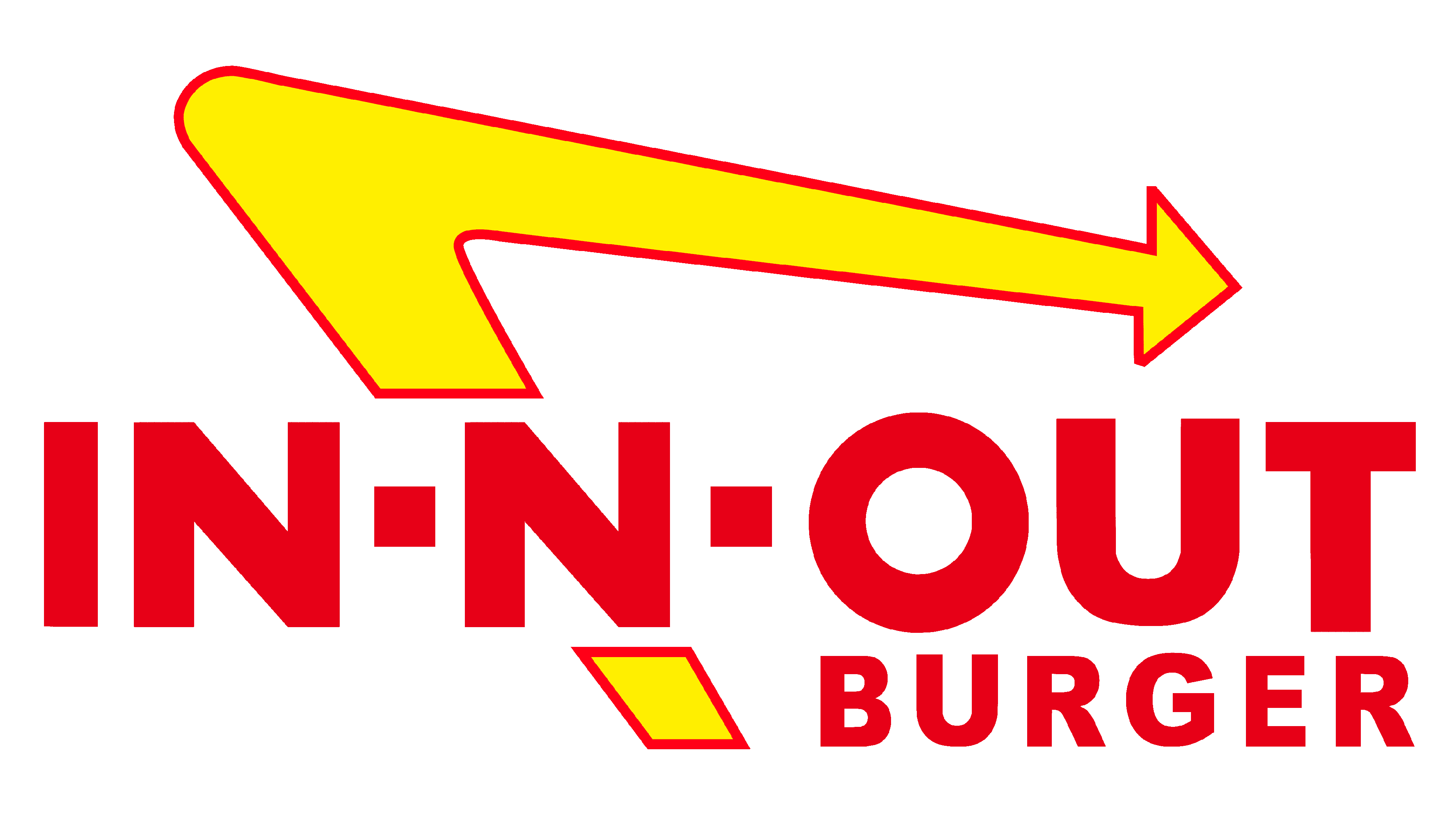
Post redesign, a lengthy and golden triangular arrow was incorporated into the nameplate. The V-shaped extension indicates leftwards, therefore, advertisement signage with the emblem is typically positioned upright the establishments to ensure the indicator’s orientation is spot on.
The inscription “IN-N-OUT BURGER” is preserved, however, its hue and size have been revamped. The characters now sport a dark red shade. The second word is compressed to such a degree that it sits comfortably below “OUT”.
The arrowhead is the perfect image of the momentum implicit in the In-N-Out name caption. Not only does it invite motion, but it also indicates the way forward. Its boomerang contour proposes that patrons will undoubtedly return for an extra hamburger or fry.
Font
The chosen script for the brand name boasts a bold and uniform line weight while avoiding serifs to keep the logo uncluttered and focus concentration on the focal part: the large, canary-yellow arrow. The wording’s appearance bears a striking resemblance to Futura No. 8 by the shape of characters. This typeface family comprises a solitary style. The initial variation of the grotesque font was created in the 1920s and was subsequently digitized.
Color
The chromatic palette is not solely used to draw the gaze but also to kindle the craving of prospective patrons. The In-N-Out Burger establishment has preserved the alliance of red and yellow hues since 1954. The graphic artists employed vivid hues and juxtaposed them in a manner that prevents the integration of the logo constituents. A gap, separating the lettering and the arrow is a dividing line that partitions the vermillion characters from the outline.


