Burger King Logo
Among the trio of KFC, McDonald’s and Burger King, the third one is the smallest and youngest fast-food chain. It doesn’t mean it’s genuinely small, however – the company still makes billions off their restaurants worldwide. And they aren’t a very young brand, either – the first diner by them was opened in 1954.
Meaning and History
![]()
This ambitious name was actually inherited by the company from a short-lived predecessor called Insta-Burger King who died in 1954, the same year its remains were transformed into the modern BK. So, it originally meant that they were the best at serving patties as fast as possible.
1953 – 1954
![]()
Before Burger King properly started, it also had a logo that said ‘Burger King’, funnily enough. It was a basic black company name (all in uppercase) topped with an image that depicted half-a-sun in grey shades.
1954 – 1957
![]()
Before BK, there existed a company called Insta-Burger King, which only lasted for a year. It also had several logotype versions, but it’s not the same Burger King as we know it however you look at it.
The very first BK’s own logo was this one – a rather basic black writing that says ‘Burger-King’. The font is interesting – it features abrupt and artistically inconsistent letters. Still, it wasn’t very prominent, which is why they scrapped it just a few years later.
1957 – 1969
![]()
The 1957 version was a complete 180° turn for the design. The text was carried on virtually unfazed – it became rather thicker and red, as well as got rid of the dash.
Noticeably, it was now surrounded by a yellow trapezoid with red fringes. Beneath the main text, the shape contained a motto of sorts – ‘Home of the WHOPPER’. That’s also when they first introduced their mascot – a King – sitting perched on the burger right on top of the yellow shape with a drink in hand.
1969 – 1994
![]()
In the very next iteration, the mascot was scrapped from the emblem. It was massively simplified, in fact. Now it was just two orange semi-ovals with a tall red company name in-between – a stylization of two buns and a patty.
All the shapes were fluid and soft in this iteration, which was a success, which is why the bosses used this version for many years to come.
1994 – 1999
![]()
The design stayed the same until the close of the century, although they bleached it somewhat for the later 5 years. The buns became violently yellow, and the text turned scarlet.
1999 – 2005
![]()
A design was thoroughly updated, as you may notice. However, in its core it’s still the same concept. The text was simply made bigger, and everything else got tilted to the left and down, so there’s now much more volume. In addition to that, there are the small white flecks all over the place, meant to seem like illumination.
The only real addition was the blue stroke that surrounds the symbol almost completely.
2005 – 2012
![]()
Nothing in particular changed, except for the coloring. It was severely darkened for some reason, which made yellow into orange again.
2012 – 2020
![]()
This time, they bleached the color scheme, which made it even paler than the 1999 version. Burger King likes going back and forth with their designs, as you’ll see with the next ‘evolution’.
2020 – today
![]()
It’s just the logo from 1994 with a color scheme similar to 1969. Obviously, this is meant to inspire nostalgia, which is a running theme with these corporations nowadays.
Emblem and Symbol
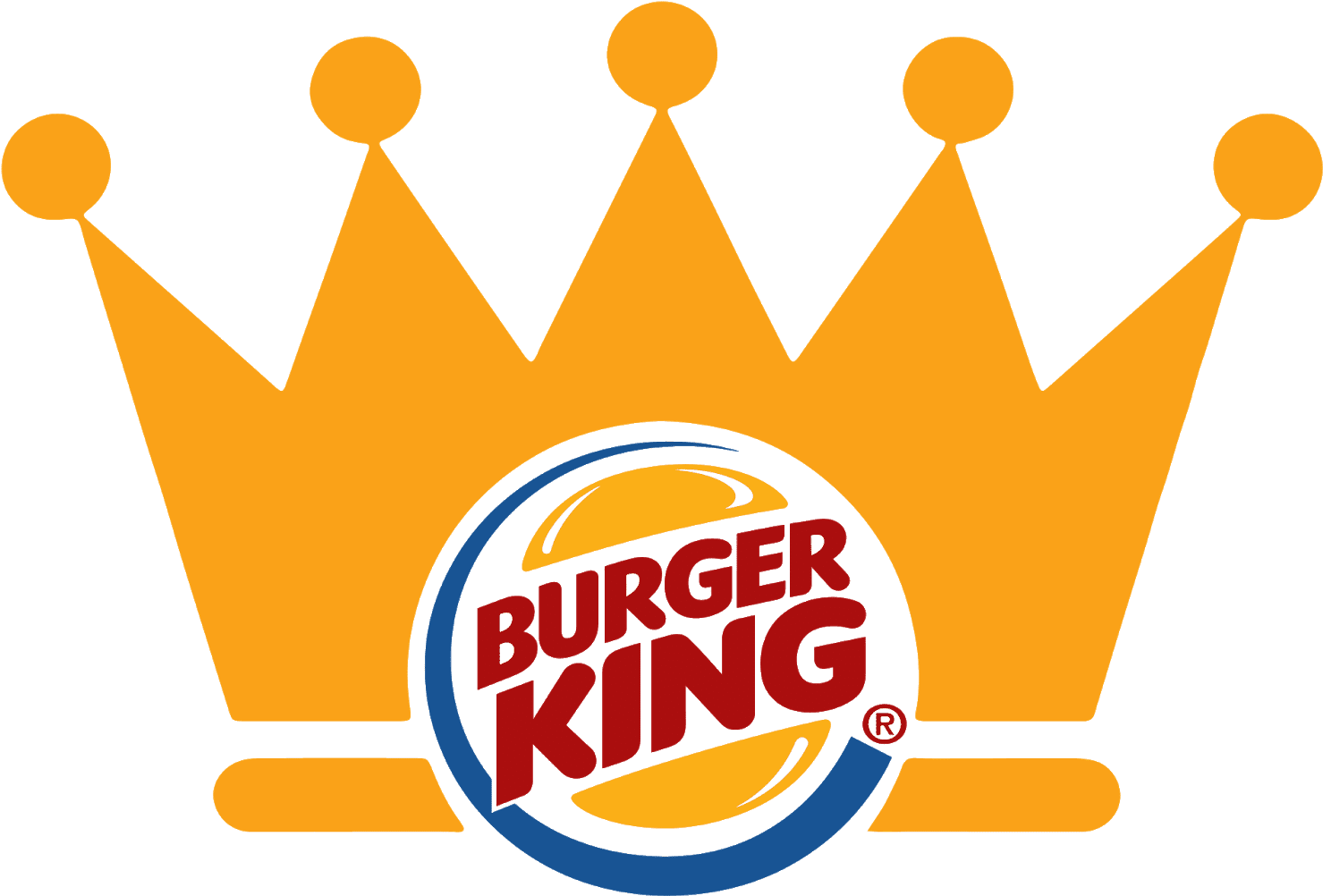
Although the King has last been seen in the 60s, a Crown is still one of the most prominent symbols of BK worldwide. The BK Crown is mostly seen in commercials or as a paper cut-out that can be worn on a head – these can be found en masse in every BK restaurant, just lying around.