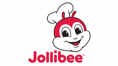
Jollibee Logo
Jollibee is a significant chain of fast food restaurants from the Philippines. The first establishment of the chain was created in 1978. Since then, their franchises have spread to many countries in Asia, North America and even Europe. The usual menu is a fusion of elements from American and Filipino cuisines.
Meaning and History
Jollibee was founded by Tony Tan Caktiong in 1978 as an ice cream parlor in Quezon City, Philippines. The business quickly evolved, shifting focus from ice cream to fast food after noticing the strong demand for hot meals like hamburgers and fried chicken. This strategic pivot proved to be highly successful, helping Jollibee to stand out in a market dominated by American fast-food giants by offering menu items with a local twist.
Jollibee’s main achievements include becoming the leading fast-food chain in the Philippines, surpassing international competitors in the local market. The company’s international expansion has been marked by significant milestones, such as opening stores in key cities across the United States, Middle East, and Asia. The brand has also made notable acquisitions, including the purchase of American fast-food chains like Smashburger.
Today, Jollibee continues to thrive as a powerhouse in the fast-food industry, maintaining its position through aggressive global expansion and a strong commitment to quality and innovation. It remains a cultural icon in the Philippines, symbolizing homegrown success and the widespread appeal of its distinctly Filipino take on fast food.
What is Jollibee?
Jollibee is a major fast-food chain originating from the Philippines, renowned for its joyful atmosphere and menu that features a blend of Western comforts and Filipino favorites. This includes their famous Chickenjoy, Yumburger, and sweet-style Jolly Spaghetti, which cater to the unique tastes of its diverse customer base.
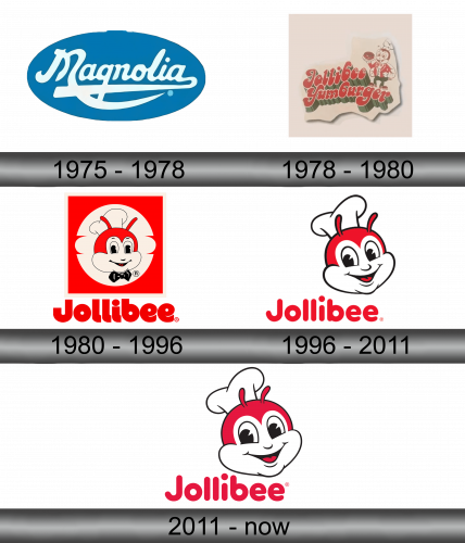
1975 – 1978
For 3 years before Jollibee as we know it took shape, its initial location was an ice cream shop owned by Magnolia food conglomerate. As a result, they used the logo of the company – it was a blue oval with ‘Magnolia’ written in cursive white letters across the middle.
It was a very artistic writing with lots of spirals and twists.
1978 – 1980
In 1978 the shop was transformed into Jollibee after several successful experiments featuring hot meals.
The logo of the new brand featured the words ‘Jollibee Hamburgers’ written in two lines with the same style. That being said, the letters became red, thicker and with more volume. There was also a new mascot standing on the corner of the second word. It’s a human-like red bee with a scarlet jumper, a chef’s hat and a burger on a tray in hand.
1980 – 1996
By 1980, the bee was devolved into red-and-white bee’s head with a white chef’s hat on it. It was set in the center of what looked like a white outline of a hamburger. It, for its part, was put in the middle of a plain red square. Below the entire composition, there was the company name written in bold white letters.
1996 – 2011
By 1996, they made the name part less angular and colored it red, while also removing much of the upper part of the logo (leaving only the head part proper). There were some changes done to it, but it’s generally the same design and concept. The only real change is that it’s now slightly to the right from its previous position.
2011 – Today
In 2011, they did some minor changes to the composition of the head, changed the red on it (and on the writing) a less saturated red and also enlarged the head proper.

