Popeyes Logo
American fast-food restaurant chain Popeyes is owned by Restaurant Brands International Inc, which owns Burger King, Tim Hortons, and Firehouse Subs. The chain’s menu includes chicken sandwiches, spicy chicken, fried shrimp, and various regional dishes. When cooking, the company uses only patented seasonings and recipes developed by its own culinary team of chefs.
Meaning and History
![]()
The Popeyes fast food restaurant chain was founded in 1972 in New Orleans. The creator of this fast food chain was Alvin Copeland who set very high goals for his restaurants. He had 500 locations in just a little over ten years. Authentic food has allowed it to become one of the world’s largest companies with around four thousand fast-food restaurants in 30 countries, most of which are franchised. Even in the midst of a global pandemic, consumers still wanted the Popeyes Louisiana Kitchen Chicken Sandwich, driving the sales up. Not many know that the original name of this famous chain was “Chicken on the Run”. Later, the business was renamed Popeyes Mighty Good Chicken, which was further rephrased as “Popeyes Famous Fried Chicken” in 1975.
What is Popeyes?
The chain is known for being the center of the #ChickenSandwichWars, which brought it fame and attracted the attention of even more consumers.
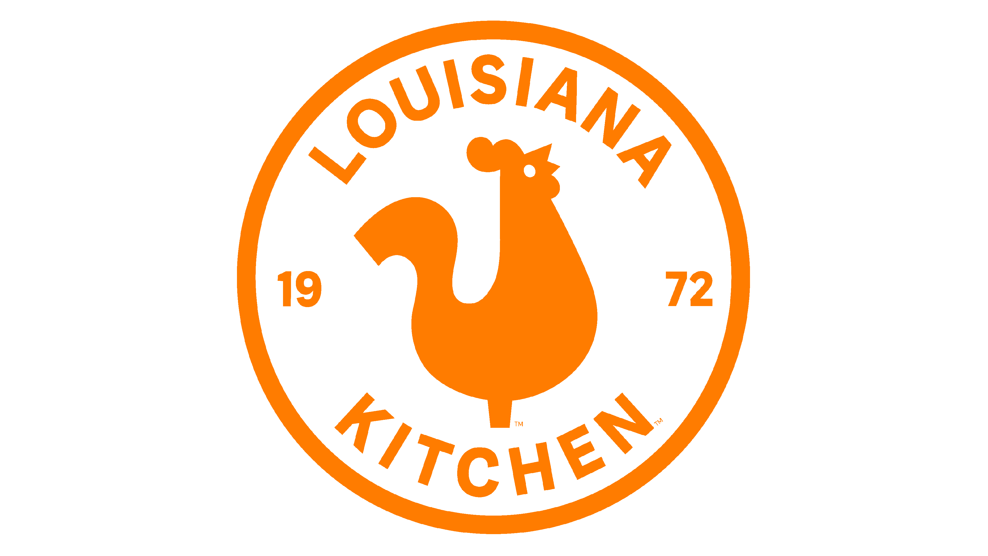
1972 – 2001
![]()
The original logo featured a fun, playful, even goofy inscription. Not only it was a bright pink color, but all the letters were also placed randomly at different heights and angles. The stroke thickness was also uneven. Smooth curves and cuts made at different angles add to the playful nature of the log. The designers did a great job creating an inviting image.
2001 – 2008
![]()
The most prominent change in the updated version was the introduction of a cherry red color. It made the restaurant look a bit more serious and reflected that it has been gaining more and more strength in the market. The font and placement of the letters were also adjusted, creating a more uniform brand image while still preserving the recognizable logo.
2008 – 2019
![]()
The new color palette also evoked happy feelings. It was a friendly, fun, and energetic pumpkin orange color. The shape of the letters reminds of the previous brand images, but here the letters were placed straight. At the same time, the designers preserved the placement of the letters at uneven heights. This made the logo relatable to the original, which can often be a hard task when trying to modernize the brand image.
2019 – Today
![]()
The redesign made the emblem appear more polished and represent a strong position of this restaurant business. First of all, the letters now all had the same stroke thickness. In addition, they were placed in one line. The font has also been redrawn, mainly the letter “Y” now featured completely straight lines instead of a curved top. The color was made just a bit brighter, so everyone could still identify with the updated brand image and feel the inviting warmth and friendliness of this restaurant chain.
Font and Color
The pinkish red used in the first logo is considered to be a playful color that arouses a feeling of warmth, excitement, and passion. Later, the company used cherry red, which was a strong color full of energy. Most of the world, though, recognizes its orange logo. This color not only makes one excited about the tasty food offered at Popeyes but also stands for happiness, warmth, and health. Although the company made a few modifications to the font each time it updated the logo, it preserved some key elements to maintain brand recognition. They use a custom, bold, sans-serif font that resembles Leticea Bumstead.