John Deere Logo
John Deere Company is a prominent producer of heavy machinery, mostly meant for agriculture and construction. It is one of the most successful American manufacturers in this field, and it’s been this way for many years – the company is over 150 years old at this point.
Meaning and History
![]()
The company was created in 1837 by the man called John Deere. He was as successful inventor who pushed the boundaries of agriculture in America by creating several efficient tools. Many of these findings made it into the products created by the company he started.
1876 – 1912
![]()
The company didn’t have any real logotypes until 1876. The first logo was completely black: a deer prancing through a small streak of grass, surrounded by text. Above it, curved for a semi-circle shape, was the company name. Below, they put the location of the company – Moline, Ill.
It’s likely that the deer imagery doesn’t have any additional connotations, save for the resemblance to the founder’s name and maybe the connection to nature.
1912 – 1936
![]()
The 1912 logo was pretty much the same, apart from several small changes. They redrew the front legs of the animal and added more grass beneath it, for one. Then, they also removed some degree of curve from the upper text. Below this emblem was small thin inscription that stated where the trademark was created, nothing special.
1936 – 1937
![]()
In 1936, they added a badge-like (or a shield-like) frame around the logo. The image of the deer changed slightly – the front legs were now stretched out, and the grass below became scarcer. It could be colored, but we don’t really have evidence of anything but plain black-and-white coloring.
1937 – 1950
![]()
In 1937, the removed the frame around, as well as finally got rid of the trademark notice below.
1950 – 1956
![]()
1950 saw the most change in years.
They took the deer as it was, changed the prongs to look more like a male deer. The grass was no gone, and they put a big plaque below the animal instead. The text on it said ‘quality farm equipment’. The text above barely changed, although they elevated the words and put them closer together.
The entire thing was then surrounded by a sort of bloated rectangle.
1956 – 1968
![]()
Everything within the frame was removed, save for the deer and the name. The former stayed as it were, but the ‘John Deere’ part moved to the bottom of the shape, right after changing the font to a plainer non-serif type.
1968 – 2000
![]()
This time, the rectangle around was narrowed to a square shape, which also prompted the text to squeeze from the sides. Additionally, the deer changed pose once more, which cleverly reduced detail.
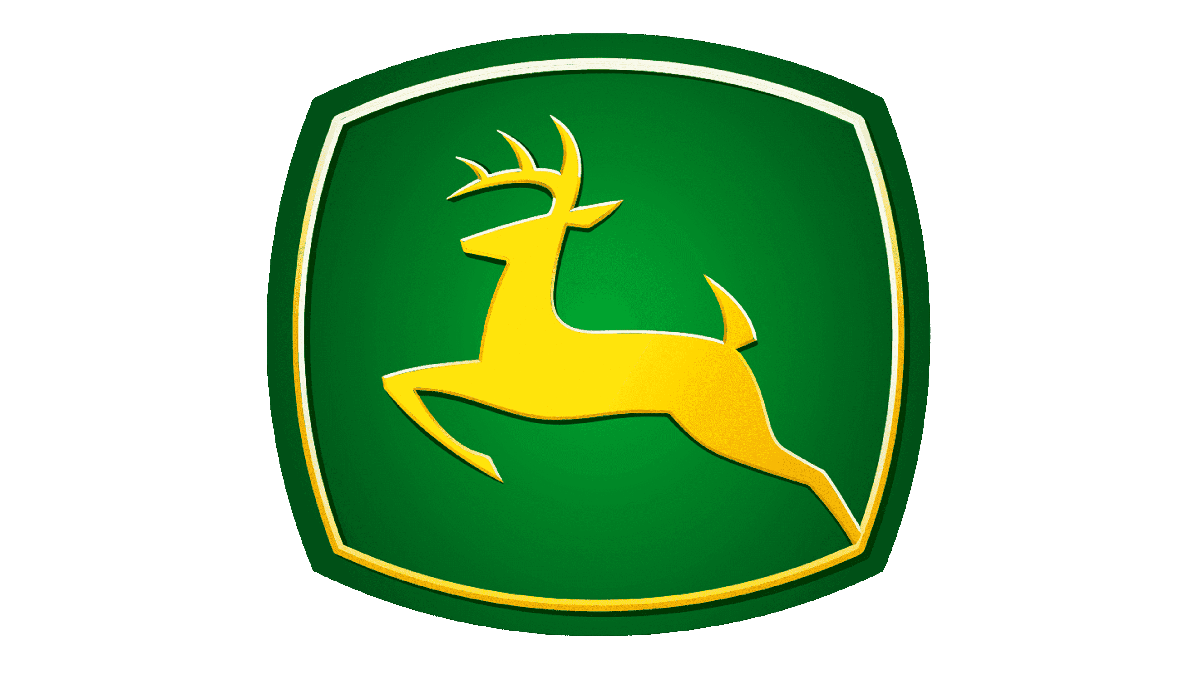
2000 – today
![]()
They narrowed the sqare down even further onto the deer and moved the text from it to immediately below. In addition, everything was repainted either green (the name, the background, second outline) or yellow (first outline, the deer). The choice of color was probably to showcase their association with nature and agriculture.
Emblem and Symbol
Deere’s machinery is obviously vehicles, which means they have brand badges somewhere on them. In this case, it’s the latest emblem sans text. In addition to that, it’s common for these badges to be black or yellow instead of the now-usual green background.


