TRD Logo
TRD is an abbreviation standing for Toyota Racing Development, the subdivision of the Toyota Corporation, responsible for the tuning of the Toyota and Lexus automobiles. The subsidiary was officially established in 1976.
Meaning and history
![]()
TRD, or Toyota Racing Development, was officially founded in 1976, although the tuning activities were being held by the company since the 1950s. However, in the 1970s, the company decided to form a separate department, giving it more financing and research opportunities.
Initially, the department was created for the Motorsport direction of the company, which was at its peak in the 1970s.
TRD works not only with Toyota vehicles, but also with the Lexus one, as it is a luxury brand of the Japanese automaker, and its cars are even more frequent visitors of the Toyota Racing Department.
What is TRD?
TRD stands for the tuning subsidiary of Toyota company, Toyota Racing Development, founded in 1976, and specialized in enhancing the technical and design characteristics of the Toyota and Lexus cars.
In terms of visual identity, the Toyota Racing Department hasn’t had many experiments. The Toyota subdivision has always had its badge based on a heavily stylized abbreviation, which only changed its colors and surroundings throughout the years. The current badge of TRD is fully based on the original version, and this is how you can see the progressiveness of the Japanese automaker — even today this lettering looks super powerful and modern, not to mention how it was perceived in 1976.
1976 – 2015
![]()
The original TRD logo, designed in 1976, featured uppercase lettering in thick black lines, set on the right from a red and black parallelogram, slanted to the right, as a sign of motion and speed. The badge was underlined by the full name of the department, set in the uppercase of a traditional geometric sans-serif font. As for the main lettering, its most recognizable detail is the letter “R” with its smooth, worm-like open contour and an elongated bar.
1976
![]()
For a few months in 1976, Toyota Racing Development was using one more badge, in addition to the primary version. It was the same custom uppercase TRD lettering, but this time in red, with the lines of the “R” elongated even more. The abbreviation was accompanied by the full name of the subsidiary, set in a narrowed sans-serif, in black, above the red capitals.
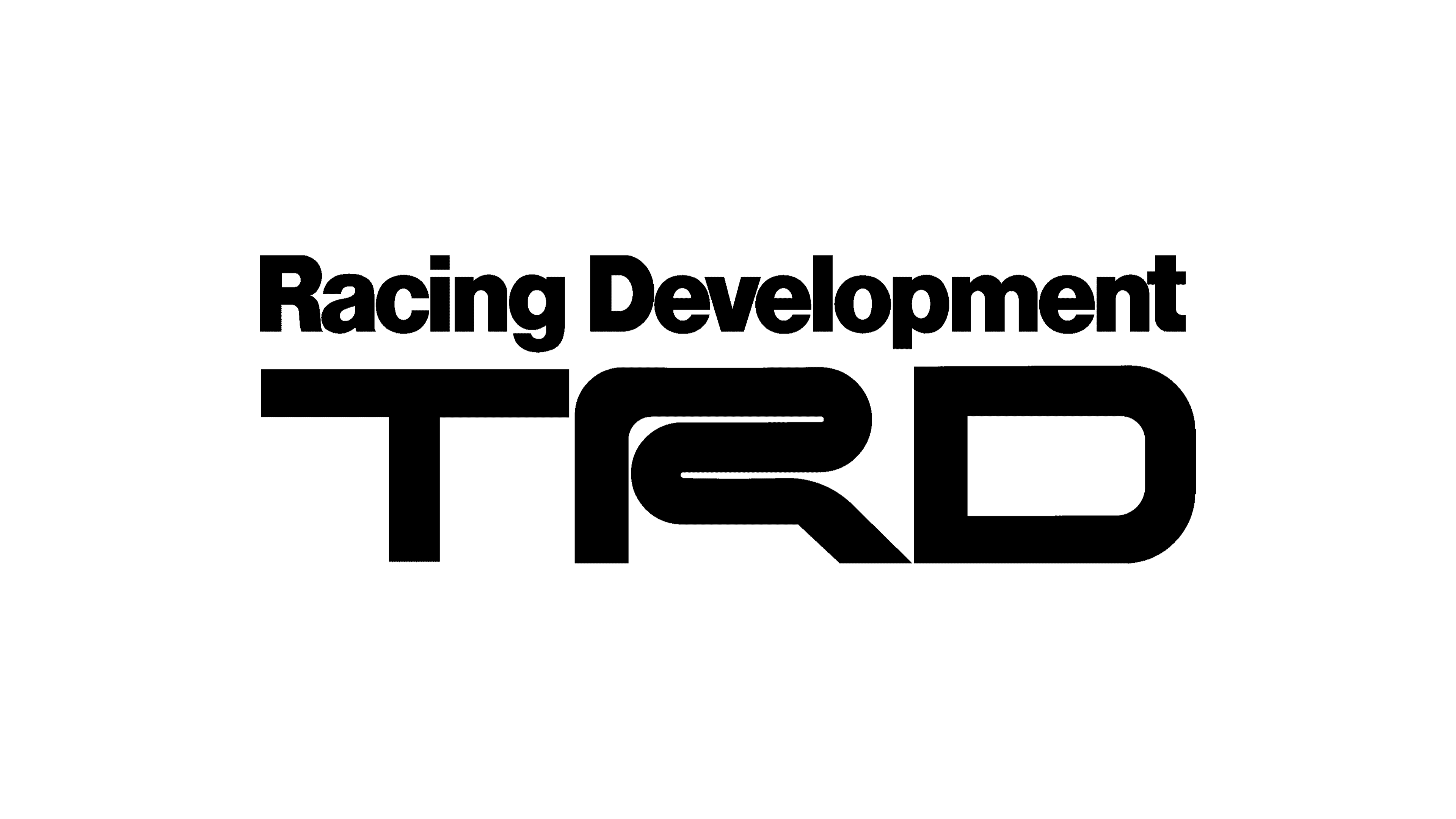
2015 – Today
![]()
The original TRD logo was redesigned only in 2015. The new badge is very laconic and minimalistic, but its black color and clean contours of the uppercase letters make it look very brutal and powerful. Compared to the initial version of the badge, this one is sharper and more angular. The letter “R” was slightly modified and now features a slightly larger size than its neighbors. The additional lettering was completely removed from the logo.
Font and color
The custom uppercase lettering from the primary TRD logo is set in a modern geometric sans-serif font with a designer “R”, looking like nothing else. The closest fonts to the one, used in this insignia, are, probably, Protrakt Variable Extra-Bold-Exp-Three, or Otomo Otomo, but with some significant modifications of the contours.
As for the color palette of the TRD visual identity, it was switched from red and black to just black, but that didn’t make it look boring or regular. Black suits perfectly the concept of the brand and makes the interesting lines of the abbreviation look strong and confident, at the same time evoking a sense of motion and progress.