USPS Logo
United States Postal Service, as the name suggests, is a federal institution tasked with delivering your mail should you find yourself anywhere on the United States territory. It’s truly a massive service used by the majority of the US civilian population. There are also other offices for delivering post, but this one is chief among them.
Meaning and History
![]()
This service is a rather new addition, only being launched in 1970-71 after a massive strike by the postal unions all over America. Its predecessor, Post Office Department dates back to the times of the War of Independence, so it’s also worth taking into account their history.
1829 – 1837
![]()
The department didn’t have any sort of emblem before 1829. In 1829, they introduced the seal that featured a god Hermes – the Greek deity that acted as a messenger for the Olympians in the myths – with all his attributes, including the winged helmet and so forth. He stood on a small speck of land labeled ‘America’.
Around the main seal was also the frame with a writing that said ‘SEAL OF THE GEN. POST-OFFICE DEPARTMENT’ in uppercase serif.
1837 – 1970
![]()
For the longest time, the department has this emblem to act both as a logo and as a seal. It featured a messenger on horseback riding to the right side above the grassland (represented by a short streak of grass). Around it was the writing, once more – but this time divided into top and bottom parts.
The top part said ‘POST OFFICE DEPARTMENT’ (in uppercase serif’), and the bottom part was ‘UNITED STATES OF AMERICA’. Both were separated by the twin stars on the mid level.
1970 – 1993
![]()
In 1970 the department was turned into the USPS, and they gave it a new emblem. It was a blue eagle with wings spread-out above him, carrying words ‘U.S. MAIL’ sandwiched between two red bars – supposed to represent your package.
To the left, top and right of this image were words ‘UNITED STATES POSTAL SERVICE’ arranged into a square shape, which made parts of it warped into angles. The rest of the square was filled with stars. All of the text was black.
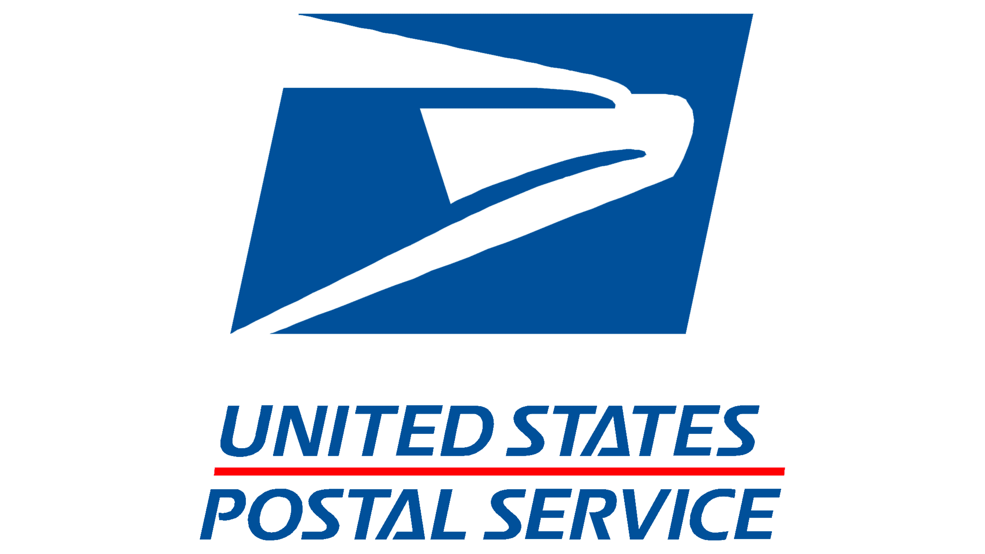
1993 – today
![]()
In 1993, there was a massive overhaul to make the logo more simplistic, comprehensive and modern. It was now a tilted azure rectangle with the eagle’s head of the same color inside it. Its muzzle was colored white for clarity, and there was also a thick white outline around the whole thing.
Emblem and History
The USPS logo is also used by several other services, most notably the Postal Inspectors – a police service tasked with keeping the post workers safe, as well as checking whether the packages are secure and not harmful. They have badges that combine the usual police badges with the USPS symbolic.