Chick-fil-A Logo
Chick-fil-A is a popular fast-food chain in America. In terms of products, they are similar to KFC, although they have a lot of distinctive features. Notably, this one never made it out of the home market in America, which is why not a lot of people have even heard about this brand in other parts of the world.
Meaning and History
‘Fil-a’ is how Americans pronounce the word ‘fillet’ – pair it with ‘chicken’, and you get a clear view of what this restaurant chain is selling. The name itself wasn’t around until 1967, when the brand got launched, incidentally. That being said, there have been predecessors with the same premise and work ethic.
What is Chick-fil-A?
Chick-fil-A is an American fastfood chain that opened in 1946. It’s one of the oldest such restaurant brands in America, although it’s not particularly known outside of the country. They specialize in chicken dishes, but also serve many other items, especially breakfast dishes, including fries, waffles, coffee and salads.
1960 – 1963
Although the restaurant officially debuted in 1967, its founder initially worked at another fast-food establishment, the Dwarf Grill near Atlanta in Hapeville, Georgia. Initially, the restaurant featured a menu item known as “Chick-fil-A,” which was the name for chicken in a sandwich. However, the dish was written slightly differently as “Chick-Fill-A,” and this unique handwritten style was used for the emblem in italics.
The logo featured a smiling chicken head in a cartoon style on the left. The drawing was created with a few simple strokes, complete with a red beard and comb. In this version, the final “a” is in lowercase.
1963 – 1964
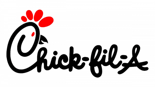
The initial logo featured a white cockerel’s head with a black-lined smile, small eyes and red elements you would normally see on the animal.
There was also a brand name immediately to the right of the main image. It was written as if by hand in a very similar approach as what we have now. Most of the writing was done in black, although the dashes and the letter ‘A’ were strongly red. That last letter was also the only part not written by hand – it looks almost serif.
1964 – 1975
In 1964, there was a significant redesign of the logo, where the developers made substantial changes. They eliminated the standalone chicken head and incorporated it into the inscription. This new version was much more appealing, as the capital “C” now featured a beak, an eye, and a crest formed by four oval elements of varying heights. This redesigned logo proudly adorned the first restaurant of the fast-food chain.
1975 – 1985
In 1975, they introduced the design that is basically what we have now but with some distinctions. The cock was gone, for starters. The writing was still hand-written, but even more fluid and soft. This time, however, most of the letters were black. The only red parts were on the first ‘C’ letter.
It was made to look like a hen. They added four red blobs onto the head to resemble a crest. There was a red dot for an eye, and they also attached a slightly opened black beak to the right side of the ‘head’, which was just a spiraled ‘C’.
1985 – 1998
In 1985 they changed just a little. The proportions on the letters shifted a bit, which made some of them look shorter and smaller.
1998 – 2012
In 1998, they decided to turn the whole thing red. It was a slightly dark hue of the red. Nothing else changed, really.
2012 – today
In 2012, they changed the color to a brighter and paler hue, so it now looked almost like pink. They also rearranged the head by making the entire letter ‘C’ smaller and narrower. Lastly, the beak finally closed to resemble just an ordinary triangle now.
Emblem and Symbol
That mix of the letter ‘C’ and the hen’s head has become something of a mascot. It’s an abridged version of the logo proper, and they use it when they can’t fit the entire thing onto the canvas. Additionally, this image is used as an icon for the app they released for mobile phones.
