La Roche-Posay Logo
La Roche-Posay, a French skincare brand, specializes in products for sensitive skin. Known for integrating thermal spring water in its formulations, the company offers a range of skincare and makeup products. Present in numerous countries, it has a strong market presence in Europe and North America. Owned by L’Oréal, the world’s largest cosmetics company, La Roche-Posay emphasizes dermatological safety, often collaborating with healthcare professionals for product development. Their product line caters to various skin needs, including anti-aging, hydration, and sun protection.
Meaning and history
La Roche-Posay’s journey is a fascinating tale of transformation and global acclaim. Originating in the picturesque French town of La Roche-Posay in 1975, it emerged as a local pharmacy gem, dedicating itself to addressing the unique skincare needs of individuals with sensitive skin. However, in 1989, this exceptional brand found a new guardian in the form of the global cosmetics giant, L’Oréal.
Under L’Oréal’s astute ownership, La Roche-Posay blossomed into a worldwide phenomenon, spreading its dermatological expertise far and wide. It has rewritten the rules of skincare, marrying scientific precision with luxurious indulgence. This brand’s relentless pursuit of innovation resulted in groundbreaking solutions for an array of skin ailments, from acne and eczema to rosacea, cementing its status as an industry leader.
La Roche-Posay didn’t just conquer its native France; it conquered the globe. Today, its products grace the shelves of more than 60 countries, testimony to its unwavering commitment to dermatological excellence. Healthcare professionals worldwide recommend its products, while legions of loyal customers swear by its transformative effects.
In essence, La Roche-Posay’s odyssey, from a local gem to a worldwide skincare sensation, is a testament to its unyielding dedication to scientific research, the pursuit of perfection, and the unwavering pursuit of skin health for all.
What is La Roche Posay?
La Roche-Posay is a French skincare specialist, particularly for sensitive skin types. It’s renowned for incorporating selenium-rich thermal spring water in its products. This water is thought to offer soothing and skin-protecting antioxidant benefits. The brand’s portfolio includes moisturizers, cleansers, sunscreens, and treatments for acne, eczema, and rosacea.
Before 2020
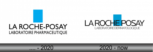
The logo presented is a minimalistic and modern design, comprising two primary elements. The dominant feature is a solid, vibrant blue rectangle with a clean, uniform color fill. It is positioned above the text, drawing the eye with its bold saturation and simple geometric form. Below the rectangle, the brand name “LA ROCHE-POSAY” is spelled out in capital letters, utilizing a sans-serif typeface that conveys a clinical or pharmaceutical quality, consistent with the brand’s identity. This typeface is characterized by its precise, unembellished lines, which speak to the brand’s focus on purity and effectiveness. The text “LABORATOIRE PHARMACEUTIQUE” is placed directly beneath the brand name in a smaller font, reinforcing the medical and scientific aspect of the brand. The entire logo uses a monochromatic color scheme, with the text set in black against a white background, which contrasts sharply with the blue rectangle, emphasizing the brand’s straightforward, no-frills approach to skincare. The overall effect of the logo is one of professionalism and trustworthiness, suggesting a brand that prides itself on its dermatological expertise.
2020 – Today
The current logo stands out from past versions with a repositioned blue square. The “LA ROCHE-POSAY” text and “LABORATOIRE DERMATOLOGIQUE” remain unchanged in bold, sans-serif font. Now, the blue square moves behind the text, altering its traditional placement.
The new logo’s dynamic design breaks from past linearity, signaling modernity and innovation. The blue square’s shift behind the text suggests movement and a progressive brand ethos. The bright blue symbolizes purity and cleanliness, key for sensitive skin product branding.
The logo refresh subtly updates its identity while respecting the brand’s heritage. It retains a clean, professional aesthetic with an engaging modern twist. This evolution reflects La Roche-Posay’s adaptability and commitment to contemporary dermatological solutions. The interplay of text and color underscores the brand’s emphasis on clarity and efficacy in skincare.


