PwC Logo
PwC is a global organization that provides consulting and auditing services. The network’s participants are legally distinct entities, according to PwC International Ltd. The company is one of the so-called Big Four audit firms and has been around for more than 160 years. PwC is recognized as one of the most influential brands in the world. It functions in more than 150 countries throughout the world and across a range of economic sectors, including telecommunications, the service sector, consumer and industrial products, and financial services.
Meaning and History
![]()
The history of the international company PwC began when Samuel Lowell Price, along with William Edwards, opened an accounting firm on December 24, 1849. Having borrowed £2,000 from his father, 23-year-old Edwin Waterhouse hung a plaque with his name in January 1864, sent business cards and business letters, and began to wait for clients. In 1998, it was given its current name when Price, Edwards, and Waterhouse joined forces. The firm’s clientele has increased throughout all economic sectors, much like the company itself. PwC has been named one of the Top 100 Global Brands by Brand Finance since 2007 and is the number one brand in the commercial services sector. When it came to the biggest audit and consulting firms, PwC even came in first position in 2012.
What is PwC?
PricewaterhouseCoopers is a leading brand among the Big Four firms. The network of PwC firms provides audit, tax, and advisory services that aim to add value to business clients.
1998 – 2010
![]()
The first logo of the service was not what one would expect from a company that deals with serious matters. However, it did not stand in its way to success. The logo was simply the full name of the company printed in bold, sans-serif font with the first letters being capitalized. The black color and an exquisite, small monogram on the far right added a professional touch. The inscription looked dynamic and funky because some of the letters were placed higher or lower and broke up the straight line. The designers surely wanted to show that the company can think outside the box and is not afraid to experiment.
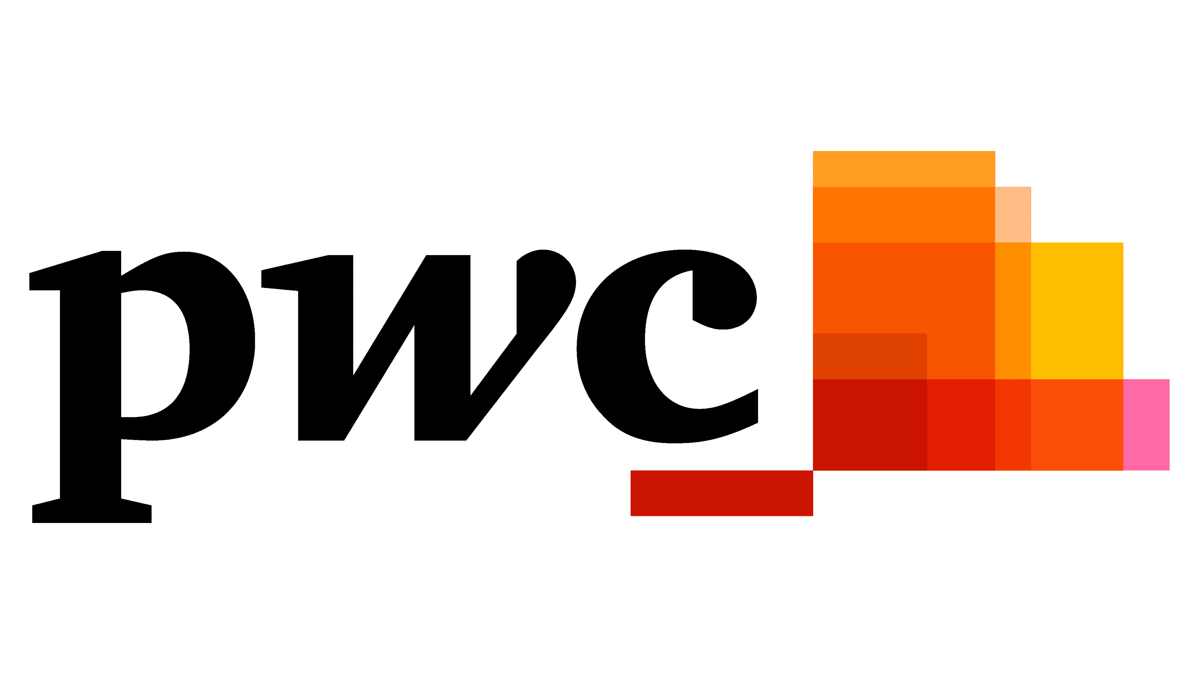
2010 – Today
![]()
The new logo of the consulting company uses only the initials, which were printed using all lowercase letters. The designer, Wolff Olins, used a bold font with slab serifs. The black inscription was accompanied by a colorful image in the upper right corner, made up of multicolor rectangles of different sizes stacked one over the other. As the company says, there is a story behind this emblem. The “Jenga” game served as an inspiration. The skills and virtues, such as patience, trust, groupwork, responsibility, and analysis, are all represented in this game. This is the message the company wanted to send with its updated brand image. The abstract image is done in red, orange, and yellow colors.
Font and Color

The company initially went for a rather safe and traditional color palette, black and white. However, in 2010, it introduced bolder color choices and added red, orange, yellow, and a bit of pink. These are associated with energy, optimism, opportunity, creativity, and other positive emotions.
The original logo uses a rather traditional sans-serif bold typeface that looks a lot like Helvetica font. In 2010, it introduced a slab serif font ITC Charter Black. Just like in the original logo, the company added a little unique touch to the inscription in the second version and made the second letter italicized.


