Maybank Logo
Maybank is a large Malaysian bank, among the most prominent in the country. It provides all the regular banking services, including loans, credit and debit cards, and insurance. They don’t just operate in Malaysia. There are large clusters of these banks in neighboring Singapore and Indonesia, as well as smaller numbers in other countries of the world. For instance, a few operate in the United States, the United Kingdom, and Europe.
Meaning and History
![]()
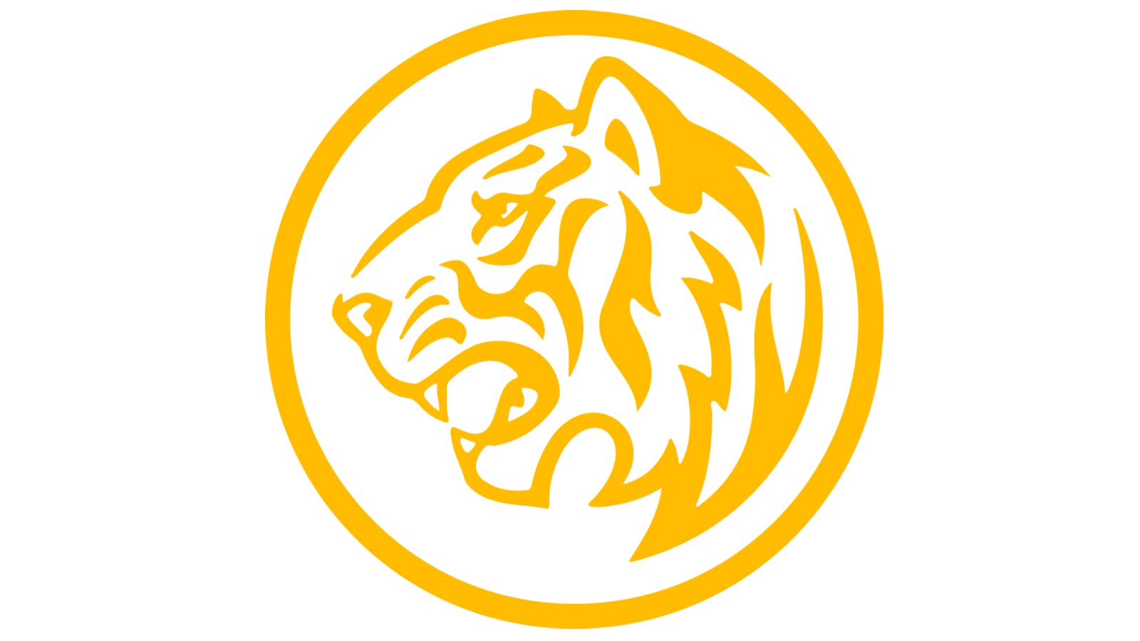
Maybank (full name Malayan Banking Berhad) was founded in 1960 as a means to process deals for international trade. ‘Berhad’ in the name denotes a public limited company. The rest of the name is self-explanatory. Nowadays, Maybank grew to become a general-purpose bank, fit for personal, home, education, and other loans. The tiger, typically depicted in the Maybank imagery, is a national animal of this country. The color scheme also resembles that of a tiger, although with some changes.
What is Maybank?
Maybank is one of the largest banks in Malaysia. Not only do they provide banking services and financial consulting, but the company also provides insurance for education, retirement, business, health, and more. It’s an extensive company with branches in many countries of Asia and the world.
1993 – 2012
![]()
The 1993 logo is a long yellow rectangle with the word ‘Maybank’ stretched thin across it so that the letters look overly squat. They don’t occupy the entirety of this figure – the left-most section is given over to a small emblem that features a tiger’s head inside a ring. The head looks grotesque – although very nuanced, it’s not really realistic. The emblem itself is very small, compared even to the letters.
2012 – today
![]()
The next logo largely follows the same design, but with tweaked elements. The rectangle became much wider, which made it possible for the letters to become taller and, therefore, better-proportioned. They also changed the font into a cleaner, smoother style. The emblem on the left endured many tweaks. Firstly, they made it much larger. Secondly, the head itself is not much more realistic – it truly resembles a tiger’s head en profile, rather than a hyena of sorts, like before.
Font
The letters they used in these logos are bold, sans-serif characters. In the older versions, they were stricter and similar to the many office styles. Later, sanded them down & made them smoother and more fluid. As a result, there are very few sharp corners. Instead, the turns here are round and smooth. In the company’s name, the letters are mostly lowercase, save for the very first one. In the very first logo, they are also stretched sideways into ill proportions.
Color
The colors for much of their branding are bright tallow and black. This color scheme is similar to a fur of a tiger, but yellow is also one of the national colors of Malaysia. It’s the same shade of golden yellow as seen on their flag. In these logos, the black is used for the letters and the lines in the emblem to the left. Space around these black objects is completely yellow, which creates a pleasant, strict combination.


