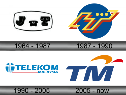
Telekom Malaysia Logo
TM (or Telekom Malaysia) is the chief telecommunications corporation in Malaysia. It’s responsible for much of the telephone connection in the country. Throughout its rich history, it’s been known under different names. The current name has only been introduced in 1990 when the company was heavily rebranded.
Meaning and History
One way or another, the company has been around for a long time. Independently, it operated since 1957 when the company coincidentally gained independence. Throughout the years, it’s been known as ‘Jabatan Telekom’ (Department Telekom), ‘Syarikat Telekom Malaysia’ and finally just ‘Telekom Malaysia’ (or TM).
1964 – 1987
The company got its first logotype in 1964, although it’s been in operation for 7 years already.
This logo featured a bloated black rectangle with thick uppercase letters ‘J’ (for Jabatan, which translates to ‘department’) and ‘T’ (Telekom). The company mostly worked around providing telephone connection to Malayans. That’s why there’s also a little stationary telephone in the middle on the emblem.
1987 – 1990
In 1987, the company was renamed to Syarikat Telekom Malaysia, which basically means ‘Telekom company Malaysia’. The logo, however, is not so comprehensive. It’s a blue circle with something written in yellow and red on top of it. In fact, if it is written in some sort of local script – for instance, the Jawi alphabet – then it’s not eligible.
It’s just a combination of lines culminating in three yellow dots in the top right part of the emblem.
1990 – 2005
In 1990, the company was again renamed, this time to ‘Telekom Malaysia’, often shortened to just TM. The chief part of the logo was the name itself – the world ‘Telekom’ written in uppercase, as well as the word ‘Malaysia’ written in the same style below the right side of the first word.
To the left of these was a blue circle with 5 stylistic white cables going upwards from the right bottom part. Two on the sides eventually spread out into two wider cables to probably signify the crossroads and, hence, connection.
2005 – today
By 2005 they realized that most people called them ‘TM’ anyway and changed the logo to this variant instead. The two dark blue letters are written in fluid manner and are tilted to the right slightly.
Emblem and Symbol
The 2005 logo also has two additional details. There is a moon-like orange blot on top and another red half-circle next to it. These, alongside the colors of the letters, represent the colors met on the Malaysian national flag. It’s a lot like the American flag, but it has orange imagery of moon and sun where the stars would be.


