Liberty Flames Logo
The Liberty Flames refer to the sports teams of Liberty University. Jerry Falwell, a prominent evangelical leader, founded these teams. The creation took place in Lynchburg, Virginia. The teams were formed to promote school spirit and participate in intercollegiate athletics.
Meaning and history
Liberty Flames emerged in 1971 when Liberty University began its journey in intercollegiate sports. Initially, the school aimed to boost community and student engagement through sports. As the university grew, so did the scope of its athletic programs. By 1988, the Flames had made significant progress, marking their presence in NCAA Division I, the highest level of college athletics in the United States. This transition reflected the university’s commitment to excellence in sports and academia. Over the years, the Liberty Flames have won multiple conference championships, showcasing their prowess and the effectiveness of their athletic programs.
What is Liberty Flames?
Liberty Flames is the collective name for the athletic teams of Liberty University. These teams compete in various sports at the NCAA Division I level. The name reflects the spirit and passion of the university’s athletic endeavors.
1979 – 1980
The logo features a powerful, soaring eagle depicted in bold blue lines with a touch of red on its talon, clutching a flaming torch. This striking image symbolizes strength, freedom, and enlightenment, capturing the essence of dynamic movement and fierce determination. The minimalistic use of colors highlights the eagle’s majestic form and the flame’s intensity, emphasizing vitality and passion.
1980 – 1984
The updated logo showcases a dynamic, upward-soaring eagle entirely in a vivid red silhouette within a circular boundary. The stylized word “flames” beneath the circle adds a modern, energetic touch with its flowing, cursive script. This design shifts from a dual-color representation to a singular, impactful red, focusing on simplicity and visual impact. The overall composition is cleaner, more contemporary, and sharply defines the eagle’s ascent, symbolizing rising ambition and fiery spirit.
1984 – 1985
This logo features a sleek, red circular design encapsulating a stylized bird’s head, outlined minimally yet effectively within. The bird’s profile is captured in a forward-looking pose, suggesting alertness and readiness. Surrounding the circle, red flames sweep back gracefully, implying speed and dynamism. This artistic blend of elements symbolizes energy and passion. The use of a single color accentuates the logo’s modern simplicity and visual impact. The overall design is both symbolic and straightforward, emphasizing a fierce and spirited identity.
1985 – 2000
The logo now completely abandons the flame motif, opting for a bold, block-letter “LU” in blue and red. The design is straightforward and focuses on the initials of Liberty University. Underneath, “Liberty University” is written in smaller red font, enhancing brand recognition. This version shifts towards a corporate, institutional identity, emphasizing clarity and simplicity over symbolic imagery. The clean lines and clear color contrast portray a more formal and professional image.
2000 – 2003
The logo reintroduces dynamic elements, combining the previous block “LU” with flowing, stylized blue flames. The “LU” remains prominently outlined in red, enhancing visual contrast against the dark blue. The addition of flames signifies a return to the university’s spirited identity, blending traditional and modern aesthetics. This design conveys motion and energy, aligning with the university’s ethos of dynamism and progress. The streamlined flames also suggest speed and transformation, revitalizing the brand’s image.
2003 – 2013
This logo iteration reintroduces a detailed eagle head, rendered in red and white, symbolizing strength and vigilance. The eagle is streamlined, with flowing lines that mimic flames, integrating the “flames” theme both visually and textually. “Liberty Flames” is boldly spelled out below in solid blue, providing a strong contrast. This design blends traditional mascot imagery with modern graphic style, emphasizing agility and spirit. The overall look is sharp, modern, and more graphically complex than its predecessor.
2013 – Today
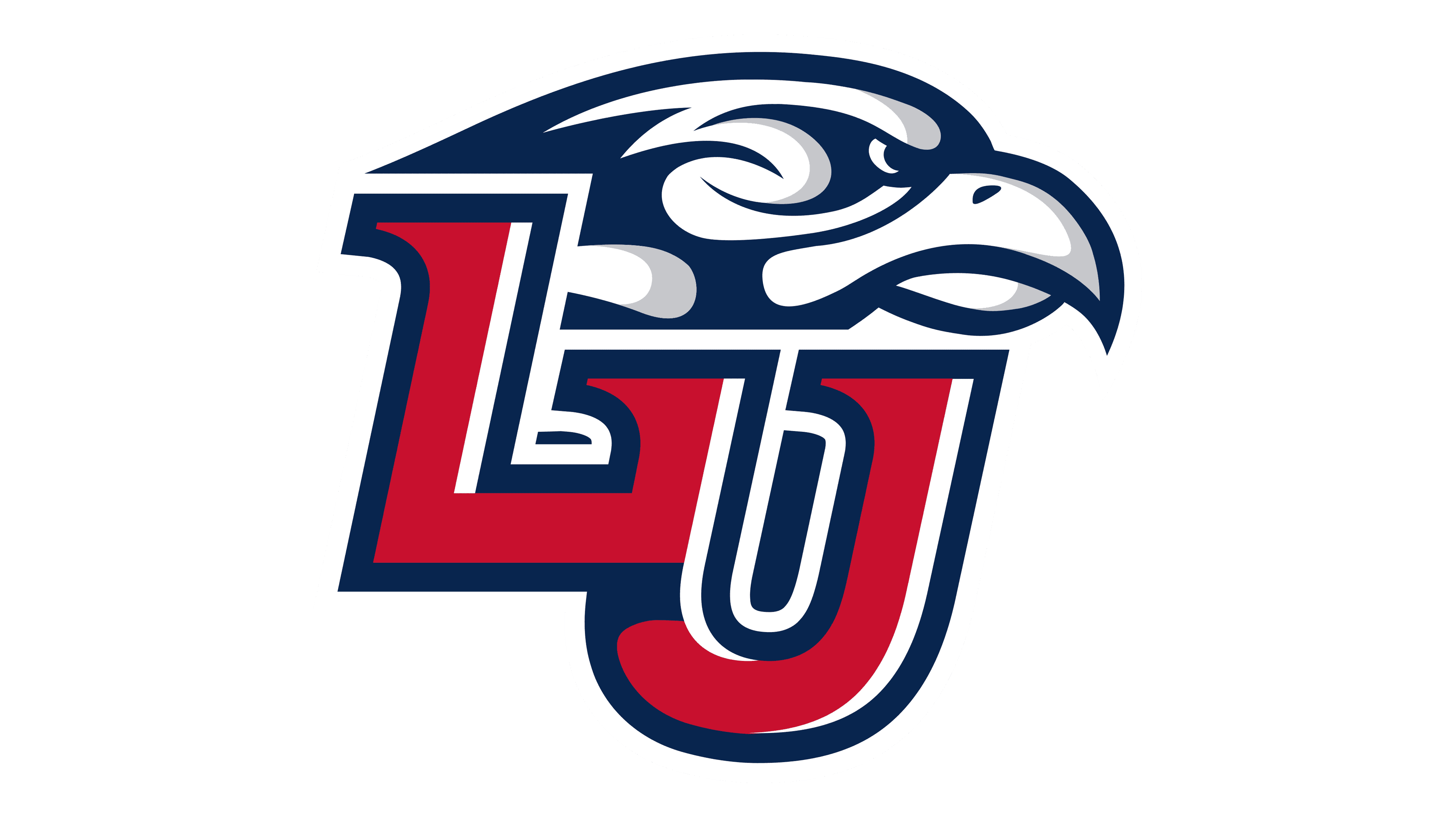
The logo now incorporates a stylized eagle head integrated with the letters “LU”, merging mascot and monogram. This design combines deep blue, red, and white, enhancing depth and dimension. The eagle’s head is more abstract and artistic, using negative space effectively. The “LU” is bold and prominently foregrounded, anchoring the design. This version unites the university’s initials and its mascot symbolically and visually, strengthening brand identity and continuity. The overall style is modern, sharp, and distinctly collegiate.


