Logitech Logo
Other than the computer mice it initially started with, Logitech is recognized for speakers, keyboards, cameras, headphones, headsets, gaming devices, music systems, video surveillance products, and remote controls. Logitech continues to advance in PC navigation, online communication, digital music, home entertainment control, gaming, and wireless devices. Logitech has been actively extending its geographic reach since it was founded.
Meaning and History
The history of Logitech began in 1981 with the creation of computer mice, which were new at the time and offered a more intuitive to use a computer. After gaining expertise and accumulating some financial resources, two Stanford University students, Daniel Borel from Switzerland and Pierluigi Zappacosta from Italy, along with Giacomo Marini, a former manager of Olivetti, launch their own business, Logitech S.A., in Switzerland. In the 1990s, the management took internet communications breakthroughs seriously. Significant management changes happened in 1998 when Guerrino de Luca from Apple joins Logitech as President and CEO and brings a wealth of expertise. The business continued developing wireless technology in the 2000s and soon established itself as an expert in the industry. Since Borel and Zappacosta had been programmers before, it was intended to call the venture Softech. It was already taken, though, so the founders of Logitech decided to use the root for the French term for software – “logiciel.”
What is Logitech?
The business has established itself as a market leader when it comes to mice devices and has created several versions to cater to the changing demands of desktop and laptop customers. The corporation sells its goods in practically every nation on earth.
1981 – 1985
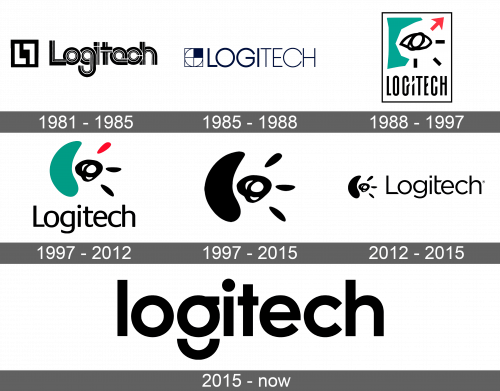
The original logo looked quite futuristic. It was the name of the company done using a geometric font with letters overlapping each other. Although it was black and white, the logo did not look boring or plain as each letter had two thinner black lines complementing each main thick line. The wordmark was further enhanced by an image that looked like a black square with two white “L”s and one of them being mirrored and turned upside down
1985 – 1988
An updated version had a simpler, yet more stylish appearance. All the letters were now capitalized and done in dark blue. The first half of the name was bolder, which added some interest. There was still a square on the left of the name. It had a thin border with a thin circle inside of it. The circle was broken down into four sections. It looked as if it had the letter “L” because the upper right corner was filled with dark blue, while the remaining sections were white.
1988 – 1997
The logo underwent a complete redesign. It looked very abstract and presented the whole emblem on a white square with a thin black frame. At the bottom, there was the name of the company done using a sans-serif font with all uppercase letters. It appeared that the tail of the letter “G” was crossing the next letter as the “I” had a diagonal white slit doing through its upper half. The most interesting part was above it. it was a rough drawing of an eye using a black color, which was accompanied by three dashes going outwards in the lower right portion of the drawing and a bigger red arrow pointing up. The dashes resembled eyelashes, while a bright green abstract shape on the left is meant to be a nose.
1997 – 2015
The eye and nose drawing with all the arrows was redrawn to give it a much smoother and rounded look. Instead of three dashes and an arrow, the eye had only three rounded dashes coming out on the right and being quite symmetrical. While the eye looked bolder, the nose now resembled an uneven shape of a half moon. The whole emblem was done in black and had a much more sophisticated appearance.
1997 – 2012
The logo lost the black frame and updated the font. The smooth, rounded version of the abstract drawing accompanied the name, only it was done in color like the original one. The font looked quite basic with clean lines and smooth curves. This logo had a balanced and harmonious feel.
2012 – 2015
The company used a new font, although the overall look was very similar to what the company had earlier. A black and white image of an eye (its rounded version) was placed to the left of the name. although there was no color, it looked quite familiar.
2015 – Today
This was the first time the company’s emblem did not have the eye element as part of its logo after a long period. The name of the company in all lowercase letters was presented without any other details. The font did not look fancy with an exception of the letter “g”, which had its tail disconnected and resemble a half circle that was placed under the upper half of the letter.
Font and Color
An original geometric font that featured multiple lines of varying thickness was replaced by a simpler sans-serif typeface with clean lines. The font used from 1997 until 2012 is called Praxis Pro Regular. In the logo introduced in 2015, the brand used a customized version of the Oceanwide Pro Semibold font. Although the color scheme is not very unique, black and white is a classic choice that many large, successful companies go for. The addition of green and red created a good combination of colors and added some energy to the emblem.


