Maryland Terrapins Logo
The Maryland Terrapins, representing the University of Maryland, College Park, are a symbol of athletic excellence in collegiate sports. Known as the “Terps,” they compete in the NCAA Division I, showcasing their prowess in the Big Ten Conference. Their iconic mascot, Testudo, a Diamondback terrapin, embodies the spirit of Maryland’s athletic teams. Renowned for their basketball, lacrosse, and football teams, the Terps have a history rich with national championships and notable alumni. With a passionate fan base, the Terrapins play a significant role in Maryland’s sports culture, embodying both competitive spirit and academic integrity.
Meaning and history
The Maryland Terrapins, the athletic teams of the University of Maryland, College Park, have a storied history dating back to the early 20th century. The “Terrapins” moniker, inspired by the Diamondback terrapin, a species native to Maryland, was adopted in 1933, symbolizing the state’s unique heritage.
In their early years, the Terrapins excelled in football under the leadership of coaches like H.C. Byrd, after whom the university’s original stadium was named. They became a powerhouse in the Atlantic Coast Conference (ACC), their home for over 60 years, before transitioning to the Big Ten Conference in 2014, marking a new era in their history.
Maryland’s basketball program has been a cornerstone of its athletic identity. The men’s team, under Coach Gary Williams, reached its zenith in 2002 by winning the NCAA Championship. The women’s basketball team, equally formidable, captured the NCAA title in 2006 under Coach Brenda Frese, establishing themselves as a dominant force in women’s college basketball.
The Terrapins’ lacrosse teams, both men’s and women’s, have a legacy of success, with multiple national championships that highlight their dominance in the sport. The men’s team has been particularly successful, with a history stretching back to national titles in the 1970s and maintaining prominence to this day.
In track and field, the Terrapins have produced several Olympic athletes, showcasing their broader impact beyond collegiate sports. Their soccer programs, too, have made significant strides, with the men’s team winning multiple NCAA Championships.
Throughout their history, the Terrapins have not only excelled in sports but also fostered a sense of community and pride among students, alumni, and Maryland residents. Their mascot, Testudo, is a beloved figure, often seen as a symbol of good luck, with students leaving offerings at its statue for good fortune.
As they continue to compete at the highest levels of collegiate athletics, the Maryland Terrapins carry with them a legacy of sporting excellence, a commitment to academic achievement, and a deep connection to the state of Maryland and its rich athletic heritage.
1967 – 1970
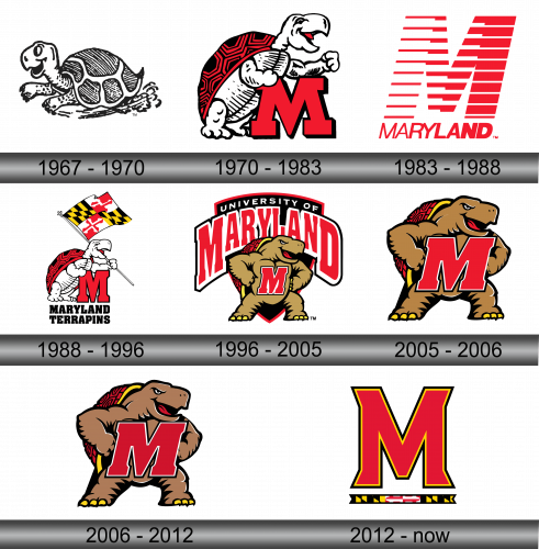
This logo is a creative rendition of the Maryland Terrapins’ emblem, showcasing a cartoonish terrapin mid-stride. It sports a pronounced, genial grin, and its eye is round and lively, imparting a sense of vigor and approachability. Detailed with textured striations, the terrapin’s shell appears almost like a fingerprint, individualistic and distinctive. The limbs are etched with lines that suggest swift, rhythmic motion, mirroring the dynamism and zest of Maryland’s athletic squads. This logo is more than a mere symbol; it is an artistic encapsulation of the university’s sporting ethos, radiating with a jovial yet competitive aura that is both endearing and emblematic of the Maryland Terrapins’ legacy.
1970 – 1983
This logo portrays a more dynamic and stylized terrapin perched atop a bold red letter ‘M’, signifying the University of Maryland. Unlike the previous emblem, this terrapin is depicted with greater detail and a sense of movement, its muscular arms raised as if in mid-cheer, exuding a more competitive and animated vibe. The shell features a complex maze-like pattern, adding a layer of visual intricacy. This logo contrasts with the former by infusing more action and vigor, aligning with the athletic prowess of the Maryland Terrapins. It captures the essence of collegiate sports: spirited, bold, and full of energy.
1983 – 1988
This logo presents a modern, abstract interpretation of the letter “M,” synonymous with Maryland, composed of bold red bars that fracture and shift, creating a sense of motion and depth. In stark contrast to the previous, more literal terrapin imagery, this design leans into minimalism, evoking the state flag’s patterns in a stylized form. Below, “MARYLAND” is spelled out, anchoring the design with clarity. This emblem is a departure from the traditional mascot-based logos, favoring a sleek, contemporary aesthetic that still manages to convey the energy and forward momentum of the Maryland Terrapins.
1988 – 1996
This vibrant logo merges the Maryland state flag with the athletic might of the Maryland Terrapins. The terrapin, flexing with a broad smile, now triumphantly hoists the flag, a nod to state pride. Contrasting with the previous minimalist ‘M’, this version returns to the full-bodied mascot, adding celebratory flair. Beneath, bold lettering proclaims “MARYLAND TERRAPINS,” asserting the name with as much vigor as the terrapin above. This logo harmoniously combines tradition with the lively spirit of Maryland’s sports teams, a distinct shift from the abstract representation before it.
1996 – 2005
The current logo for the Maryland Terrapins exudes confidence and might, featuring a robust terrapin, arms folded, behind a shield emblazoned with the letter ‘M’. This marks a shift from previous designs by combining the mascot with the emblematic power of a crest. The wordmark ‘UNIVERSITY OF MARYLAND’ arches protectively over the terrapin, asserting the institution’s identity. The terrapin’s gaze is forward, ready for action, reflecting the university’s focus on the future and ambition in collegiate athletics, distinct from the celebratory posture of the flag-bearing terrapin in the prior logo.
2005 – 2006
This logo features a confident terrapin with a wide stance, holding a red ‘M’ shield, suggesting readiness and resilience. It differs from the previous logo, which had the terrapin behind the shield, by placing the mascot at the forefront, emphasizing its role as the face of Maryland pride. The terrapin’s expression is friendly yet determined, a balance between approachability and competitive spirit. This design iteration underscores the prominence of the terrapin in representing the university’s athletic teams.
2006 – 2012
The logo features a terrapin confidently clutching the iconic red ‘M’, symbolizing the University of Maryland. This version retains the previous design’s boldness but adds a subtle enhancement to the terrapin’s detail, giving it a more modern feel. The mascot’s stance is assertive, reflecting the university’s proud athletic tradition. The design is a testament to the Terrapins’ enduring spirit, blending classic and contemporary elements.
2012 – Today
The logo showcases a bold red ‘M’ with a yellow and black outline, reflecting the University of Maryland’s colors. Beneath it is a banner with a stylized depiction of the Maryland state flag. This minimalistic design focuses solely on the letter ‘M’, a departure from the previous logos that featured the terrapin mascot. It’s a modern take on university branding, emphasizing strong typography and state identity over the visual of the mascot. This logo’s simplicity and focus on the letter make it versatile for various applications, symbolizing the university itself.
