Tennessee Volunteers Logo
Tennessee Volunteers represent one of the oldest educational institutions in the United States. There are multiple sports programs that play under the same logo. They cover the typical American sports, such as football, baseball, basketball, track & field, soccer, and softball, among several others. The teams are playing as part of the Big 12 Conference, NCAA Division 1, and SEC. The athletic program is one of the few across the country that does not receive state funding, but it still manages to be one of the best.
Meaning and History
Back in 1794, the University of Tennessee got many athletic students who make it proud by playing and winning various games. The women’s basketball team, for instance, won 18 gold, 3 silver, and 1 bronze medals during the Olympic games. The men’s swimming and diving team also brought 7 gold medals. Not many know why the team has such an interesting name. However, if you are familiar with the history, the state in which it plays has been nicknamed Volunteer State since 1812 because it had a lot of men volunteer to go fight for their country.
What is Tennessee Volunteers?
Also known as Vols, this is an athletic program at the University of Tennessee. There are over ten different sports that have both men’s and women’s programs.
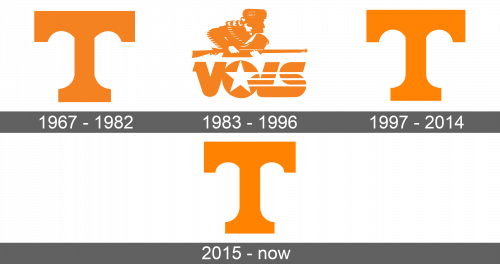
1967 – 1982
The capital letter “T” was the only element of the logo. Its height was the same as its width. The sides of the horizontal line are pretty wide. They turn at a right angle just a little inside and then connect to the vertical line in an arch. The sides of the vertical line also connect to the bottom line creating a smooth slope. Overall, the logo looks very balanced, while a bright orange color stands for success, determination, and enthusiasm.
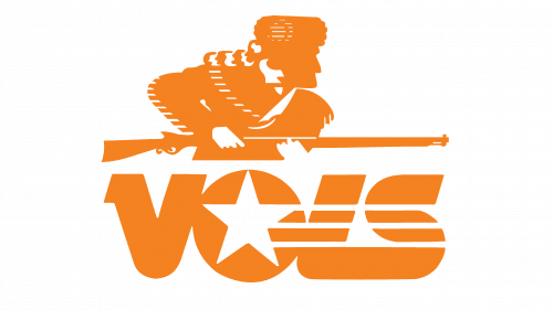
1983 – 1996
A new logo design was used for a little over ten years since 1983. At the bottom, it had their name shortened to “VOLS”. All the letters were capital and interconnected. They had smooth curves and straight lines. In the center of “O”, there was a white star with three lines coming out of it to the right and crossing the other two letters, which added some movement to the emblem. Above the word, there was a figure of a hunter visible to a waistline. He was looking right and holding a rifle, which was drawn in parallel to the word and had the same length as it did. The character looked focused on his goal. He had a fur hat on his head that was decorated with a tail of a raccoon. The coat also had interesting details in the form of strips on its sleeves and collar. The whole logo was done in orange and white colors.
1997 – 2014
After a while, the team brought back the “T” it used before. It was exactly the same emblem. The team even kept the orange color, which looked a bit lighter.
2015 – Today
In 2015, the look of the logo was updated. It had a brighter color, which made it look full of energy. The top horizontal line was shortened, so it was no longer the same length as it was tall. This made it look more like a letter than a sign. The arches inside the letter were also adjusted accordingly.


