Memphis Tigers Logo
The Memphis Tigers represent the athletic teams of the University of Memphis. Established in Memphis, Tennessee, they were formed to compete in college sports. The teams participate primarily in NCAA Division I athletics. The Memphis Tigers have achieved prominence through a commitment to athletic excellence.
Meaning and history
The Memphis Tigers date back to 1912, initially competing as the “Normalites”. They later adopted the “Tigers” nickname, symbolizing fierceness and competitive spirit. The Tigers’ colors, blue and gray, were chosen to honor the Civil War’s reconciliation between the North and South. Over the years, the teams have participated in various conferences, significantly shaping their competitive legacy. Notable shifts include joining the Missouri Valley Conference in 1968 and Conference USA in 1995. In 2013, they became members of the American Athletic Conference, marking a new era in their history.
What is Memphis Tigers?
The Memphis Tigers are the athletic teams of the University of Memphis, competing in NCAA Division I sports. They encompass a wide range of sports, including basketball, football, and soccer. The teams are known for their spirited and competitive play, embodying the university’s values and pride.
1963 – 1965
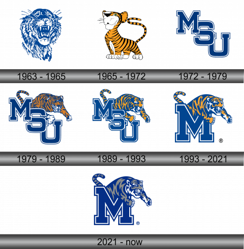
The logo features a fierce tiger’s head, its features sketched in bold, expressive lines. Shades of blue define the contours, highlighting the animal’s raw intensity. Its eyes, wide and piercing, convey determination. Whiskers fan outward, complementing the creature’s snarl. Every stroke illustrates movement, as if capturing the tiger in mid-roar, encapsulating the spirit of competition. This emblem, a symbol of tenacity, embodies the drive and passion of a team ready to face challenges head-on.
1965 – 1972
This logo presents a cartoonish tiger, a stark contrast from the previous design. It features bold orange stripes on a playful stance, conveying a friendlier image. Bright-eyed with a cheeky grin, the tiger’s upturned gaze suggests optimism. Its large paws and pronounced whiskers add to the whimsical charm. A long, striped tail curls upwards, balancing the image with a sense of motion. This illustration opts for a more approachable and animated character, signaling a team that is not only fierce but also engaging and spirited.
1972 – 1979
This emblem shifts from playful animation to bold typography. The “MSU” letters interlock in a strong, navy blue font, emphasizing the institution’s acronym. The design opts for simplicity and impact, focusing on the school’s initials rather than its mascot. Gone are the tiger stripes and cartoonish charm, replaced by a straightforward and professional appearance. This visual approach targets immediate recognition, suitable for a variety of applications. It reflects a more formal and unified representation of the university’s identity.
1979 – 1989
The latest iteration marries the bold typography of “MSU” with the tiger motif. The tiger leaps forward, integrating with the letters, signifying a return to the mascot’s dynamic presence. This fusion symbolizes the university’s spirit and its athletic prowess. The tiger’s stripes and fierce expression are detailed, projecting strength and determination. Its positioning over the letters creates a layered effect, adding depth. This design balances the formality of the acronym with the vitality of the mascot, crafting a comprehensive identity.
1989 – 1993
In this logo, the tiger’s pose is more pronounced, enhancing the visual impact. The tiger, poised and powerful, now overlaps the “MSU” acronym more assertively. Its stripes are refined, creating a more realistic portrayal. The color contrast is sharper, with the orange and blue more vivid, adding to the design’s boldness. This tiger seems to leap out of the frame, symbolizing forward motion and progress. The depiction conveys agility and readiness, traits that align with the university’s competitive ethos.
1993 – 2021
In this evolution, the tiger climbs atop the “M,” asserting dominance in the visual hierarchy. The “M” is now standalone, dropping “S” and “U” for a simplified, stronger focus. The tiger’s depiction is more detailed, with each stripe and muscle finely rendered. Its face is fierce, its paws gripping the “M”, as if taking possession of the letter and, by extension, the brand it represents. The color palette remains consistent, with the navy and orange colors signifying tradition and energy. The addition of the registered trademark symbol underscores the logo’s official status.
2021 – Today
The tiger’s shading has evolved to a single navy tone, streamlining the design for a more modern look. Its form is unaltered, but the monochromatic approach emphasizes the graphic’s clean lines and shapes. The tiger maintains its fierce stance atop the “M”, reflecting continuity and tradition. The “M” itself remains a prominent, bold character, anchoring the logo with a sense of stability. This subtle shift to a single color enhances the logo’s versatility and reinforces the tiger’s iconic status within the brand.

