Midea Logo
Midea stands as a global titan in home appliances and HVAC systems. He Xiangjian, its founder, launched it in Guangdong, China. Initially, Midea’s aim was to simplify daily chores through innovative appliances. It successfully merges cutting-edge technology with practical utility.
Meaning and History
Midea began in 1968, starting as a small workshop in China. It initially focused on plastic products. By 1980, Midea expanded into the appliance market, launching its first air conditioner. Ownership changes were minimal, with founder He Xiangjian retaining control. The company went public in 2013, diversifying its product line and global presence. Midea acquired KUKA, a German robotics firm, in 2016, signaling a shift towards smart manufacturing. Throughout, Midea emphasized innovation and global expansion, becoming a leading home appliance brand worldwide. Its growth strategy included strategic acquisitions and a focus on R&D. Midea is known for its diverse range of products, including kitchen appliances, HVAC systems, and robotics, maintaining a strong global presence.
What is Midea?
Midea is a renowned brand, specializing in manufacturing home appliances. Known for its innovative products, it makes life easier and more comfortable. Midea continues to lead with its forward-thinking approach and global presence.
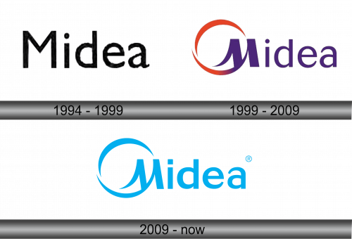
1994 – 1999
The logo showcases “Midea” in a bold, monochromatic font, conveying simplicity and modernity. Its minimalist design features sturdy, upright letters, with a distinct dot accentuating the ‘i’, adding a touch of uniqueness. The typeface’s slight irregularities suggest a human touch, blending industrial strength with approachable warmth.
1999 – 2009
In this evolved logo, Midea embraces color, adding vitality to its identity. The iconic ‘M’ merges with a dynamic swoosh, symbolizing movement and innovation. This swirl, in hues of red and orange, suggests energy and warmth. Below, the word ‘Midea’ appears in a clean, purple sans-serif, embodying sophistication and modernity. This logo marks a significant shift from the stark monochrome, infusing the brand with a lively, contemporary spirit.
2009 – Today
The logo shifts to a refreshing blue palette, echoing clarity and trust. The ‘M’ and the swoosh remain, now streamlined for a cleaner look. This design embodies serenity and reliability, key qualities in the appliance industry. The use of blue also reflects Midea’s commitment to innovation and efficiency. With a registered trademark symbol, the brand asserts its established presence.


