Mississippi Rebels Logo
The Mississippi Rebels, often referred to as Ole Miss Rebels, represent the University of Mississippi in college sports. Established in the late 19th century, they compete in the NCAA’s Division I and the Southeastern Conference (SEC). The name “Rebels” was adopted to embody the spirit of independence and determination. The university, located in Oxford, Mississippi, created these teams to participate in various sports, promoting athletic excellence and school spirit. The teams participate in a wide range of sports, including football, basketball, and baseball.
Meaning and history
The Mississippi Rebels, symbolizing the University of Mississippi, have a storied history. Established in the late 1800s, they joined the Southeastern Conference (SEC) in 1932. Initially, they focused on football, basketball, and baseball. Their football team gained prominence in the 1950s and 1960s under Coach Johnny Vaught, securing multiple SEC titles. In the 1970s and 1980s, the Rebels faced challenges but remained resilient in various sports. Women’s sports, introduced in the 1970s, brought new successes. The 1990s and 2000s saw improved facilities and renewed competitiveness. Recent years highlight advancements in athletics and commitment to excellence. The Rebels continue to be a symbol of pride for the University of Mississippi.
What is Mississippi Rebels?
The Mississippi Rebels, often referred to as “Ole Miss Rebels,” represent the University of Mississippi in collegiate sports. As a part of the NCAA’s Division I, they compete primarily in the Southeastern Conference, showcasing prowess in a range of sports including football, basketball, and baseball. This team stands as a beacon of athletic spirit and pride for the university.
1970 – 2002
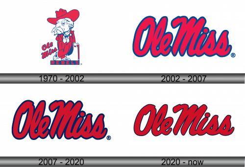
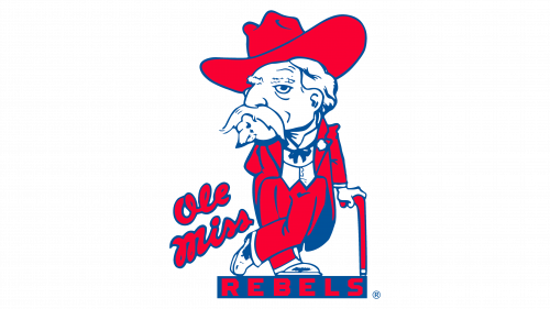
The logo features an older man with a stern gaze, clad in a vibrant red suit and matching wide-brimmed hat. His white mustache droops grandly, complementing a rebellious demeanor. He leans on a cane, suggesting wisdom and experience. Beneath him, “Ole Miss” in cursive script bleeds into “Rebels,” proclaiming the team’s identity in bold, block letters, all set against a stark black backdrop. This emblem evokes the historic pride and fighting spirit of the team.
2002 – 2007
This logo showcases “Ole Miss” in stylized, flowing script, bathed in vibrant red with a subtle navy outline. Absent is the earlier detailed figure, opting instead for a simple, bold text focus. The cursive lends a casual yet dynamic flair, reflecting a modern collegiate vibe. This version emphasizes movement and energy, resonating with a younger audience while maintaining the iconic red and blue of the Rebels’ identity. It’s a minimalist shift from tradition to contemporaneity.
2007 – 2020
The logo is the same as before, depicting the distinctive “Ole Miss” text. It’s a text-based logo, sans imagery, exuding a classic yet bold aura with its red and blue color scheme. The font is cursive, fluid, and assertive, representing the university’s dynamic and spirited nature. It’s a streamlined symbol, a departure from traditional mascots to a more graphic-oriented identity, reflecting modern design trends in collegiate branding.
2020 – Today
This image remains consistent with the previous ones, highlighting the “Ole Miss” script in its iconic red hue edged with a navy outline. There’s no discernible change in the visual elements. The design stays true to its bold, cursive font, which conveys a sense of tradition and enduring spirit. This logo iteration continues to represent the university with a clear and vibrant brand identity, focusing on the name itself to evoke a sense of collegiate pride and energy.
