Oregon State Beavers Logo
The Oregon State Beavers, representing Oregon State University in intercollegiate athletics, are known for their competitive spirit and notable achievements across various sports. Based in Corvallis, Oregon, this team is a part of the Pac-12 Conference, actively competing in NCAA Division I. Their mascot, Benny the Beaver, is a beloved figure, symbolizing the team’s resilience and determination. The Beavers have earned recognition, especially in baseball and football, showcasing a blend of talent, teamwork, and sportsmanship. Their orange and black colors are widely recognized, epitomizing the university’s vibrant spirit and commitment to excellence in athletics.
Meaning and history
The Oregon State Beavers, representing Oregon State University, boast a storied past in collegiate sports that traces back to the 1890s. Initially centered around football, the Beavers’ athletic program soon expanded, embracing a wide array of sports and establishing a reputation in NCAA Division I.
In football, a defining moment came in the 1960s under the leadership of Coach Dee Andros. This period, known for its ‘Giant Killer’ era, was marked by surprising victories against top-tier teams, significantly elevating the team’s profile nationally.
The 21st century heralded a golden age for the Beavers, especially in baseball. Their exceptional performance peaked with consecutive College World Series titles in 2006 and 2007, a feat that etched their name in the annals of college baseball.
The Beavers’ prowess isn’t confined to male sports; their women’s basketball and soccer teams have made remarkable strides, achieving commendable success in NCAA competitions. This reflects the university’s dedication to fostering an inclusive and competitive environment across all sports.
Benny the Beaver, their iconic mascot, along with the university’s striking orange and black colors, symbolize not just athletic prowess but also a unifying spirit that resonates with the community, alumni, and supporters.
Navigating through various challenges such as changes in coaching staff and fluctuating team performances, the Beavers have shown remarkable resilience. Their commitment to sportsmanship and excellence continues to inspire and shape the future of Oregon State’s athletic endeavors.
What is Oregon State Beavers?
The Oregon State Beavers, often simply referred to as the Beavers, are the athletic teams representing Oregon State University in a wide range of sports. They are a powerhouse in college athletics, known for their vibrant orange and black colors and their mascot, Benny the Beaver. With a rich history dating back to the late 19th century, the Beavers have achieved success in football, baseball, basketball, and various other sports, making them a prominent name in NCAA Division I competition.
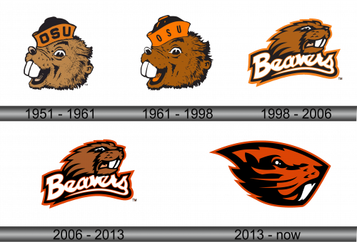
1951 – 1961
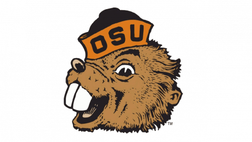
The logo features a side profile of an animated beaver, the symbol of Oregon State University’s athletic teams. The beaver is depicted with a fierce and determined expression, accentuated by sharp, attentive eyes and an open mouth bearing large white teeth. Its fur is rendered in textured strokes of dark brown, with lighter brown highlights creating a sense of depth and dimension. On the beaver’s head sits a hat with a flat brim, colored in bright orange with the letters “OSU” prominently displayed in bold, block letters, also in orange, matching the hat’s color, against the hat’s lighter band, making them stand out. The hat is cocked at a jaunty angle, adding an air of confident swagger to the mascot’s portrayal. The overall design of the logo is dynamic and full of character, aiming to evoke the competitive spirit of the university’s sports teams.
1961 – 1998
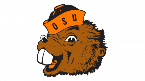
Upon closer inspection of the second logo, the changes from the previous version are subtle and primarily involve color adjustments. The brown tones of the beaver’s fur have shifted slightly, either deepening or lightening in shade, which affect the visual texture and contrast of the image. The orange of the hat also have been altered in hue, brightness, or saturation, potentially giving the “OSU” text a different visual prominence against the backdrop of the hat. These tweaks to the color palette, while not altering the design, help keep the logo up-to-date with contemporary color trends and can enhance visibility across various media
1998 – 2006
This logo represents a significant redesign from the previous iterations. The beaver is now depicted in a more aggressive and dynamic pose, facing forward with its mouth open in a snarl, showing white teeth and a pointed tongue. The fur is stylized with sharp lines and spikes, suggesting movement and ferocity. The color scheme has deepened, with a darker brown for the fur, a richer black for shading, and an intense, almost burnt orange that creates a striking contrast. The word “Beavers” is introduced below the animal, written in a stylized, italicized font with a bold white outline that makes it pop against the darker background. The lettering has a sense of motion, reinforcing the dynamic quality of the logo. The overall effect is a more modern and polished visual identity, intended to convey the power and competitive nature of the university’s teams. This rebranding effort provides a fresh and contemporary take on the Oregon State Beavers’ mascot.
2006 – 2013
The adjustment in the logo’s color palette to a darker hue is a subtle yet impactful change. The darker tones give the beaver a more imposing presence, potentially enhancing the aggressive and competitive nature the mascot is intended to represent. This tonal shift might also serve to create a stronger silhouette of the beaver, making the logo more pronounced when placed on various backgrounds or merchandise.
Moreover, the darkening of colors can affect the overall mood and perception of the logo. A darker color scheme is often associated with strength and sophistication, which can resonate well with a sports team’s image of resilience and determination. The contrast between the beaver and the background elements, such as the word “Beavers,” may also be more pronounced with the darker tones, improving legibility and visual impact.
2013 – Today
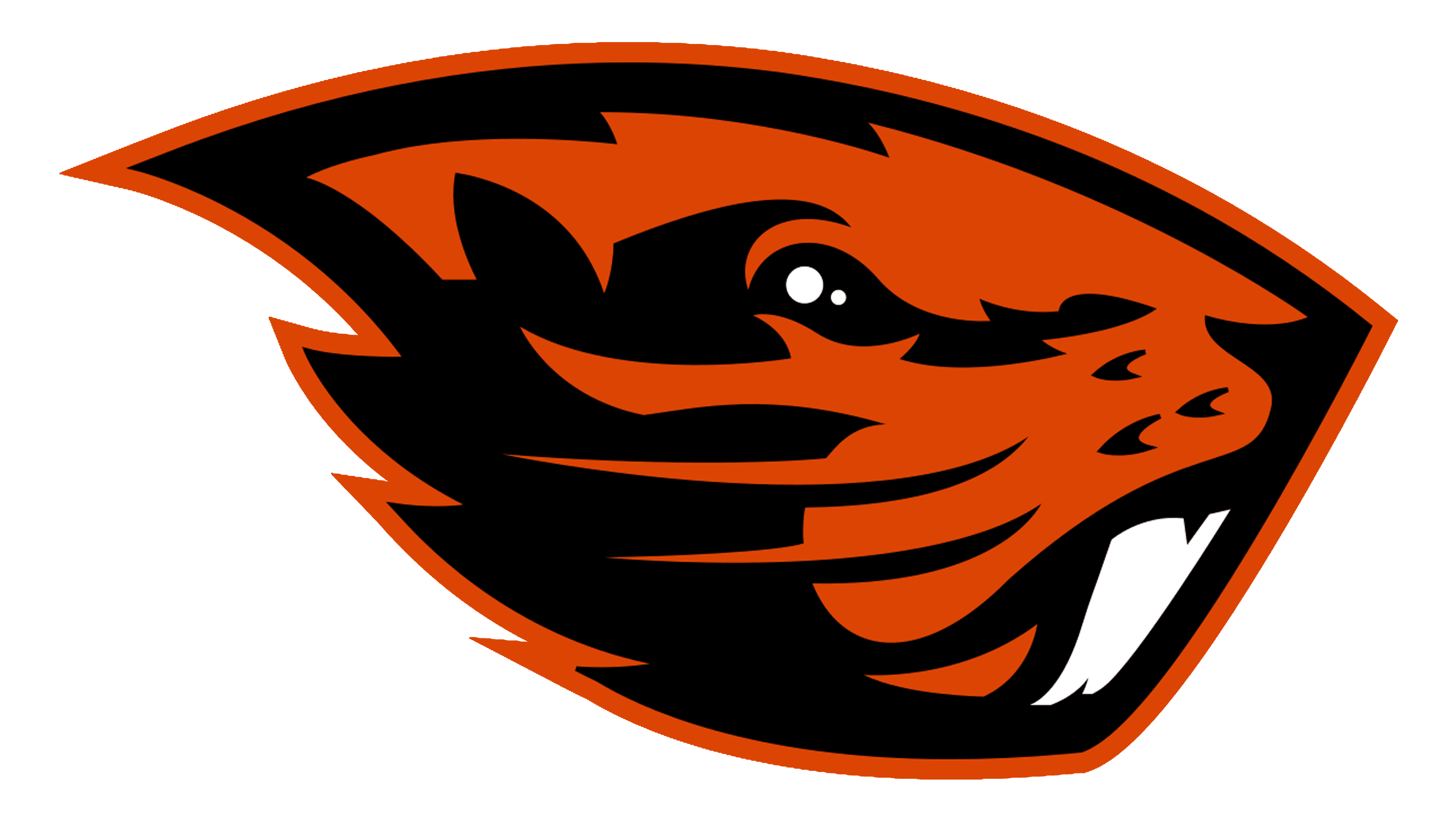
The logo is a modernized, abstract reinterpretation of the Oregon State Beavers’ mascot. It moves away from the literal depiction of a beaver towards a more emblematic and stylized design. The mascot is now encapsulated within a sleek, shield-like contour that adds an element of aggression and boldness, reflecting a warrior-like spirit.
The color scheme is simplified to two colors: a vibrant orange and a deep black, creating a stark and high-contrast visual. The beaver is portrayed with abstract black shapes forming its facial features, such as determined eyes and snarling mouth, set against the orange background. This minimalistic approach strips down the image to essential forms, allowing for instant recognition and a more iconic presence.
The beaver’s eye is a single white dot, adding a focal point and bringing life to the logo. The dynamic lines and sharp angles within the design suggest movement and ferocity, aligning with the athletic and competitive nature of sports teams.
This iteration of the logo signifies a contemporary trend in branding, where simplicity and adaptability to various media are paramount. It represents a significant shift from the previous, more detailed and representational logos, marking a new era in the university’s visual identity.
