Monsta X Logo
Monsta X delights with romance typical of 1990s boy bands. During their existence, Monsta X created 9 studio albums, 12 mini-albums, and 47 singles. Their work has been recognized with 44 prestigious music awards and received in 2019 the award of the Minister of Culture, Sports, and Tourism of the Republic of Korea. The team hit the peak of fame in 2017 when they were honored with the most prestigious awards given to Korean artists. Young and ambitious artists decided not to limit themselves to the stage. They also appeared on various TV shows.
Meaning and History
Monsta X was created in 2015 by the South Korean label Starship Entertainment. It included participants of a NO.MERCY survival show. Of the 13 trainees, seven were chosen for the boy band. The boy band received the first award in less than a year. In June 2017. the band’s first world tour, called Beautiful, began. The band name itself has two meanings. The first is “Monsters in the K-pop Scene” and “My Star”. The latter is French for “My” while “Sta” is consonant with the English word “Star”. The “X” sign means unknown.
What is Monsta X?
Monsta X is a Korean music group. The Monsta X group consists of seven similar but at the same time completely different members. Monsta X performs in rap, hip-hop, and K-pop. The peculiarity of this band is that they sing in several languages at once: English, Japanese, and Korean. They arrange large-scale tours across the globe.
2015 – 2019
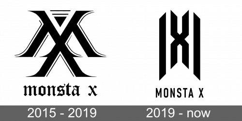
The first logo of the band consisted of a monogram and a name printed underneath. The monogram was drawn in such a way that the upper half of the “X” became the central part of the “M”. The letters had serifs, wide strokes as well as thinner strokes for shadows. A triangular element that was not part of the letters added a feeling of movement. In general, the monogram would be hard to decipher on its own, yet it was elegant and stylish. The inscription below was done in all lowercase letters and had a Gothic feel to it, making the band associated with “monsters” rather than “My star”. It is hard, tough, to associate this band with something other than romance and sweetness.
2019 – Today
The updated monogram of the band had a geometric and symmetrical appearance. It featured straight lines, and diagonal turns and cuts. The letter “X” was placed in the center and served as the middle leg of the “M”. Two other strokes were placed slightly lower and extended lower than the “X”. The name also looked different and now had all uppercase, sans-serif letters that were widely spaced apart. This was a logo of a more confident and well-recognized band rather than beginners in the music industry.
Font and Color
The font used for the name in the first logo is very similar to Cloister Black, while the monogram is inspired by Blackletter or similar font. The second logo used a font similar to Gambler Gothic Regular for the name. The black color seen in both logos is a classic choice and a symbol of mystery, elegance, and sophistication.


