Mötley Crüe Logo
Mötley Crüe is a heavy metal and glam rock band, born in the United States and very popular in the 1980s. Mötley Crüe was one of the few rock bands of the 80s whose members were not afraid to do what they liked. They wore women’s clothes, used makeup, went on stage under the influence of alcohol, and often staged provocations.
Meaning and history
The story of Mötley Crüe began on January 17, 1981, when bassist Nikki Sixx left the band London and began rehearsing together with drummer Tommy Lee and vocalist/guitarist Greg Leon, who had previously played in Suite 19. The trio rehearsed for a while before Leon left them for good. Six and Lee began searching for new members and soon met Bob Diehl, better known as Mick Mars. After an audition, Mars was accepted into the band. He also suggested the name “Mötley Crüe” to the then-nameless band.
Soon Mötley Crüe met their first manager Allan Coffman. The band released their first single “Stick to Your Guns/Toast of the Town”, which was released on their label Leathür Records.
Certain fame came from the band’s unusual clothing, high-heeled boots, lots of makeup, and constant use of alcohol and drugs. Using a mixture of heavy metal and glam rock, throughout the 1980s the band managed to release several best-selling albums, which were Shout at the Devil (September 26, 1983), Theatre of Pain (June 21, 1985), and Girls, Girls, Girls (May 15, 1987).
The members’ lifestyle nearly ruined the band until their managers Thaler and McGee intervened and banned a European tour, fearing that the musicians would “come back in body bags.” Shortly thereafter, all of the band members except for Mick Mars underwent drug rehab. Mars recovered on his own. After rehab in 1989, Mötley Crüe achieved tremendous popularity with the release of their fifth album, Dr. Feelgood (September 1, 1989), produced by Bob Rock. On October 14, 1989, the album reached number one and remained on the charts for 109 weeks.
In 1998, the contract between Mötley Crüe and Elektra Records expired, giving the band complete power over their material and plans. This meant that they became the sole owners of the rights to all their albums.
In 2001, an autobiographical book, The Dirt, was published, describing Mötley Crüe as “the most infamous rock band in the world”. The book was on The New York Times’ top ten bestseller list and spent ten weeks there.
On January 28, 2014, Mötley Crüe announced the end of their career and a farewell tour. The band played their last concert on December 31, 2015, in their hometown of Los Angeles.
What is Mötley Crüe?
Mötley Crüe is an American glam metal band founded in Los Angeles in 1981. The band was formed by bassist Nikki Sixx and drummer Tommy Lee, who were later joined by guitarist Mick Mars and vocalist Vince Neal. Mötley Crüe has sold over 100 million copies of albums worldwide in their history.
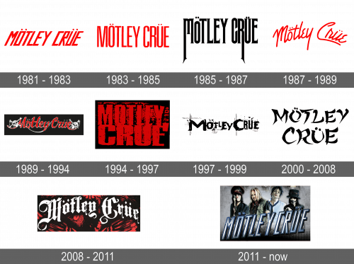
In terms of visual identity, the legendary band has always been open to experiments and changes. Throughout the years, Mötley Crüe has redesigned its badge around ten times.
1981 – 1983
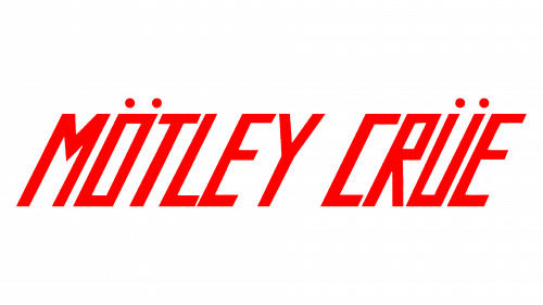
The original Motley Crue logo, introduced in 1981, has stayed with the band for a couple of years. It was a slanted uppercase logotype in a geometric sans-serif typeface with distinctive rectangular contours of the letters. The main thing about the badge was its color, the bright scarlet shade of red.
1983 – 1985
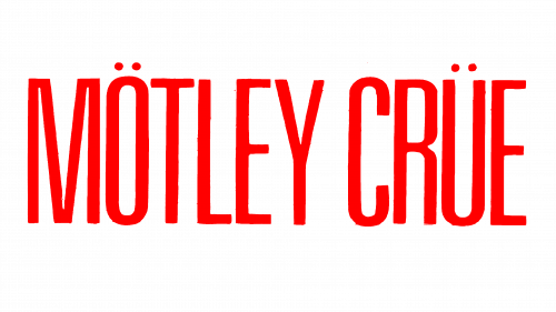
The redesign of 1983 changed the typeface of the Motley Crue lettering to a more traditional sans-serif, with the rounded yet narrowed shapes of the characters. This time the logotype was set straight, but the color remained untouched, and this was a very obvious and strong three, connecting it to the previous version.
1985 – 1987
In 1985 the concept of the Motley Crue badge was changed. This time the lettering was set in plain black, with the first letters of the two parts of the band’s name l having their vertical bars elongated and sharpened at the ends, stylized as gothic characters. As for the typeface in general, it was a very sophisticated narrowed serif font, with thin and sharp ends of the bars.
1987 – 1989
In 1987 the band returned to bright red color. The lettering in the wordmark got switched to the title case; with the strict font changing to a smooth cursive, where the ends of the bars were rounded. The new logotype was placed arched above the line, and looked very smooth and even friendly, despite the aggressive color.
1989 – 1994
The redesign of 1989 has added some graphical elements to the red Motley Crue logotype, and placed the new composition on a solid black background, outlining the smooth cursive letters in thin white. Now the inscription was accompanied by two white sculls with crossed bones, creating a very creepy and dramatic combination.
1994 – 1997
In 1994 the badge of the heavy metal band became as dramatic as never before, even though, the graphical parts with scary images were removed from the logo. The new concept was built around an extra-bold red lettering, set in two levels against a black background, with blurred contours, and some red patterns inside and around the letters.
1997 – 1999
The black color came back to the Motley Crue logo in 1997, with the red disappearing from the badge. The lettering here was set in a heavily stylized font with the uppercase characters set slightly dancing above the line. The inscription was accompanied by thin geometric patterns on the background, which were also set in black. This version of the logo stayed with the band for about two years.
2000 – 2008
The redesign of 2000 has brought an Asian-inspired image to the Motley accrue visual identity. The new inscription was set in bold black lines against a plain white background, with playfully-curved tails of the bars, which were also flared. It was a very Japanese image, which stayed with the band the longest — for eight years.
2008 – 2011
In 2008 the logo of Motley Crue was composed of bold white lettering, arched on a black banner with red decorative elements on it. The inscription was set in a heavy Gothic-style typeface with the tails of the “M” and the “C” elongated and elegantly curved.
2012 – Today
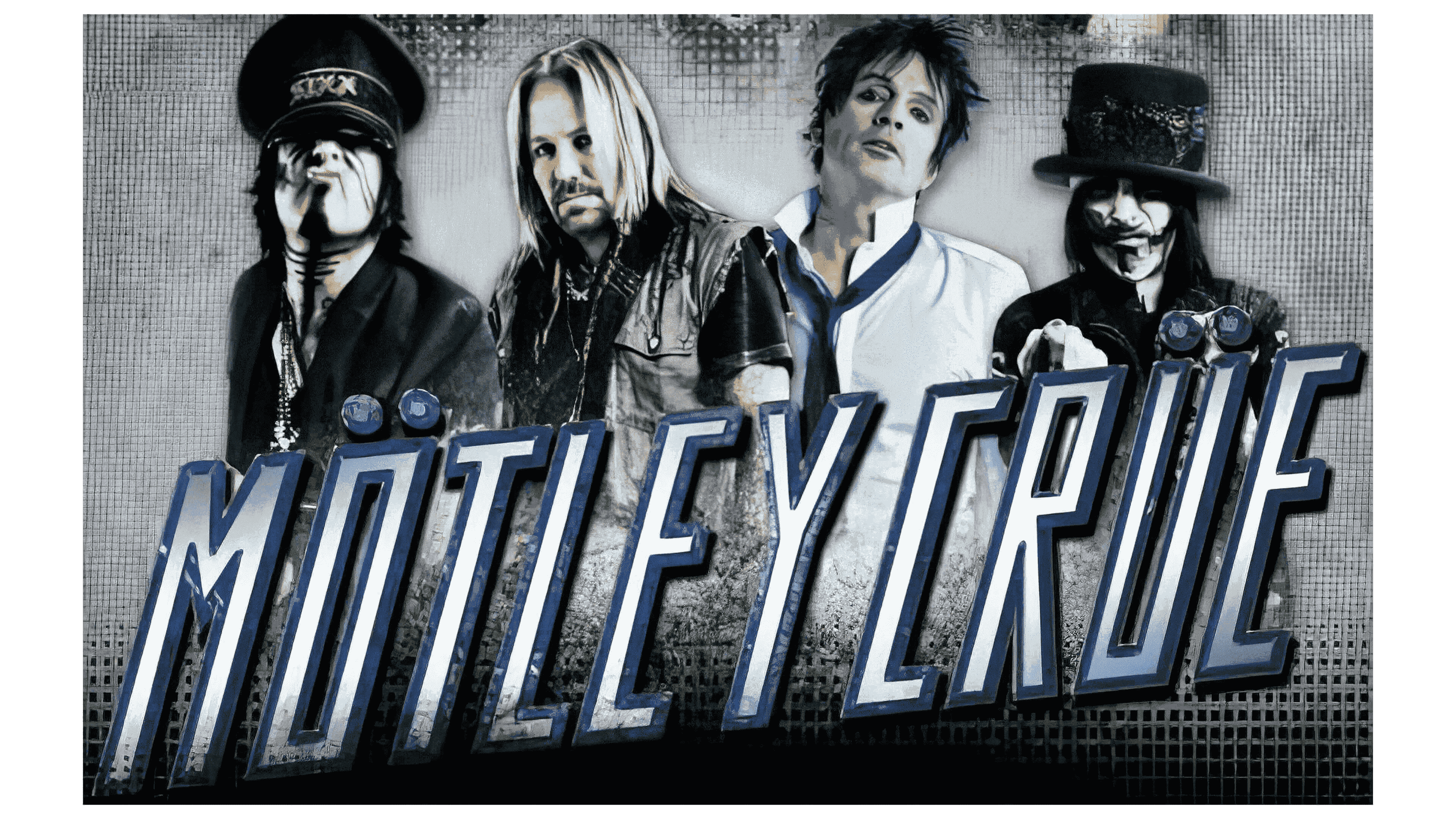
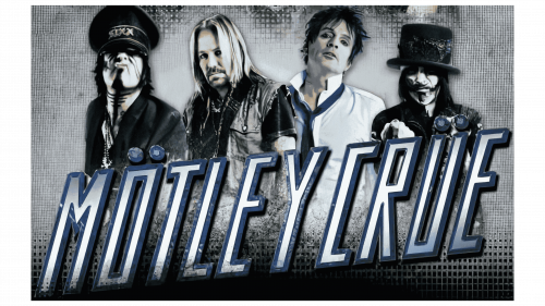
The latest logo, with which the legendary band started its final tour, was introduced in 2012. It was the most ornate of all the band’s badges ever created. The five members of Motley Crue were depicted on the background and overlapped by a geometric sans-serif lettering in silver and blue.
Font and color
The strict and slanted uppercase lettering from the Motley Crue logo is set in a custom geometric sans-serif typeface, with square shapes of the characters. The closest fonts to the one, used in this insignia, are, probably, Go Home Oblique JNL, or Cheapsman Slant, with some modifications of the contours.
As for the color palette of the Motley Crue visual identity, for a significant time, it was all about the combination of red and black, which was sometimes accompanied by white elements, but the last version of the logo was set in a cold scheme — with medium blue and silver gradients.
