Iron Maiden Logo
Iron Maiden is a London-founded musical performer. Assembled in the mid-70s, IM grew into the most recognizable representatives of the English heavy metal movement. They’ve taken a prominent spot in the development of the genre. Their songs, organized into 41 albums, highlight the topics of love, culture, loneliness, et cetera. The IM’s maker was the singer Steve Harris, and today the group consists of Janick Gers, Dave Murray and Adrian Smith as guitar masters, Nicko McBrain for drums, and Bruce Dickson as the voice of the group, alongside Steve.
Meaning and history
![]()
Iron Maiden started in London, 1975, thanks to a bass player named Steve Harris. This name traces back from The Man In The Iron Mask book by Dumas. This title resmbled Harris of a torture cell of the Middle Ages.
Originally, the band’s line-up was fluid, as many members were kicked out of the band for varying reasons. Harris and his friend-guitar player Dave Murray were the only stable participants.
After a line of IM permutations, they’ve recorded the eponymous album for EMI Recording Company. It appeared in 1980 in the British and English album charts and was enlisted in the so-called Metal For Muthas Tour. At the time the band contained Dennis Stratton (2nd guitar player), Clive Burr (Drums), Paul Di’Anno (vocals), playing on the tour alongside Murray and Harris. The album, performed on this tour, granted the band the initial success, which allowed it to grow instantly in the years to come.
Now they have 40+ singles, four extended plays, and numerous songs, organized into 41 albums, sold 130+ million times worldwide.
What is Iron Maiden?
Iron Maiden is one of the globe’s most recognizable performers singing heavy metal songs. They have achieved numerous rewards for their outrageous style and drive. Their songs, affecting the literature, history and philosophy, became iconic for many fans, spread across the whole world.
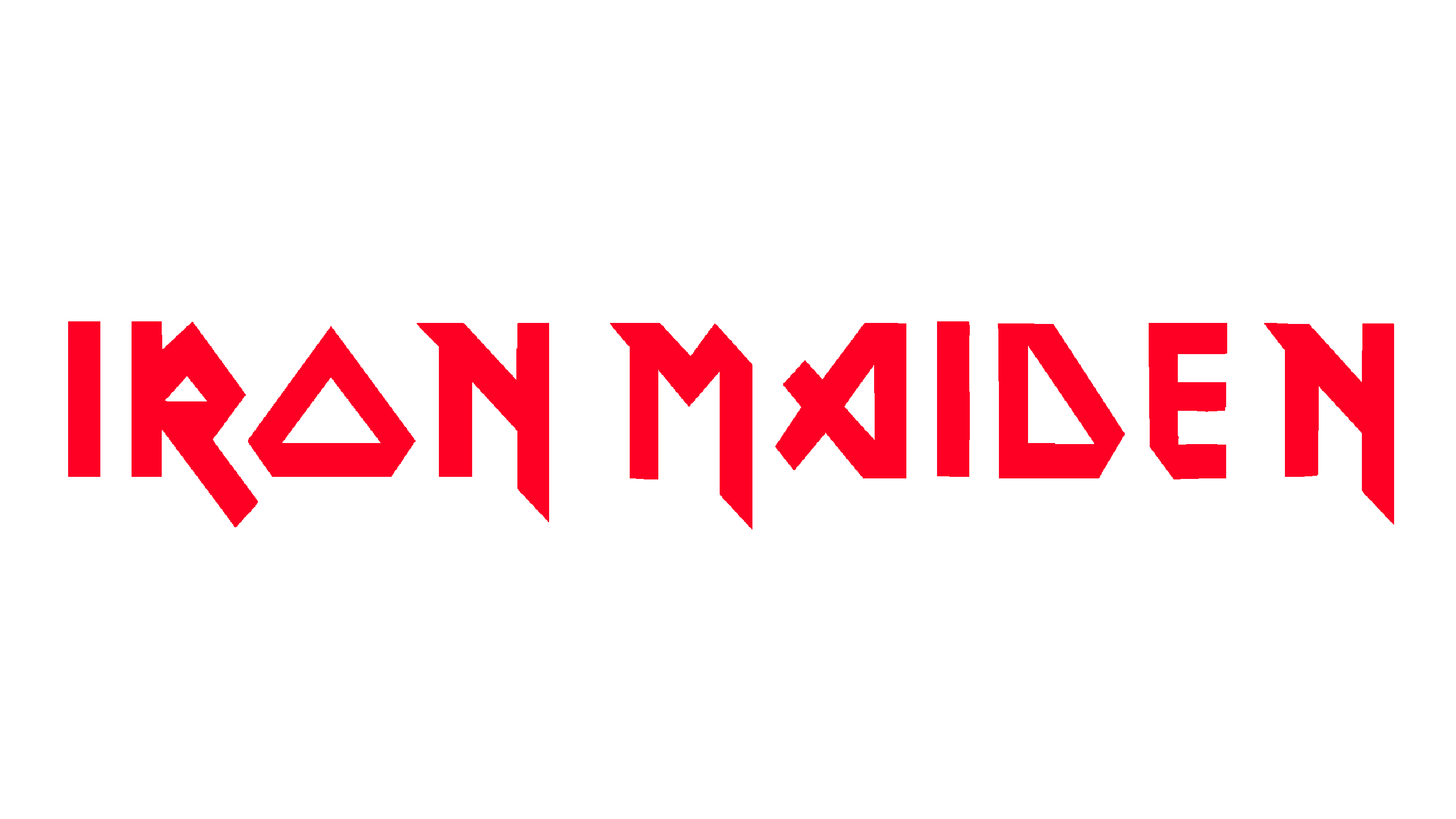
1980 – 1998
![]()
Their main logotype has never changed throughout the group history. Since the start, folks from Iron Maiden have been using a dark red nameplate, written in two uppercase words, split by a small gap. Each character had two contours: one black, one red. The feature highlighting the 1980s logotype is that the ‘n’,’r’, and ‘m’ letters had elongated lower bars, so they got out of the inscription limits. It also made the wording look sharper and more aggressive.
1998 – 2015
![]()
The latter redesign came up in a time of Virtual XI album release. They had removed the aforementioned sharpened tips of the symbols, which made the logotype more compact and less shouting. However, it still reflected the mood and traditions of heavy metal genre, as well as those of Iron Maiden
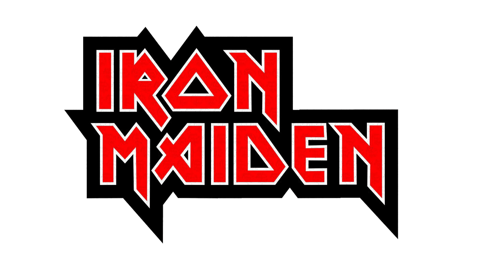
2015 – today
![]()
In 2015, the band has come back to the starter icon with the lower tips or ‘r’,’m’, and ‘n’ continued. The logotype is similar to the 1980 variant except for one aspect the red color became even richer.
Font
The Iron Maiden inscription features a bold sans-serif typeface, which contains angular uppercase letter forms with sharp edges, which makes it look dangerous and heavy. Each character somewhat resembles a rune, with their abrupt lines and sharpened tips. This typeface was invented by Dennis Wilcock, the Iron Maiden’s vocalist, active between 1976 and 1978. The script would later be named Metal Lord and associated with heavy metal music movement.
Color
The Iron Maiden nameplate is written in red capitals, limited by two white and black outlines. The reason why they painted the name red hides in the feelings translated by the shades: black stands for power and prestige; red is the color of rage and action, often associative with metal; finally, white means precision and clearness.